Overview
PAS dashboard consists of various tiles, graphs, and donut charts. The records are displayed in the dashboard after the users select the organization and the accounting period.
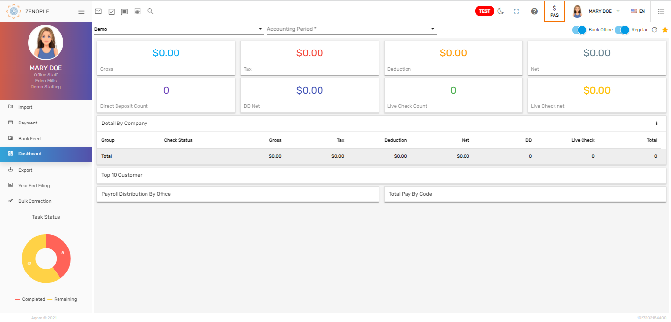
The dashboard features six navigation. They are:
- Toggle Button
- Tiles
- Detailed Table
- Graph
- Donut Chart
- Task Status
Toggle Button
We have two different toggle buttons in the dashboard. According to the selected toggle, information in the dashboard is displayed.
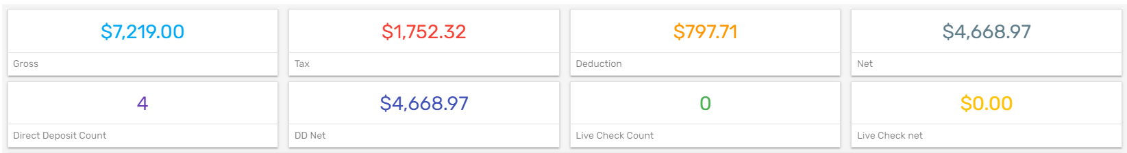
Tiles
According to the selected accounting period, tiles give the numeric representation of the 'Gross,' 'Net,' 'Taxes,' 'Deduction,' 'Direct Deposit Count,' 'DD Net,' 'Live Check Count,' and 'Live Check Net.'
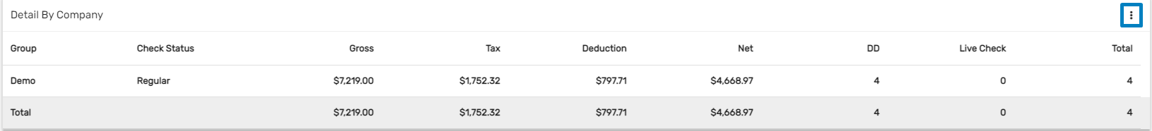
Detailed Table
As per the selected company and accounting period, the tabular information gives the detail of the 'Check Status,' 'Gross,' 'Tax,' 'Deduction,' 'Net,' 'DD,' 'Live Check,' and the 'Total.' Detail by a company is selected as default.
Users can click on the vertical ellipsis button and view the details accordingly by 'Company', 'Office', 'Bank Account', 'Check Type', and 'Check Date'. The group changes as per the selected details.
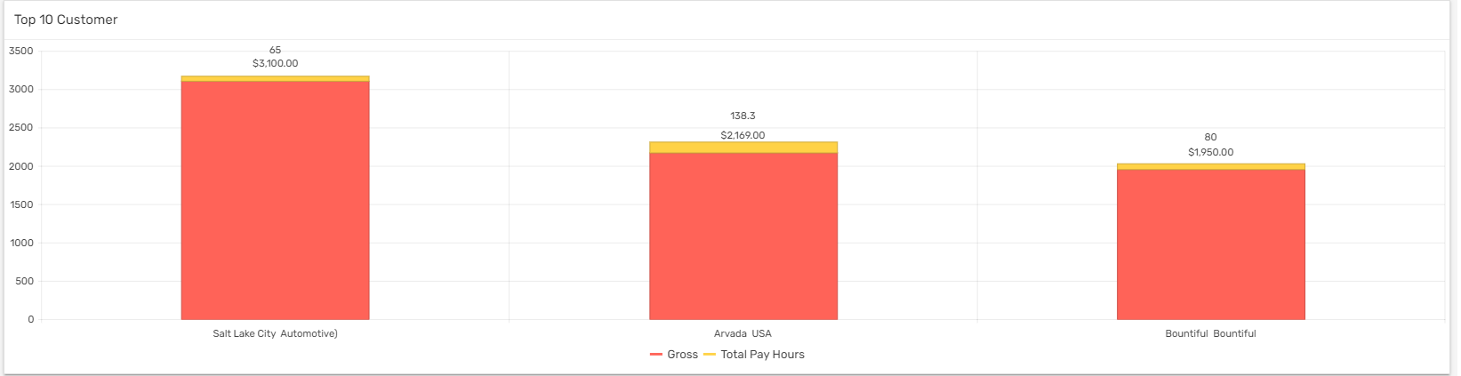
Bar Graph
This shows the information of the top 10 applicable companies as per the gross pay.
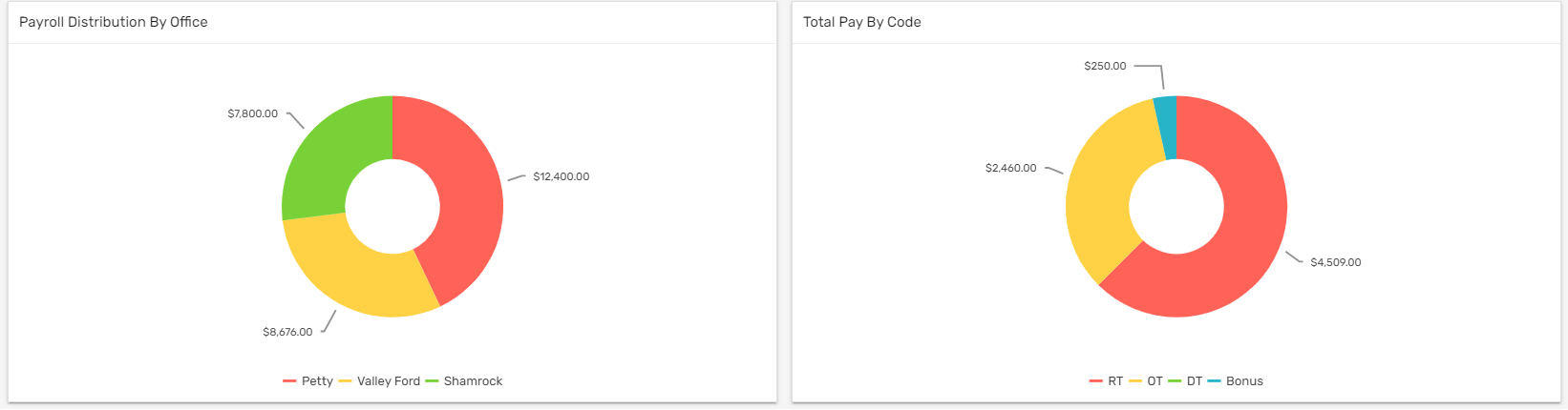
Donut Chart
There are two donut charts in the dashboard, 'Payroll Distribution by Office' and 'Total Pay by Code.'
'Payroll Distribution by Office' shows the total invoice amount of all the offices of the client individually while 'Total Pay by Code' shows the Regular time, Overtime, Double time, and Bonus amount individually as per the selected accounting period and company.
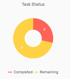
Task Status
Task status shows the count of tasks completed and tasks remaining. Users can view the count of task status in the donut chart.