Dashboard
Tiles
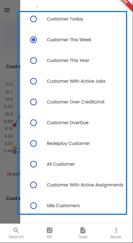
Tiles are streamlined visual representations that occupy a prominent place at the top of the screen, granting users rapid and convenient access to vital customer-related data. These intuitive tiles serve as a gateway to comprehending customer activity in depth. Users can swiftly navigate through various options, such as viewing customers created today, this week, this month, and this year. Additionally, they can explore categories like customers with active jobs, those surpassing their credit limit, customers with overdue accounts, redeployed customers, all customers in the database, customers with active assignments, and those currently idle. These tiles empower users to effortlessly engage with and gain insights into their customer management processes.
 A simple long-tap on any of the tiles grants users access to a contextual menu that provides versatile sorting options. This menu empowers users to effortlessly organize and filter customer data. They can choose to view customers created today, this week, this month, or this year, tailoring their insights to specific timeframes. Furthermore, users can explore specific categories, including customers with active job assignments, those exceeding their credit limits, customers with overdue accounts, redeployed customers, the complete customer database, customers with active assignments, and those who are currently idle. This intuitive feature enhances user control and simplifies data navigation within the system.
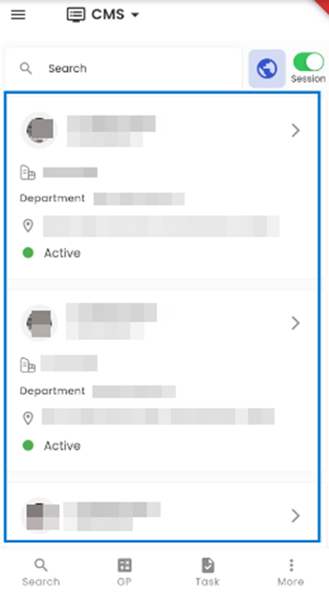
Tapping on any tile will redirect to the customer directory. It will show the details of the customer depending on the tile selected.
Charts
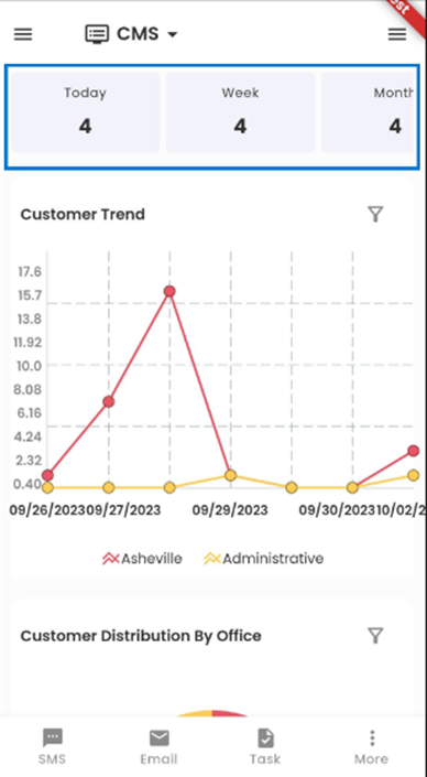
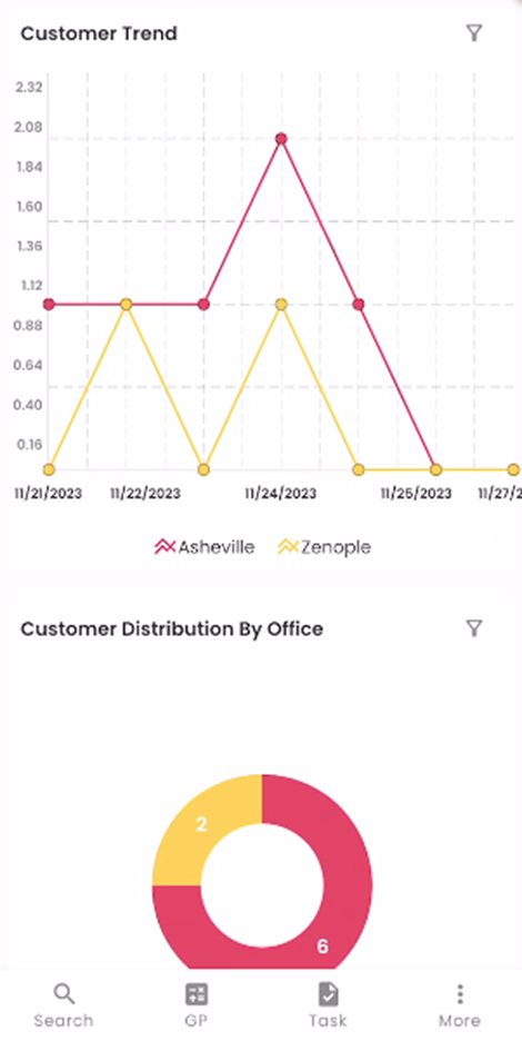
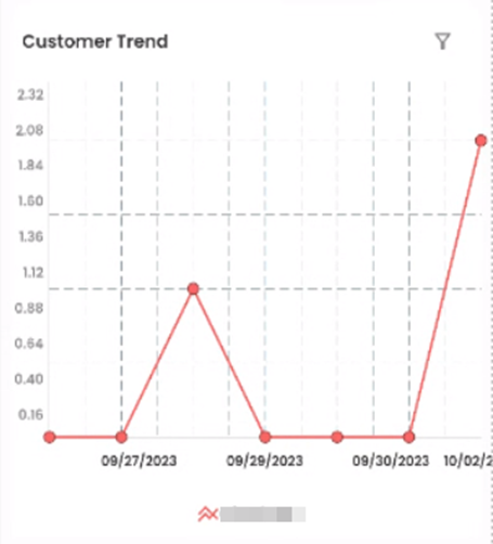
The users can view the charts section on the landing page positioned below the Tiles of the CMS dashboard, presenting users with two charts namely the Time Graph and the Donut Chart. Right from the start, users are greeted with the simultaneous display of these two charts. The default configuration showcases the Customer Trend chart, providing insights into customers' trends over time, and the Customer Distribution By Office chart, which offers a graphical overview of customer distribution with respect to different offices.
The dashboard provides a variety of three chart options namely the Time Graph, Donut Chart, and Bar Diagram. The users can select from a choice of four different customer tile types using the ‘Filter’ option. This flexibility ensures that users can tailor the display to their specific preferences and requirements.
Choosing Customer Charts
Tapping on the ‘Filter’ icon allows the user to choose from various Customer Tiles. The user can choose from various Customer Tiles namely Customer Trend, Customer Distribution By Office, Top 10 Customers By Revenue, and Top 10 Customers By Sales. Upon selection, the chosen chart will be promptly showcased in the dashboard's charts section, ensuring a seamless and personalized viewing experience. You can choose from the following options:
Customer Trend: The Customer Trend chart represents the timeline of the number of customers that are registered into the Zenople system for different offices for the date selected. The different color lines represent each office which is mentioned in the legend below the chart. The vertical axis of the chart indicates the number of applicants whereas the horizontal axis indicates the dates.
By tapping on the dots within the charts, users can instantly access a box displayed above the dot, revealing the number of customers associated with the specific date, and facilitating a quick and convenient data overview.
This chart enables users to promptly view the dates with the highest and lowest customer counts, providing a clear visual representation of customer activity over time.
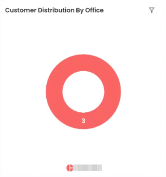
Customer Distribution By Office
The ‘Customer Distribution By Office’ is denoted by a donut chart. The number in the chart indicates the number of customers and each color indicates the specific office which is specified below the chart. This is handy for comparing the records and drawing valuable conclusions quickly.
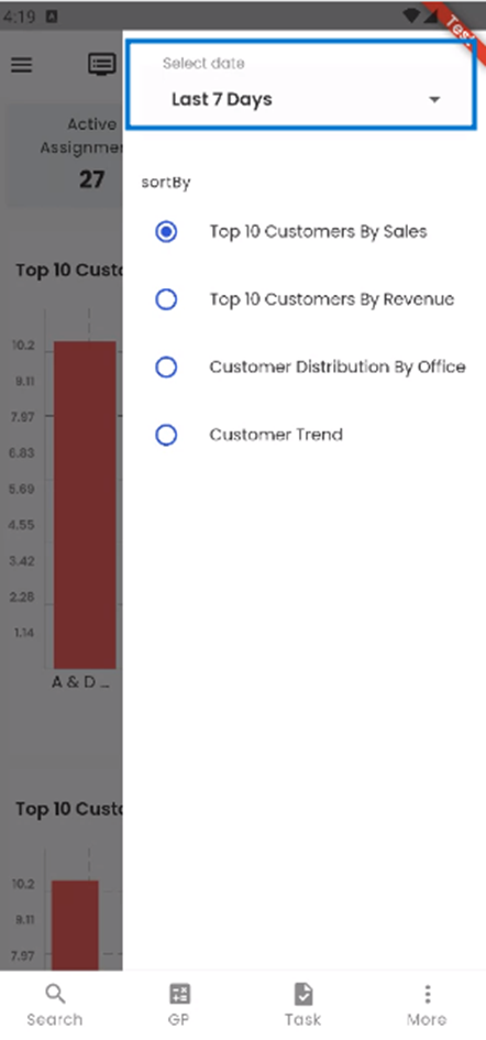
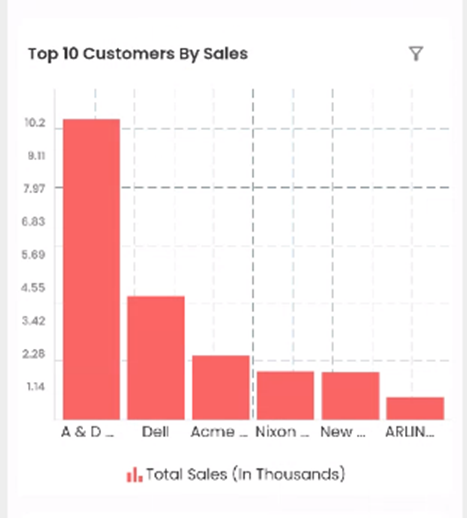
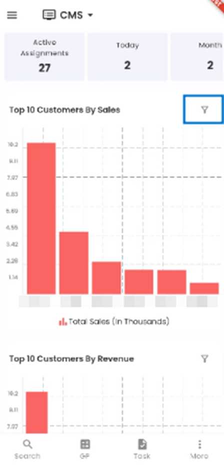
Top 10 Customers By Sales
The ‘Top 10 Customers By Sales’ chart is presented in the form of Bar Diagram, displaying the total sales for each customer in descending order, with customer names positioned below their respective bars. It makes it easy for user to view the customer with the highest sales. The user can reveal a specific customer's total sales (in thousands) by selecting the corresponding bar. The vertical axis of the bar diagram indicates the Sales amount whereas the horizontal axis indicates the customers.
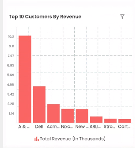
Top 10 Customers by Revenue
The ‘Top 10 Customers by Revenue’ chart displays the Revenue of the customers in descending order. The customers’ names are mentioned below each bar diagram. Selecting the bar the user can see the Total Revenue (in thousands) of the specific customer above the bar.
The 'Top 10 Customers by Revenue' chart exhibits customer revenue in descending order, with customer names displayed beneath each bar; users can access the total revenue (in thousands) for a specific customer by selecting the corresponding bar, providing a clear overview of revenue distribution.
Filter
Tapping on the ‘Filter’ icon allows the user to choose from various Customer Tiles.
The user can choose from various Customer Tiles namely Customer Trend, Customer Distribution By Office, Top 10 Customers By Revenue, and Top 10 Customers By Sales. Upon selection, the chosen chart will be promptly showcased in the dashboard's charts section, ensuring a seamless and personalized viewing experience.
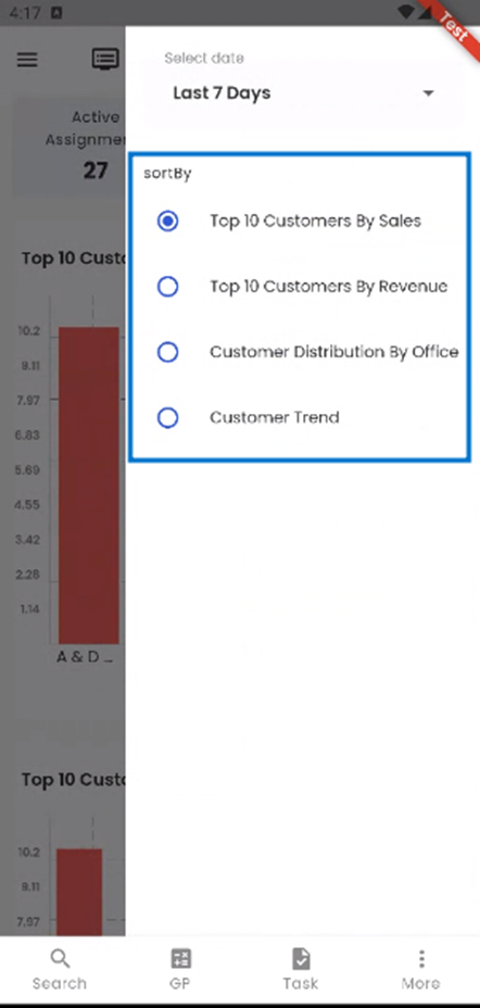
The ‘Select Date’ filter allows the user to choose from different timelines such as This week, Last 7 Days, and so on, influencing the information displayed on the chart. By default, users can initially view charts covering the 'Last 7 Days'.