Overview
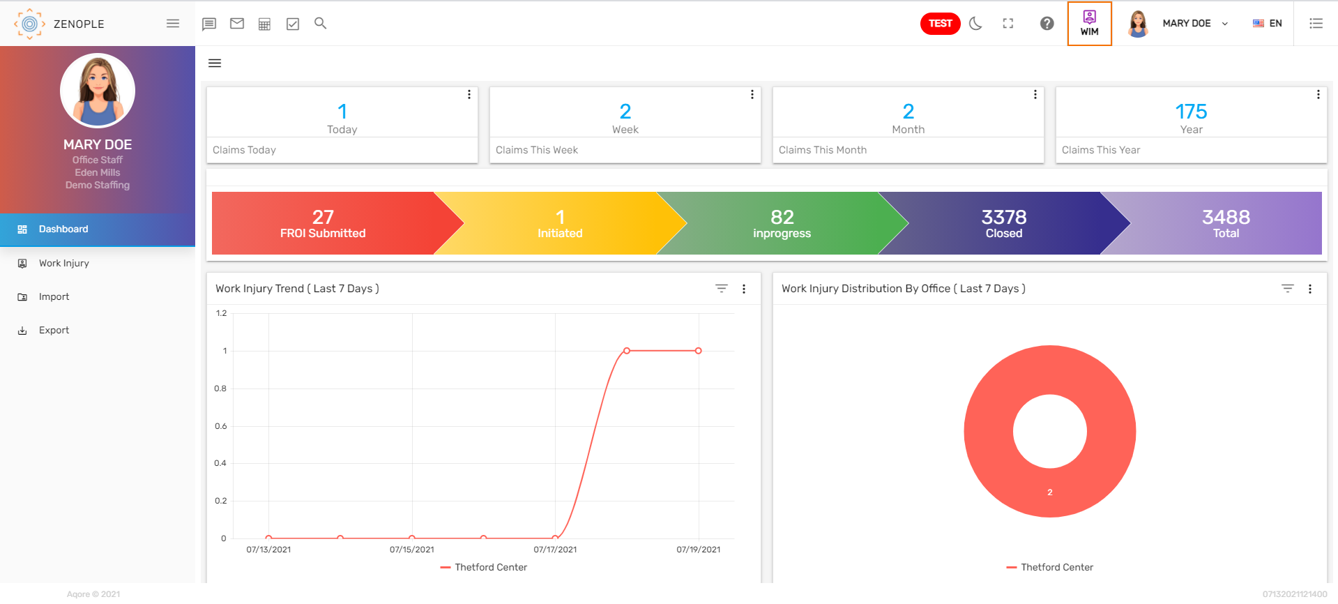
The first landing page of the Unemployment Management System (UMS) is the ‘Dashboard’. The dashboard consists of various tiles, workflow, trendlines, a donut chart, and directory filters.
Tiles
Tiles are the numeric representation of information. There are various tiles on the top of the screen. Users can view the number of 'Unemployment Today,' 'Unemployment This Week,' 'Unemployment This Month,' and 'Unemployment This Year.' Tiles are customizable and can be added upon the user’s request. Users can click on the vertical ellipsis, select other options and view the records accordingly.

Workflow
Unemployment workflow displays the count of 'Initiated,' 'InProgress,' 'Determinations Received,' 'Closed,' and 'Total' records. Clicking on each stage will redirect users to the detail page of that stage.
The unemployment workflow consists of 5 different stages. They are:
- Initiated
- In progress
- Determination Received
- Closed
- Total

1. Initiated
When a person files the unemployment claim, the case is open and the unemployment claim is in the ‘Initiated’ stage.
2. In Progress
When the claim starts the process, it is in the ‘In progress’ stage.
3. Determination Received
If the claim receives the determinations, it is moved to the ‘Determination’ stage.
4. Closed
Once the claim or case is closed, it is moved to the ‘Closed’ stage.
5. Total
It displays the total number of unemployment claimed.
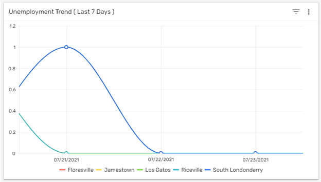
Trend Lines
Trend lines in the dashboard show the graphic comparison of the number of unemployed people added into the Zenople system according to different offices in a period of time. The default date is set as the 'Last 7 Days.' Users can filter the Unemployment Trend by date like 'Last 7 Days, 'This Week,' 'Last Week,' 'This Month,' 'Last 30 Days,' etc. Also, users can select an office in the trend lines to see the number of sales records under a particular office in the selected time.
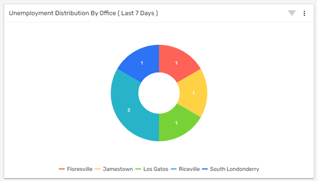
Donut Chart
The donut chart of 'Unemployment Distribution by Office' shows the number of unemployed people as per the office on the selected date. The default date is set as the 'Last 7 Days.' Users can filter the chart of the unemployed people by date like 'Last 7 Days,' 'This Week,' 'Last Week,' 'This Month,' 'Last 30 Days,' etc. The donut chart is handy for comparing the records and also valuable in concluding quickly.
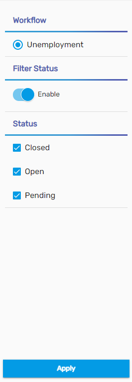
Filter
UMS includes a filter option that helps to search for the unemployment records according to different filters and statuses. Filter popups when users click on the hamburger icon and users can display the records in the dashboard as per the selected filters.