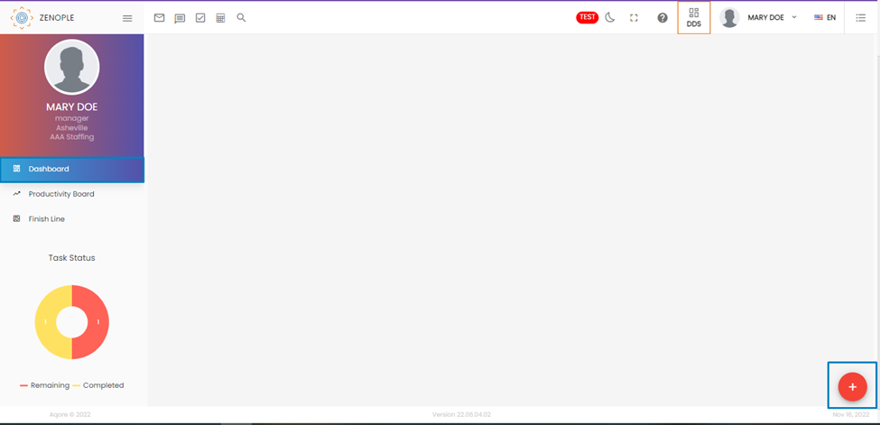
Dashboard:
As the name suggests, the Dashboard of DDS is a board or a space that can be dynamically customized per the user's requirements. If we look at the preview of the Dashboard navigation, we can see a blank space with just an “Add” button on the bottom-right corner of the screen.
If users click the Add button, an “Add widget” button will appear. Clicking the button reveals a list of widgets users can choose to visually represent their data.
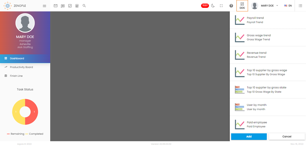
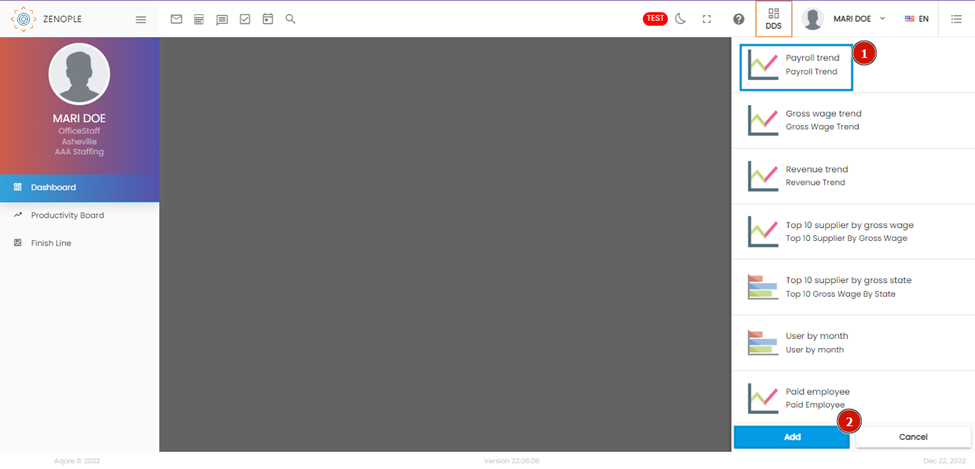
From the list, users can choose to add any widget one at a time. Choosing a wizard (number 1) and clicking on Add (number 2) gives the graphical representation of the selected wizard.
The “Widget Template” wizard helps us provide details about the widget we want to add to the Dashboard.
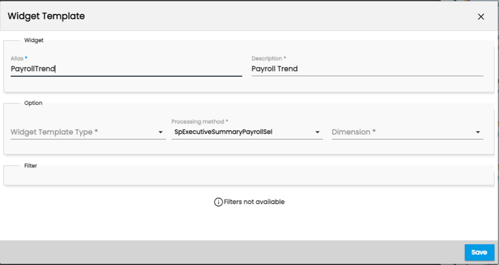
The “Alias” field shows the name of the widget we choose. The Description part allows users to add a description for the widget. In the “Widget Template Type,” users can choose how they want to represent the data.
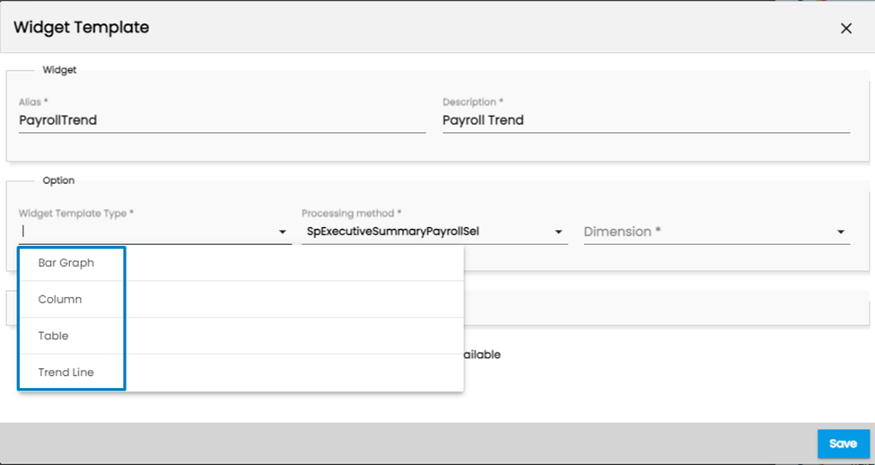
Similarly, the Dimension field allows users to specify the dimension of the widget.
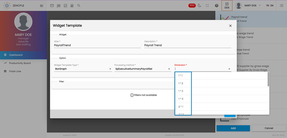
After choosing the field values, the widget gets represented in the Dashboard.
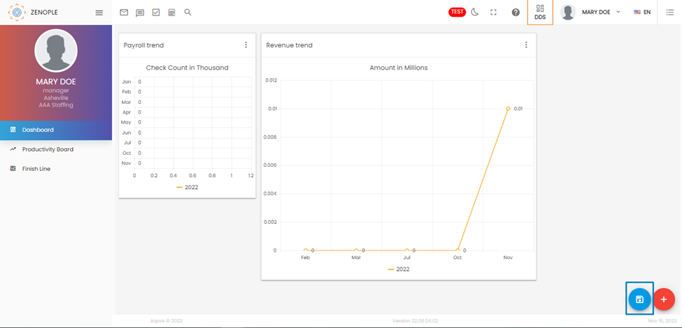
In the above screenshot, we can see a new icon beside the add icon that appears as soon as we add another widget and re-arrange its position. Because the system supports manually rearranging the columns, the new icon works as a “Save Changes” button. Once users have arranged the position of multiple wizards, they can click on the icon to save the changes.