Overview
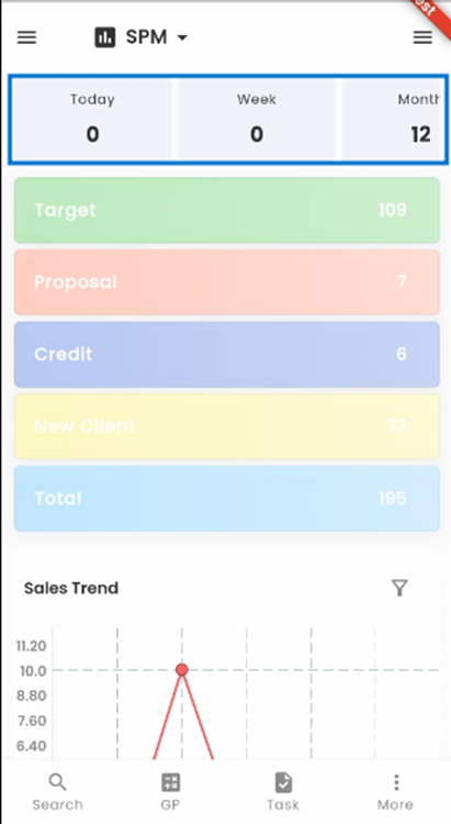
The dashboard displays various tiles, workflow, and graphs of the SPM application that help in the visualization and analysis of the records. Users can see multiple 'Tiles,' 'Workflows,' 'Sales Trends,' and 'Sales Distribution by Office Charts.'
Tiles
Tiles are positioned at the top of the screen, giving users effortless access to critical sales-related information. These user-friendly tiles are a gateway to a comprehensive understanding of sales activities. With intuitive navigation options, users can quickly explore a variety of metrics, including sales targets for today, this week, this month, and this year.
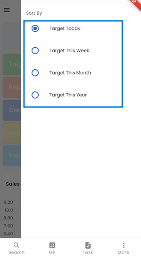
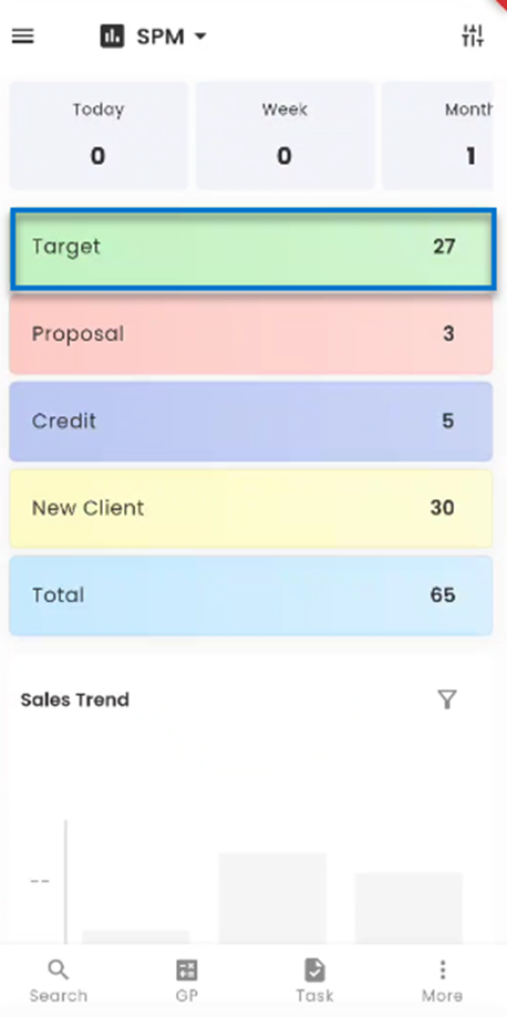
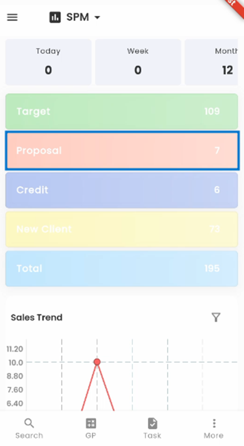
A long press on any tile opens a contextual menu, offering users many versatile sorting options. This menu allows them to effortlessly access sales targets for the day, week, month, or year. This intuitive feature amplifies user control and streamlines data navigation within the system for a seamless experience.
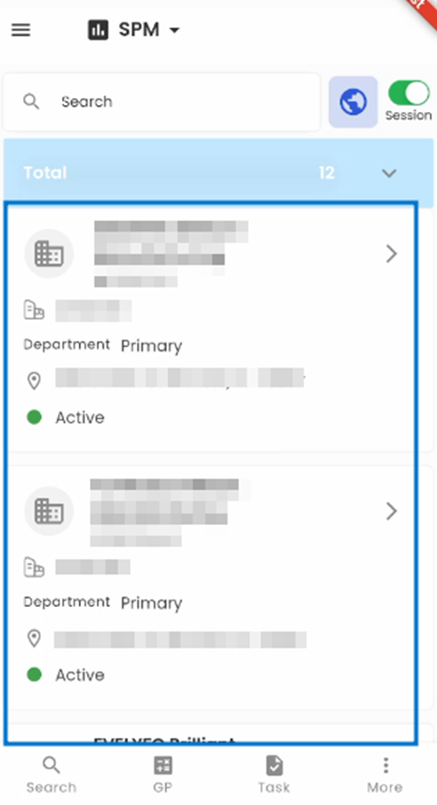
The records count of the selected option will appear on the tile.
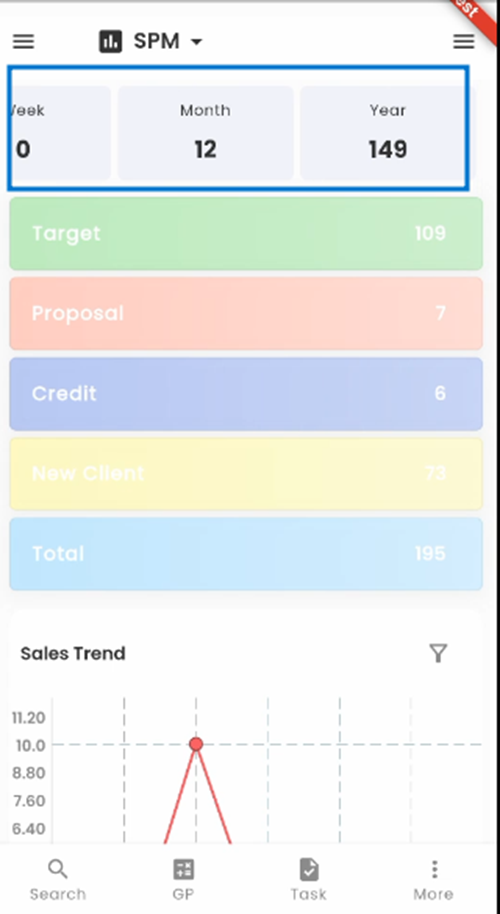 Tapping on any tile will redirect to the sales directory. It will show the details of the sales target depending on the tile selected.
Workflow
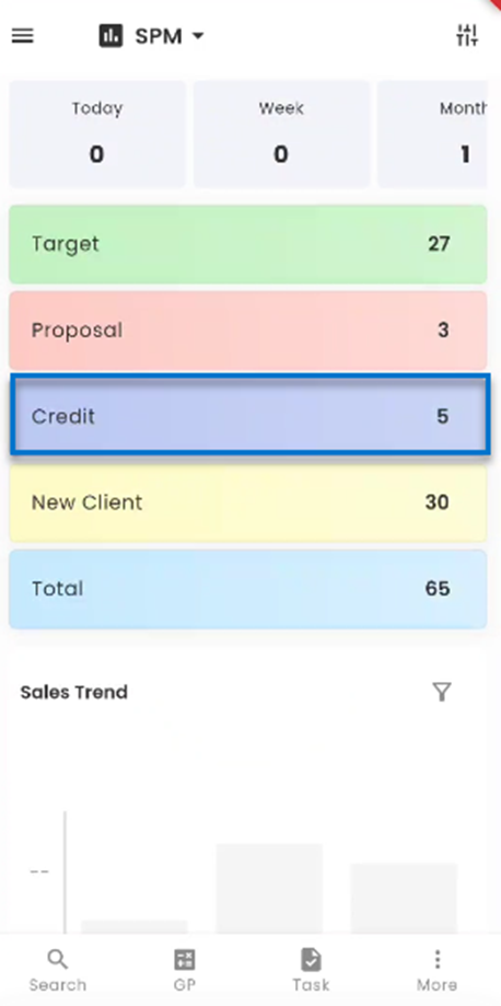
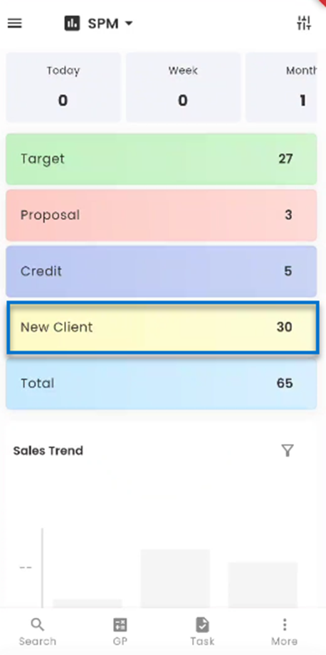
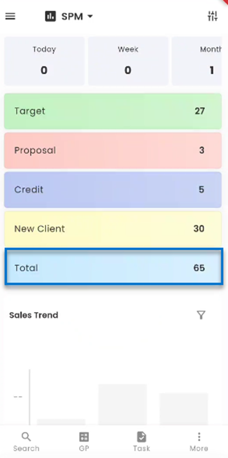
The workflow for SPM application consists of 5 stages: Target, Proposal, Credit, New Client and Total.
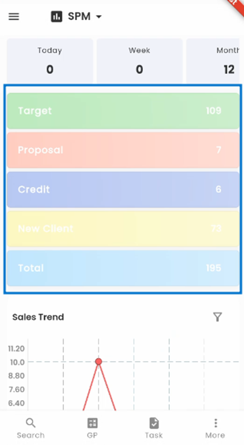
Target is the first workflow stage of SPM and all the targets are recorded in this stage.
The proposal stage represents the second phase in the sales workflow, where prospective targets are presented with various proposals, formal documentation, and agreements.
In the Credit stage, the credits of targets are analyzed based on the company’s requirements to qualify as a client.
Prospective clients are presented with proposals while their creditworthiness undergoes thorough analysis. Upon meeting the requirements, they become qualified and are officially designated as 'New Clients,' marking their entry into this stage of the process.
All the data of the above stages can be viewed in this stage.
Charts
The dashboard provides two chart options: the Time Graph and the Donut Chart. The users can select from a choice of two different options using the ‘Filter’ option. This flexibility ensures users can tailor the display to their preferences and requirements.
Tapping on the ‘Filter’ icon allows the user to choose from various Sales Tiles.
The user can choose from two of the Sales Tiles: Sales Trend and Sales Distribution by Office. Upon selection, the chosen chart will be promptly showcased in the dashboard's charts section, ensuring a seamless and personalized viewing experience.
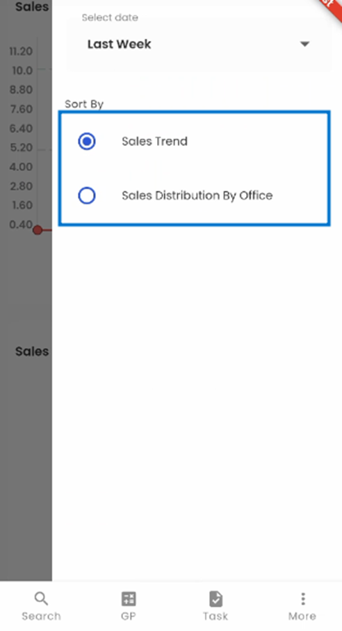
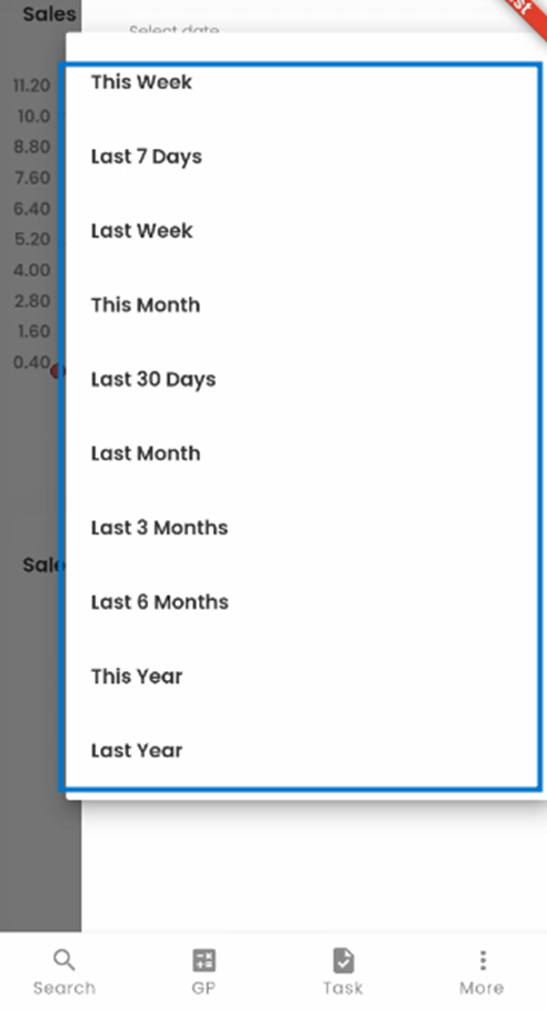
The ‘Select Date’ filter allows the user to choose from different timelines such as This week, Last 7 Days and so on, influencing the information displayed on the chart. By default, users can initially view charts covering the 'Last 7 Days.'
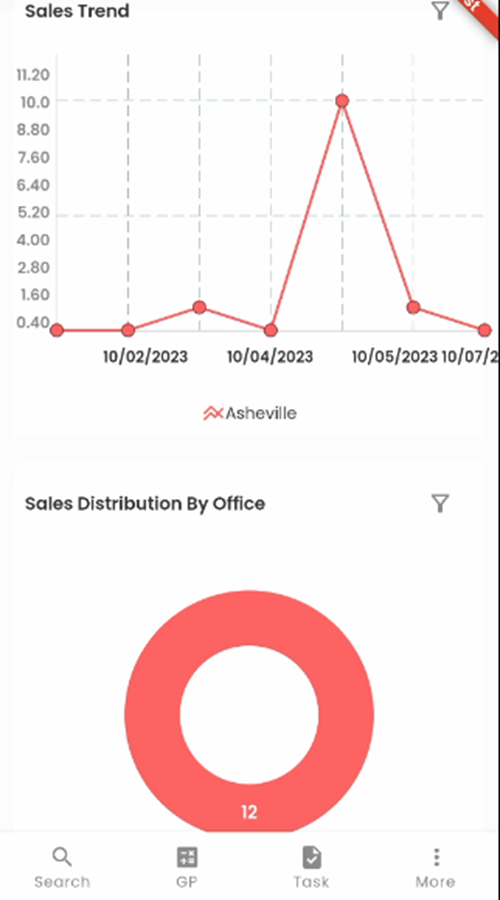
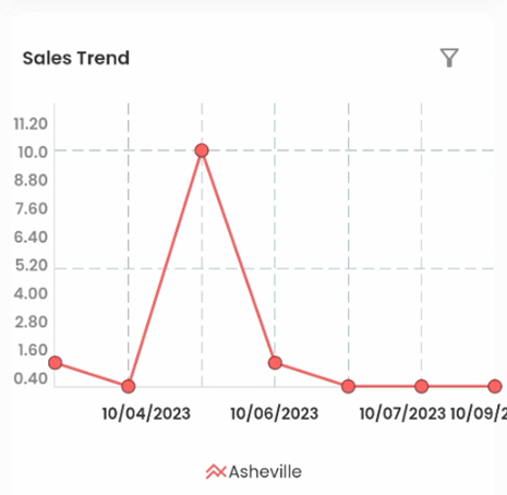
The Sales Trend chart represents the timeline of the number of sales that are registered into the system for different offices for the date selected. The different color lines represent each office, which is mentioned in the legend below the chart. The vertical axis of the chart indicates the number of applicants, whereas the horizontal axis indicates the dates.
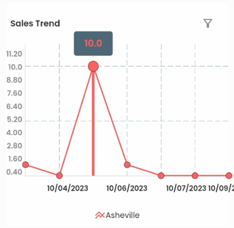
By tapping on the dots within the charts, users can instantly access a box displayed above the dot, revealing the number of customers associated with the specific date facilitating a quick and convenient data overview.
This chart enables users to promptly view the dates with the highest and lowest customer counts, providing a clear visual representation of customer activity over time.
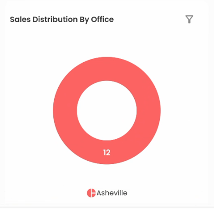
The ‘Sales Distribution by Office’ is denoted by a donut chart. The number in the chart indicates the number of sales, and each color indicates the specific office, which is specified below the chart. This is handy for comparing the records and drawing valuable conclusions quickly.