Overview
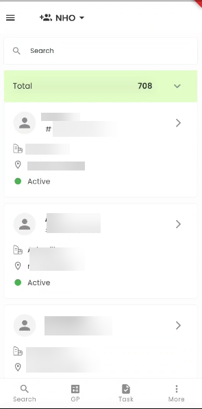
The New Hire Directory, seamlessly integrated into the Zenople mobile application, offers an efficient and streamlined approach to managing new hire records within the New Hire Onboarding (NHO) portal. Using the Search box, users can easily locate new hires by searching for their names, User IDs, or any other relevant information. New hires are presented in a user-friendly card view format, allowing for quick and intuitive interaction. Each new hire's card displays essential information, including their Profile Picture, Name, Person ID, Office, Address, and Status. Our mobile application is designed to enhance the management and interaction with new hire records, providing an intuitive and efficient solution that optimizes your onboarding process for greater effectiveness and streamlining.
Navigating to the New Hire Directory
When you select the Hamburger icon, as shown in the figure below, you will access the NHO portal's navigations. By tapping the "New Hire" side navigation, you will be seamlessly redirected to the New Hire Directory.
Card View of New Hires
The initial screen displayed is the New Hire Directory page, presenting a Card View of the registered new hires. Each new hire within the system is represented by an individual card, containing relevant information, such as their Profile Picture, Name, Person ID, Office, Address, and Status.
Efficient Searching
The search box empowers users to perform comprehensive searches for new hires within the NHO portal. Users have the flexibility to search for new hires using various criteria, including their Names, Person IDs, Phone Numbers, Offices, and other relevant information, providing a versatile and efficient search capability.
Workflow Filtering
Tapping on the current workflow grants access to an expanded view of the NHO Workflow. In this section, users can effectively filter and examine new hires at various stages within the NHO, including New Hire, Paperwork, Review, Orientation, and Employee stages. The 'Total' segment of the workflow, which is the default selection, conveniently presents a comprehensive overview of all NHO new hires across all stages.
Detailed New Hire Information
Upon tapping any card within the directory, the system will promptly unveil a bottom slider, offering comprehensive details regarding the selected new hire. This includes relevant information such as their Profile Picture, Person ID, Name, Phone Number, Status, Office, Recruiter, Apply Date, Since, Task, Stage, Address, Preferred Name, Source, and Employer, providing users with a thorough overview of the new hire's profile.
Smooth Navigation
When a user taps any area of the screen outside the bottom slider section, the bottom slider gracefully slides out of view, and the user is seamlessly returned to the New Hire Directory page. This intuitive feature ensures a smooth and user-friendly navigation experience within the application.
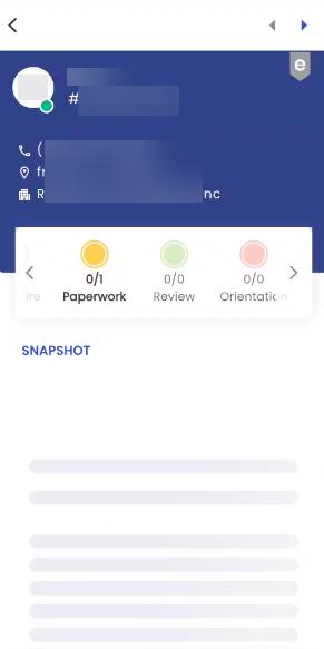
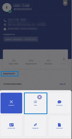
Snapshot
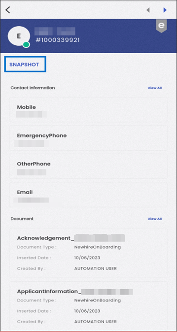
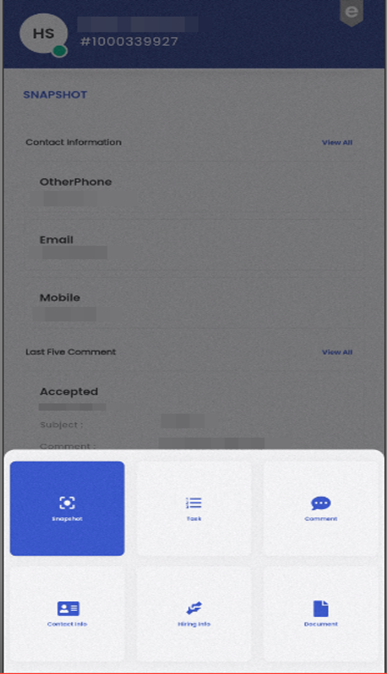
The snapshot is the first thing presented to user in New Hire Detail page which contains summary information regarding the contact details, comments, tasks, etc. If the user wants to go to any other navigation, they can simply touch the navigation title; In Our scenario “Snapshot. The user will be then presented with cards of other navigation options.
There are multiple sub-navigating options available in the snapshot section. A short overview of the same are provided below in this section.
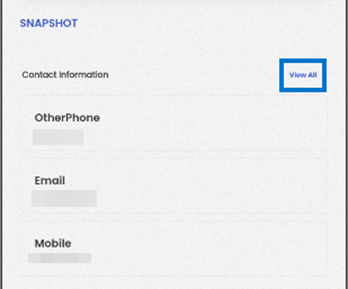
The contact information section offers users a comprehensive overview of the new hire’s contact details, providing easy access to vital contact information related to the new hire.
When a user taps on the ‘View All’ action, users will be smoothly redirected to the ‘Contact Information’ sub-navigation within the ‘Contact’ navigation. This user-friendly action allows users to access and explore the complete set of contact details associated with the new hire.
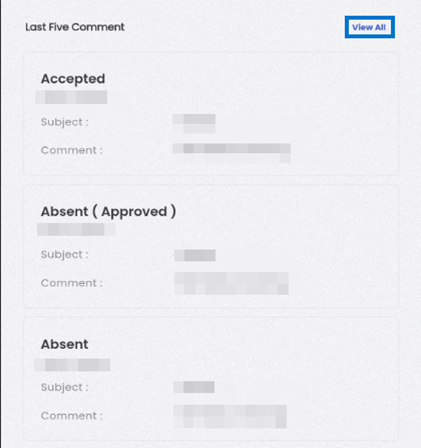
The "Last Five Comment" section serves as a valuable tool for enhancing your decision-making process. By focusing on recent interactions, you can quickly assess the new hire's current status, communications, and any updates that may be relevant to your evaluation. This feature empowers you to make informed decisions with confidence.
In cases where you require a more comprehensive view of all comments, selecting "View All" within this section will redirect you to the complete comment section, allowing you to explore all interactions in greater detail.
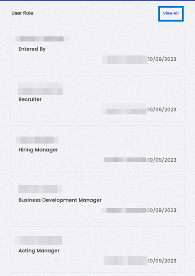
By delving into the "User Role" section, you gain a comprehensive understanding of how the new hire is integrated into the system's framework. You can identify their roles, their interactions, and the individuals responsible for managing their engagement.
This includes details such as the user's name, role, insert person, and insert date, all presented in a user-friendly card view format.
When a user engages with the "View All" action within the User Role section of the Snapshot, a seamless transition occurs, directing them to the dedicated 'User Role' sub-navigation conveniently situated within the Hiring Info section. This intuitive functionality empowers users to effortlessly dive deeper into the new hire's user roles, facilitating a thorough exploration of their various responsibilities and affiliations that bear significance to the new hire's journey within the system.
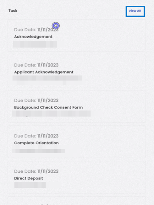
The Task section offers users a visually organized display of pending tasks within the Applicant stage. Each task is presented on an individual card, ensuring a structured and easily digestible overview. These cards provide users with crucial task details such as the Due Date, Name, and Description, enabling them to efficiently manage and prioritize their tasks.
When users decide to explore further by tapping the 'View All' action within the Task section, they are seamlessly directed to the applicant's specific Task navigation. This action grants users access to the comprehensive list of tasks associated with the selected applicant, streamlining the process of task management and tracking within the application. This transition allows for a more detailed examination of all tasks related to a particular applicant, enhancing productivity and organization in task handling.
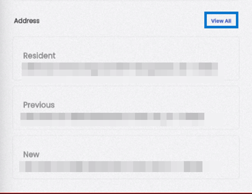
The Address section presents information concerning the new hire's address details in a user-friendly card-view format. Each card includes the Address Type and the complete address of the new hire, ensuring users have easy access to their address information.
Upon tapping the 'View All' text within the Address section, users will be directed to the Address sub-navigation located within the Contact Info navigation. This action allows users to access and explore all available address information related to the new hire, providing a comprehensive overview of their contact details within the application.
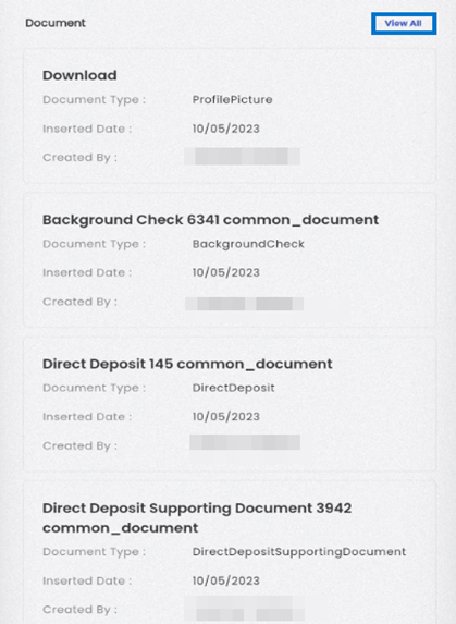
In the Document section within the snapshot, document details are thoughtfully arranged in a card view format. Each card thoughtfully includes crucial information, such as the Document Type, Inserted Date, Created By, and the current status, indicating whether the document is currently active or inactive. This well-organized presentation offers users a clear and concise way to access and review document-related information, thus simplifying their document management tasks within the system.
Upon selecting the "View All" option within the Document section, users will experience a seamless transition to the Document navigation dedicated to the specific applicant. This navigation feature provides users with a user-friendly and uncomplicated method to access and explore the complete array of documents linked to the chosen applicant, thus enhancing the efficiency of document management and review processes within the system.
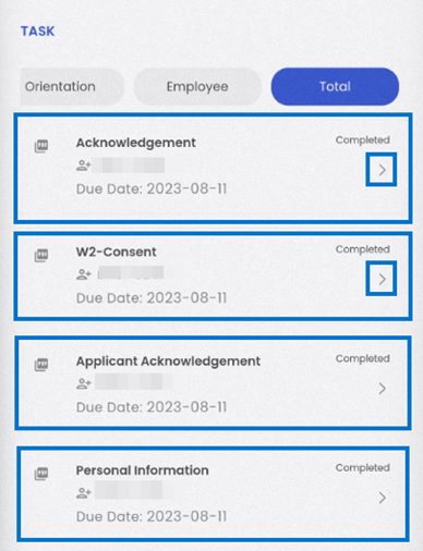
Task
The task navigation can be accessed by touching on the current navigation title shown in the screen. In given screenshot, when user taps the “Snapshot” navigation title, the navigation options are displayed. User can easily navigate to the “Task” section just by taping the “Task” navigation appeared on the options.
Within the task management interface, you will find horizontally slideable tabs that enable effortless navigation between different stages of your workflow, including "New Hire," "Paperwork," "Review," "Orientation," "Employee," and "All" for a total overview. These tabs provide a streamlined way to access various task-related sections.
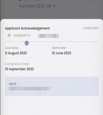
Each task is presented in a card format, offering a snapshot of essential details. The task card includes information such as the Task Name, Assigned To, Due Date, and the current Status of the task. For a more comprehensive understanding, users can tap the right arrow icon to access detailed task information. This action opens up a structured view where tasks are categorized by status and assignment, ensuring you have a well-organized overview of task-related data.
In the task details section, located at the bottom of the interface, you'll find a set of actions that simplify the task management process. Here, you can indicate the appropriate status and actions for each task. Options include marking a task as "Complete," "Forwarded," or "Archived," allowing you to manage tasks with precision and efficiency. This feature streamlines your workflow, ensuring that tasks are appropriately categorized and actions are taken as needed within the system.
Comment
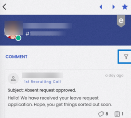
The Comment navigation provides an overview of all the comments related to the new hire, categorized by different comment types and categories, which can be customized according to the client's preferences. This feature enables users to create multiple comments related to the new hire and make necessary updates. Users have the flexibility to add and modify comments for new hires under various categories and types.
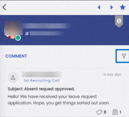
The summary card consists of information such as comment by, comment subject, comment type, comment content, and count of attached tasks as well as related links.
Browsing through comments
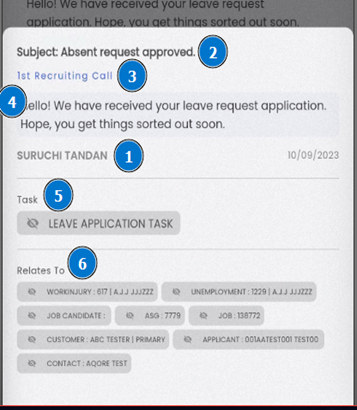
User can easily browse through comments by tapping on them. The comment detail includes comment by (1), comment subject (2), comment type (3), comment content (4) with related task (5) and other entities that relates to the comment (6).
The user can directly navigate to the related task detail or any entity that relates to the comment just by tapping on the respective chip of attached task or related items in “Relates To” section.
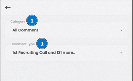
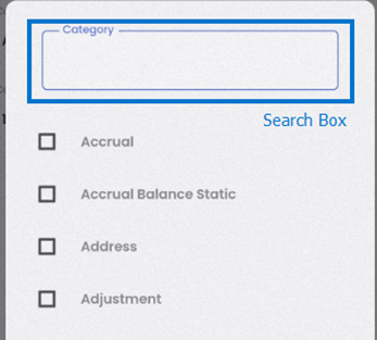
The user is also able to filter the comments based on comment category (1) and comment type (2) by tapping on the filter (funnel) icon on the right-hand side of the section. Users can seamlessly search for the comment type or category just by entering the search phrase in corresponding search boxes. Both filter options can have multiple selections. There are also options such as “All comments” and “All Comment Types” that would facilitate users to cancel out the filter selections. There is a back button at the top-left corner of the screen that can be used to cancel the filter process.
Adding or editing a comment
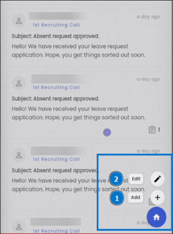
Users can use the floating hamburger icon on the bottom-right side of the screen to perform actions like creating or editing a comment.
To add or edit a comment, tap the hamburger icon and tap on add (1) or edit (2) option.
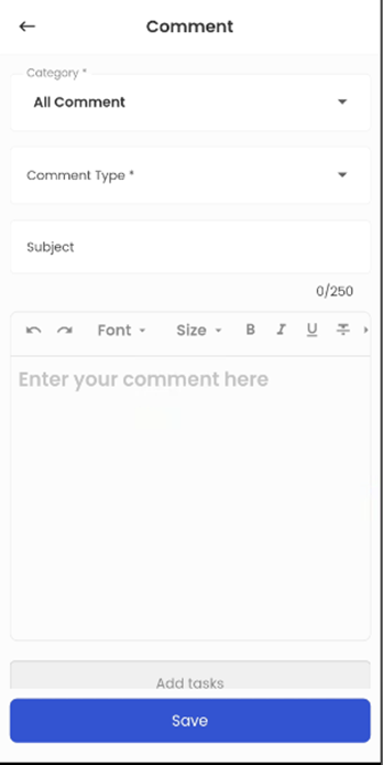
To add a comment, the user should select a comment category, comment type, subject and comment message.
Adding a task or appointment related to comment
Further scrolling down through the page to add comment, user is presented with a button “Add task”. Receiving a tap on the same button, the user will be presented with a bottom sheet form with fields for workflow stage, task template, company, assign to, task title, due date and note.
User can also choose to view any task attached with the comment just by tapping the task title pill that appears as connected tasks.
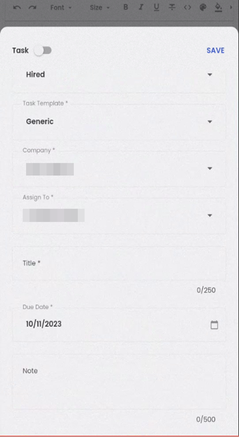
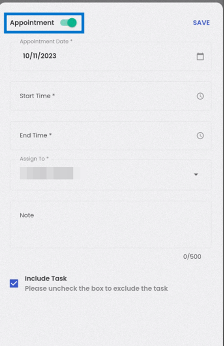
User can also convert the task to an appointment option just by sliding the switch at the top-left side of the same bottom sheet. To add an appointment, the user should provide appointment date, start time, end time, assigned to and note.
The “Include Task” checkbox at the bottom is checked if the user opts to create task for the same appointment.
Some fields for creating a task or an appointment out of comment are already populated with the default values. Such as while creating a task, the workflow stage is the current stage of new hire workflow, task template is generic, assigned to self and due date is todays date.
Whereas, while creating an appointment, today’s date is the default value for appointment date and assigned to self by default. Although the form fields are already provided with these default values, user can change them while creating tasks or appointments from the comment.
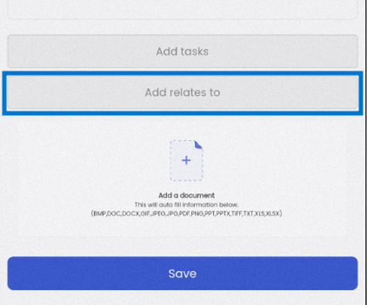
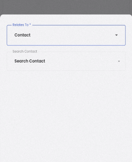
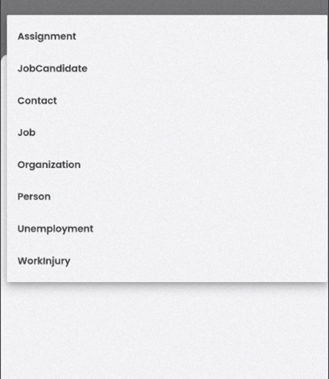
Adding other related items
Users can also tag other necessary links to the comments from the “Add relates to” option. The application lets the user select a relates to the option which lets user to choose if the comment relates to any assignment, job candidate, contact, job, organization, person, unemployment, work injury, etc.
The other input lets users to select multiple entries by searching through keyword related to the selected relates to option
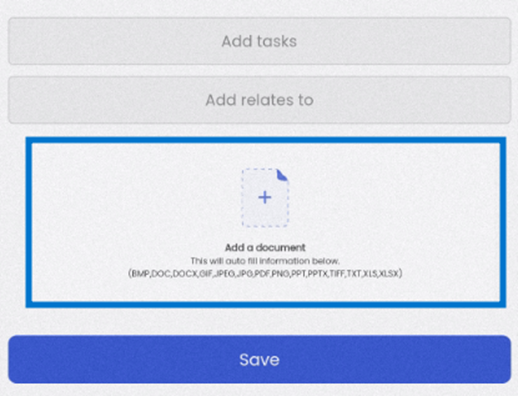
Attachments in comment
Users also have a facility to add documents to any comment. Just by tapping the “Add a document” section, user would be able to upload desired document as an attachment to the comment.
Hiring Info
The 'Hiring Info' navigation, which serves as the primary access point for vital information related to user roles. This feature empowers users by giving them the ability to enhance and modify these role-related details. When users enter the 'Hiring Info' section, they are presented with the option to oversee and refine their 'User Roles.'
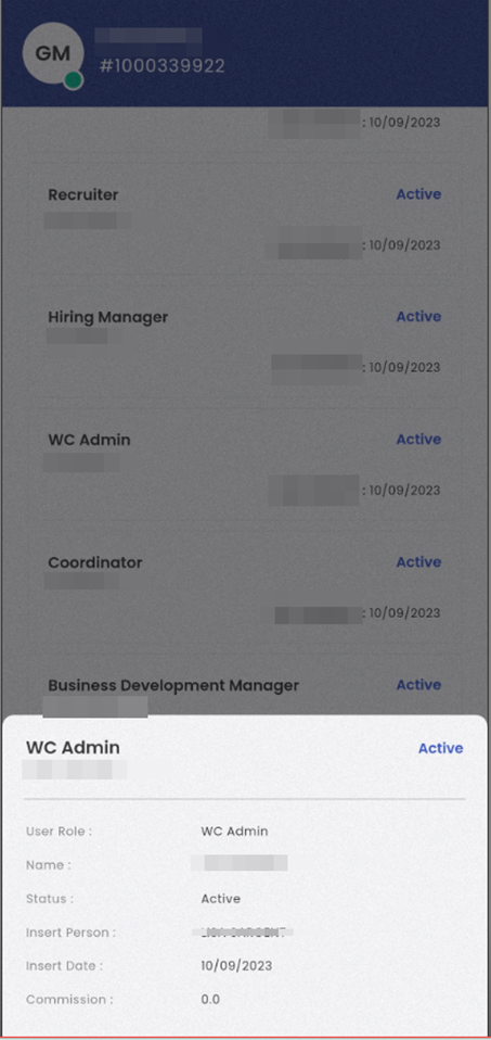
Within the 'User Roles' sub-navigation, users are directed to view details about the user roles. This section displays individuals involved with the new hire, such as the person who entered the information, the recruiter, the WC Admin, the Acting Manager, and others. Users can add and edit multiple user role details for the new hire. The User Role card view shows information like the 'Entered by,' the name of the office staff associated with the user role, the status (which can be 'Active'), and the date when the role was assigned.
By tapping the 'Filter' action, users can toggle between 'Active' and 'All' status. When 'Active' is selected, it shows only user roles with an active status. Switching to 'All' displays all user roles, whether active or inactive.

When users tap on a User Role card view, a bottom slider appears, providing additional details such as User Role, office staff's name, status, the person who inserted the role, the insertion date, and the commission charged by the office staff.
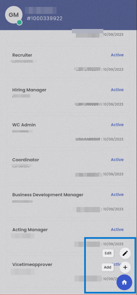
Furthermore, by tapping the hamburger icon located at the bottom right, users can access options to 'Edit' and 'Add' user roles. To edit a User Role, users should long-press and then select 'Edit.'
Selecting 'Edit' enables users to modify existing user roles, including the 'User Role,' 'Name' of the office staff, user role status, and commission. The 'User Role,' 'Name,' and 'Status' fields are mandatory.
Choosing 'Add' allows users to create a new User Role. When adding a new User Role, users must specify the User Role, Name of the office staff, and the commission.
Documents
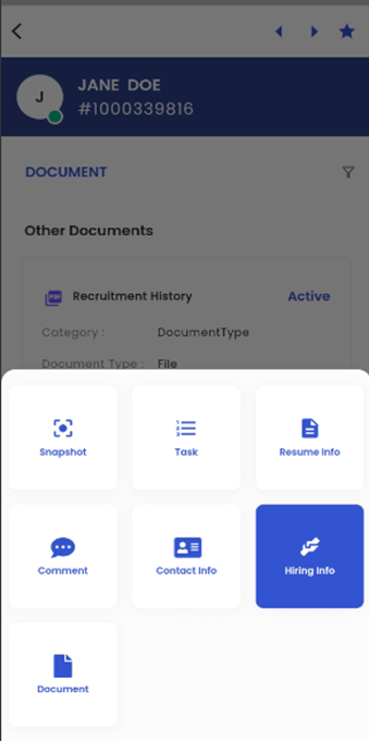
Tapping on the 'Navigation' action within the interface triggers a list that displays all the available navigation options within the New Hire Entity Detail page. From this list, users can choose 'Document,' which initiates a specific navigation related to documents. This enables users to easily access and manage documents associated with the new hire within the system.
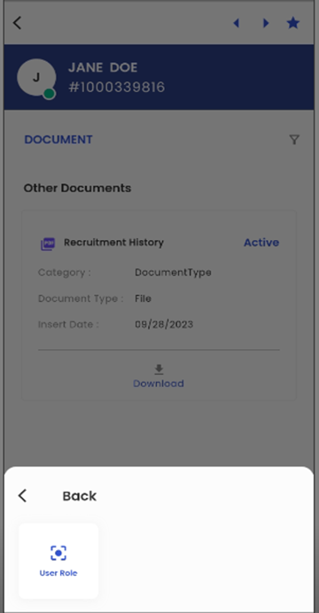
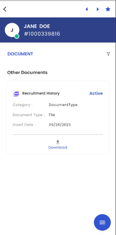
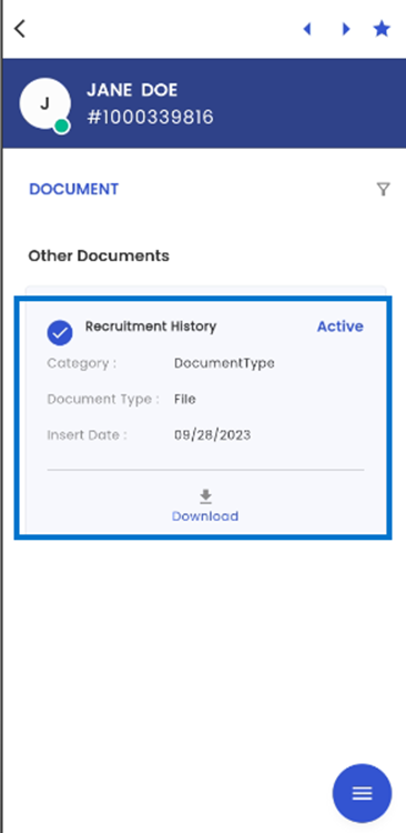
The 'Document' navigation is presented in a card-view format, with each document related to the new hire showcased in its own dedicated card. These document cards provide comprehensive information about each document, including the Document Name, Category, Document Type, Insert Date, Document Status, and an option to download the document. This user-friendly design simplifies the management and access of new hire-related documents within the system.
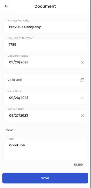
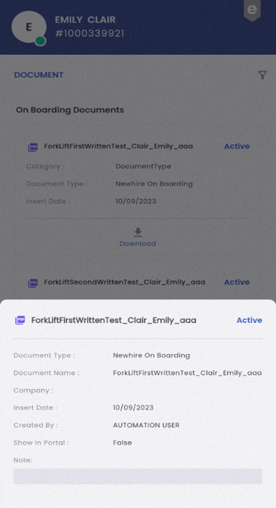
When a document card is tapped, a bottom slider interface appears, offering users a detailed view of the relevant document information. Within this bottom slider, users can access important document details, including Document Type, Document Name, Company, Insert Date, Created By, Issuing Authority, Document Number, Document Date, Valid Until, Issue Date, Verified Date, Show in Portal status, and any accompanying notes. The document's current status is prominently displayed, providing users with a comprehensive overview of the document's attributes and status within the system. This feature enhances document management and facilitates quick access to vital information for informed decision-making.
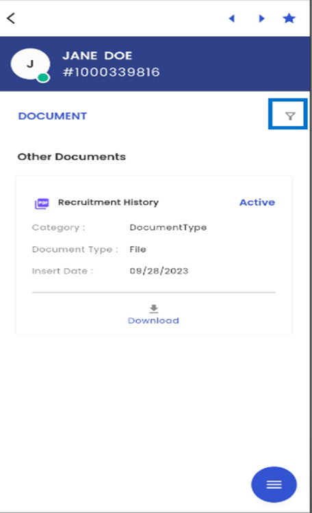
Tapping the filter icon grants access to a menu with filtering options in the navigation. Users can apply filters by toggling between 'Active' and 'All.' When set to 'Active,' only documents with an 'Active' status are displayed, providing a refined view of documents in this specific status. Conversely, when the toggle is switched to 'All,' the navigation shows all documents without status restrictions, giving users a comprehensive overview of all available documents within the system.
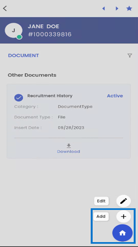
Users have the option to add documents by accessing the hamburger icon on the screen. Selecting the 'Add' icon within this menu seamlessly redirects users to the 'Add Document' navigation, making the document uploading process straightforward. Additionally, tapping the Home Icon on the screen redirects users back to the main Document Navigation page, ensuring effortless navigation and access to documents within the system. This intuitive interface design streamlines document management and user interactions.
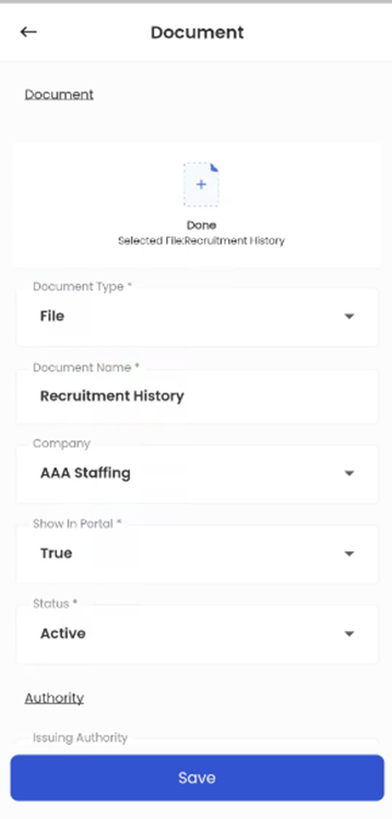
To add new documents to the system, users can tap the 'Add' icon, which leads them to the 'Add Document' navigation. In this interface, users can upload a file, select a document type, input the document name, specify the associated company, set the 'Show on Portal' status, add relevant notes, and save the document. This streamlined process ensures efficient and organized document management within the system, making it easy to add new documents accurately.
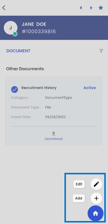
Performing a long tap on a document card allows users to select a specific document. Subsequently, tapping on the hamburger icon displays a list of available options, including 'Add' and 'Edit.'
By selecting the 'Edit' option, users can make revisions and updates to the document's details. This action takes them to a dedicated editing page, where they can modify various document attributes, such as the Document File, Document Type, Document Name, Company, 'Show in Portal' status, Document Status, Issuing Authority, Document Number, and other relevant document information. This feature provides users with the flexibility to maintain accurate and up-to-date document records within the system, ensuring the integrity of their document management processes.
Furthermore, by tapping the 'Download' option in the card view, users can download the respective document directly to their device. This user-friendly feature simplifies access and retrieval of documents, allowing users to conveniently store and reference the document on their own devices as needed.