Overview
The NHO dashboard serves as a central hub for monitoring and managing the onboarding process. Here's what you can expect from the dashboard:
- Informative Tiles: The dashboard displays tiles that offer insights into the onboarding activity. You can quickly see how many new hires have been added in various timeframes, such as today, this week, this month, and this year. This provides an at-a-glance overview of your onboarding progress.
- Structured Workflow: Beneath the tiles, you'll find the structured workflow, with each of the five stages clearly defined. As new hires progress through each stage, both the new hire and the HR team complete specific tasks. The goal is to advance new hires through the workflow by successfully completing all designated tasks, ensuring a smooth transition.
- Chart Section: Further down, you can access charts that visually represent onboarding data. The Time Graph and Donut Chart are displayed by default. These charts provide insights into trends, such as the number of new hires over time and their distribution by office. You can customize your view by choosing from different chart options and using the 'Filter' option, tailoring your dashboard experience to your specific needs.
Tiles
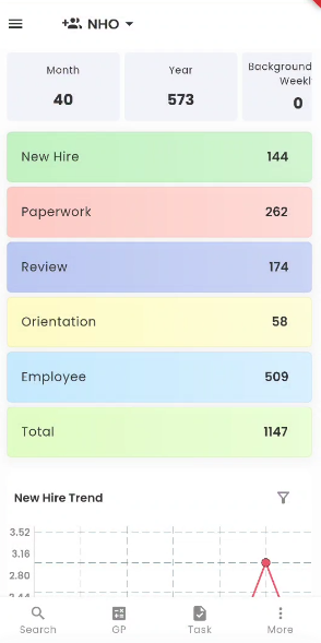
Tiles in the NHO portal provide users with a quick and visual way to access important information related to the onboarding of new hires. Positioned at the top of the screen, these tiles offer insights into the onboarding activity, with options for viewing new hires added today, this week, this month, and this year.
Efficient Access to Onboarding Data.
- New Hires Today: This tile allows users to instantly view the number of new hires added on the current day.
- New Hires This Week: Users can access this tile to get an overview of new hires added within the current week.
- New Hires This Month: The tile for this month provides insights into the number of new hires added during the ongoing month.
- New Hires This Year: For a broader perspective, users can check the tile for the entire year to see the cumulative number of new hires.
Customized Data Organization
By long-tapping on any of the tiles, users can access a contextual menu that offers sorting options, making it easy to tailor the display of data according to their specific preferences. These sorting options include:
- New Hires Today: Organize the data to display new hires added on the current day.
- New Hires This Week: Sort new hires based on their addition date within the current week.
- New Hires This Month: Filter new hires according to their addition date for the current month.
- New Hires This Year: View new hires added throughout the year.
The selected sorting option's records count will appear on the tile, providing users with instant feedback on the number of new hires within the chosen category.
Accessing New Hire Details
Tapping on any tile will redirect users to the new hire directory. In the directory, users can explore specific details of the new hires corresponding to the selected tile. This feature allows for a seamless transition from an overview of onboarding activity to in-depth information about individual new hires.
The Tiles feature in the NHO portal simplifies the process of monitoring and accessing new hire onboarding data, making it more efficient for users to stay informed and organized during the onboarding process.
Charts

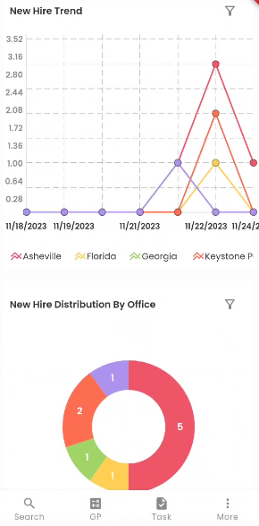
In the NHO portal, users can access the charts section by scrolling down from the NHO workflow, providing access to two key charts: the Time Graph and the Donut Chart. These two charts are displayed simultaneously from the start. The default configuration showcases the New Hire Trend chart, which offers insights into new hires' trends over time, and the New Hire Distribution By Office chart, providing a graphical overview of new hire distribution across different offices.
The dashboard in NHO offers a variety of three chart options, namely the Time Graph, Donut Chart, and Bar Diagram. Users can select from a choice of five different new hire tile types using the 'Filter' option. This flexibility ensures that users can tailor the display to their specific preferences and requirements.
Filter
Tapping on the 'Filter' icon allows the user to choose from various new hire tiles.
The user can select from various New Hire Tiles, including New Hire Trend, New Hire Distribution By Office, New Hire Timeline by Company, New Hire Turnover by Recruiter, and New Hire Timeline By Office. Upon selection, the chosen chart will be promptly showcased in the dashboard's charts section, ensuring a seamless and personalized viewing experience.
Select Date Filter
The 'Select Date' filter allows the user to choose from different timelines, such as This week, Last 7 Days, and so on. Depending on the selected option, the information will be reflected on the chart.
New Hire Trend
The New Hire Trend chart represents the timeline of the number of new hires registered into the Zenople system for different offices for the date selected. The different color lines represent each office, as mentioned in the legend below the chart. The vertical axis of the chart indicates the number of new hires, while the horizontal axis indicates the dates.
By looking at this chart, users can quickly determine which dates had the most new hires and which ones had the fewest.
New Hire Distribution By Office
Below the Time graph, the Donut chart shows the 'New Hire Distribution By Office.' The number in the chart indicates the number of new hires, and each color indicates the specific office, which is specified below the chart. This is useful for comparing records and drawing valuable conclusions quickly.
New Hire Timeline by Company
The 'New Hire Timeline by Company' is presented in the form of a Bar diagram. The red and yellow bar diagram shows the different stages of different companies.
The red bar diagram shows the new hires who moved from NHO to Review (NHO>>Review) stage, whereas the yellow bar shows the new hires who moved from NHO to Orientation (NHO>>Orientation).
New Hire Timeline By Office
The 'New Hire Timeline By Office' is presented in the form of a Bar diagram. The multiple bar diagrams indicate the different stages of each office.
The red bar diagram shows the new hires who moved from NHO to Review (NHO>>Review), whereas the yellow one shows the new hires who moved from NHO to Employee (NHO>>Employee). The office is mentioned below the bar graph.
New Hire Turnover by Recruiter
The 'New Hire Turnover by Recruiter' is presented in the form of a Multiple Bar diagram. The two bar diagrams display the new hire turnover of each recruiter, and the recruiters are mentioned below the bar diagram. The red bar diagram shows the new hires who moved from NHO to Review (NHO>>Review), whereas the yellow one shows the new hires who moved from NHO to Employee (NHO>>Employee).