Dashboard
Tiles
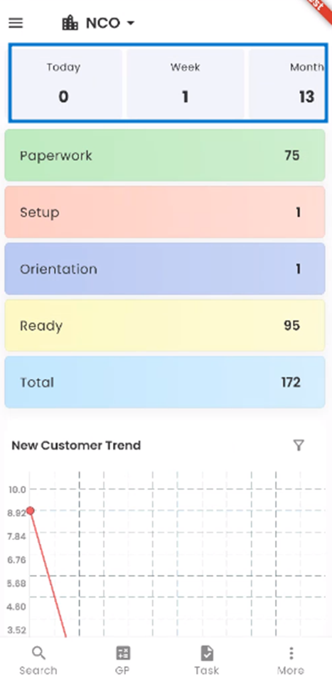
Tiles in this mobile application serve as concise visual representations of crucial information. Positioned strategically at the top of the screen, they provide users with swift and easy access to essential data related to new customer creation. These dynamic tiles empower users to gain valuable insights into new customer activity.
- New Customer Today
The first tile allows you to quickly view the number of new customers created today. It gives you an instant snapshot of the day's new customer activity. - New Customer This Week
The second tile presents a summary of new customers generated throughout the current week. It helps you monitor weekly trends and workload. - New Customer This Month
The third tile offers insights into new customer creation for the current month. This view is ideal for tracking monthly progress and goals. - New Customer This Year
The fourth tile provides a comprehensive overview of new customer activity over the course of the year. It helps you assess annual performance and long-term trends.
These tiles are designed to streamline your workflow and facilitate informed decision-making. Whether you need a quick update or a detailed analysis, our intuitive tiles have you covered.
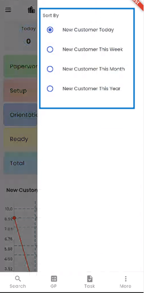
With our mobile application, organizing your data becomes effortless. By simply long-tapping on any of the tiles, users can access a contextual menu that provides a range of sorting options tailored to their needs. These sorting options allow you to fine-tune the way you view and interact with your new customer data.
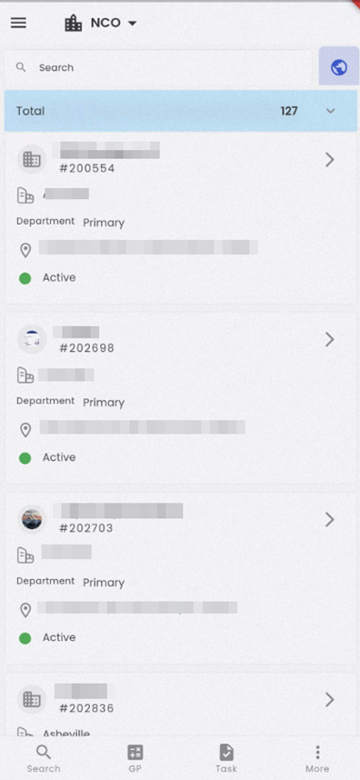
When you tap on any tile, it will seamlessly redirect you to the applicant directory, where you can access detailed information about new customers based on the tile you selected.
Workflow
The workflow of NCO is displayed below the tile. New Customer workflow consists of various stages under it. The count shows the total number of new customers under each stage and tapping on the stage will redirect to the new customer’s detail. It consists of the applicant's details. The tasks of the new customer are defined under each stage.
The workflow stages can be customized as per the client's requirements.
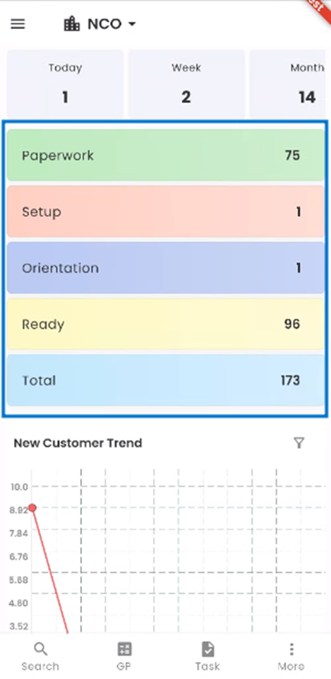
In the NCO (New Customer Onboarding) application, our workflow is structured into four distinct stages: PAPERWORK, SETUP, ORIENTATION, and READY. These stages are designed to streamline the candidate management process and ensure a smooth transition from new customers to customers.
- APPLICANT Stage: This is the initial stage of the workflow. This is the first step of NCO. All the new customers are recorded in this stage. And various paperwork related to customers is completed.
- SETUP Stage: After completion of the paperwork stage, all the setups related to job options, sales, and service profiles are done in this stage.
- ORIENTATION Stage: The qualified customers, after all the setups have been done, fall into this category. Reviewing office processes, Payroll processes, training web clock, and timeclock fall under this stage.
- READY Stage: Now, in this stage, when all the qualifications and setups have been completed, the new customer becomes a customer.
Within the workflow card on the right-hand side of the application, you'll find valuable information regarding the number of new customers currently situated in each corresponding stage of the process. This feature allows you to quickly gauge the distribution of new customers across various workflow stages.
The fifth stack, labeled as "Total," provides a holistic view of your new customer pool. It signifies the total number of new customers encompassing all stages, including PAPERWORK, SETUP, ORIENTATION, and READY. This number represents the entirety of candidates currently managed within the NCO application.
Navigating to Specific Stages
To access the detailed list of new customers within a particular stage, simply tap on the corresponding stage name. For instance, if you tap on the "PAPERWORK" stage, the application will redirect you to a filtered list, displaying only the new customers currently in the paperwork section. The numeric count will also be displayed, providing you with a real-time representation of the new customers in that specific stage.
This feature offers you a convenient and efficient way to monitor and manage new customers at each stage of the recruitment process, ensuring that you can easily access the information you need to make informed decisions.
Charts
Within the NCO workflow, users have access to an insightful charts section that enhances their understanding of new customer data. By simply scrolling down, you can explore two dynamic charts: the "Time Graph" and the "Donut Chart." Right from the start, both charts are prominently displayed, providing you with valuable visual insights.
Customizing Your Dashboard
Our dashboard offers a variety of chart options to cater to your analytical needs. You can choose from the following three chart types:
- Time Graph: This chart displays the new customers' trends over time, helping you track fluctuations and patterns.
- Donut Chart: The Donut Chart offers a visual breakdown of new customer distribution, making it easy to understand the composition of your new customer pool.
Additionally, you have the flexibility to select from two different applicant tile types using the "Filter" option. This customization empowers you to tailor the display to your specific preferences and requirements. Whether you're interested in viewing data by office, location, department, or other criteria, our user-friendly interface allows you to choose the most relevant information.
This level of customization ensures that you have the tools needed to make informed decisions and gain deeper insights into your new customer pool, all within the convenience of your NCO workflow.
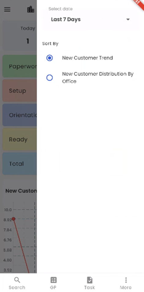
Choosing New Customer Charts
When you tap on the 'Filter' icon, a selection of sorting options becomes available, each offering a unique perspective on your new customer data. You can choose from the following options:
- New Customer Trend: This option reveals trends in new customer numbers over time, helping you visualize changes and patterns in your new customer pool.
- New Customer Distribution by Office: Selecting this option presents a chart illustrating how new customers are distributed across different office locations or departments.
Seamless Chart Selection
Upon selecting a new customer tile, the chosen chart will be promptly showcased in the dashboard's charts section, ensuring a seamless and personalized viewing experience. You can effortlessly switch between different chart views to extract meaningful insights from your new customer pool.
Selecting Date Timelines
Additionally, our 'Select Date' filter provides further customization options. You can choose from different timelines such as "This week," "Last 7 Days," and more. Depending on your selected timeline, the information displayed on the chart will automatically adjust to reflect the chosen date range.
This level of flexibility allows you to explore and analyze your new customer data in a way that aligns with your goals and requirements. Whether you need to view trends over time or assess recent activities, our user-friendly interface has you covered.
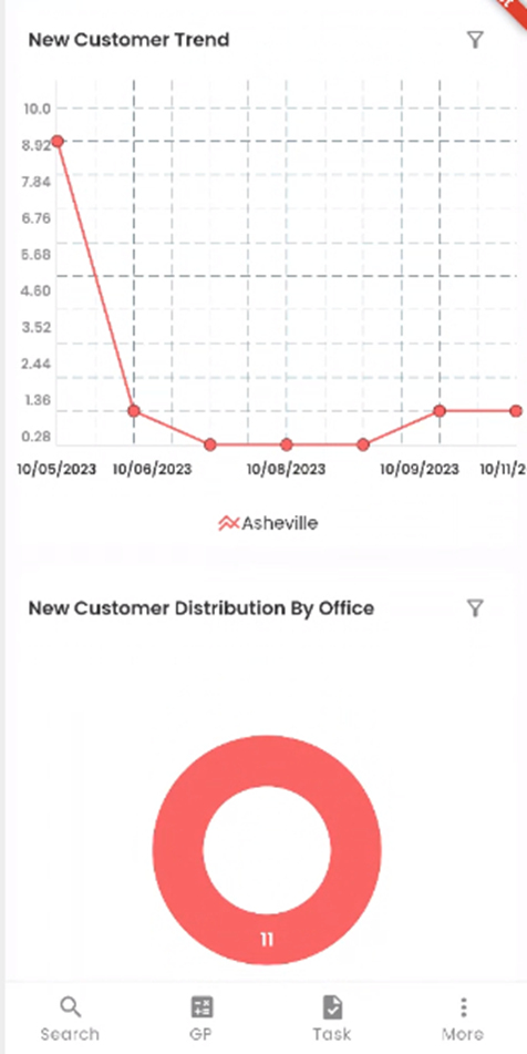
New Customer Trend
The New Customer Trend chart provides a visual representation of how the number of new customers registering into the Zenople system varies over time for different offices, based on the date selected. This chart simplifies complex data into an easily digestible format.
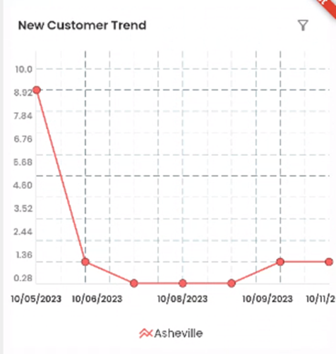
Chart Elements
- Color-Coded Offices: Each office is represented by a distinct color line on the chart, making it easy to distinguish between different locations. You can refer to the legend located below the chart to identify which color corresponds to each office.
- Vertical Axis: The vertical axis of the chart displays the number of new customers, allowing you to assess the volume of new customers for each office on a given date.
- Horizontal Axis: The horizontal axis corresponds to the dates, providing a chronological view of new customer registration. This axis allows you to track changes in applicant numbers over time.
By examining this chart, users can swiftly identify trends in new customer registration. Here's what you can discern:
- Peak Registration Dates: The peaks in the chart indicate dates when the highest number of new customers registered across all offices. These may signify busy recruitment periods.
- Low Registration Dates: Conversely, troughs in the chart highlight dates with fewer new customers across all offices. These could represent quieter periods in the recruitment process.
The New Customer Trend chart offers a clear visual overview, enabling users to make informed decisions and respond effectively to changes in new customer volume. It's a valuable tool for assessing recruitment trends and optimizing your hiring processes.
New Customer Distribution by Office
Directly below the Time Graph, you'll find the Donut Chart, showcasing the "New Customer Distribution By Office." This chart offers a visual breakdown of how new customers are distributed among different offices, providing a quick and informative view of your new customer data.
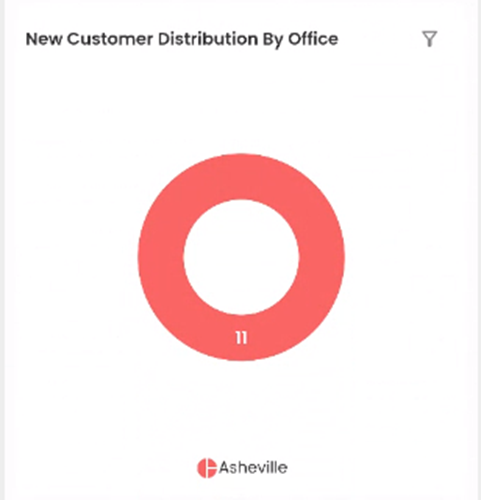
Chart Elements
- Numeric Representation: Inside the donut chart, you'll notice numeric values, each indicating the number of new customers associated with a specific office. These figures offer a precise count of new customers within each office.
- Color-Coded Offices: Each section of the donut chart is color-coded to represent a particular office. Beneath the chart, you can refer to the legend, which associates each color with its respective office.
The Donut Chart's simplicity and clarity make it a valuable tool for comparing new customers' records and drawing insightful conclusions swiftly. Here's how it can be beneficial:
At-a-Glance Insights: The chart allows users to instantly grasp the distribution of new customers among offices, providing a high-level overview of where new customers are concentrated.
Identifying Disparities: Differences in the size of colored segments can reveal disparities in new customer numbers between offices, highlighting areas that may require further investigation or adjustments.
Efficient Decision-Making: Whether you're assessing recruitment strategies, resource allocation, or office-specific performance, this chart helps streamline your decision-making process.
The Donut Chart is a user-friendly feature that empowers you to make data-driven decisions with ease. It's an essential tool for gaining a quick understanding of your new customer's distribution among various offices, facilitating more informed actions and strategies.