Lead Directory
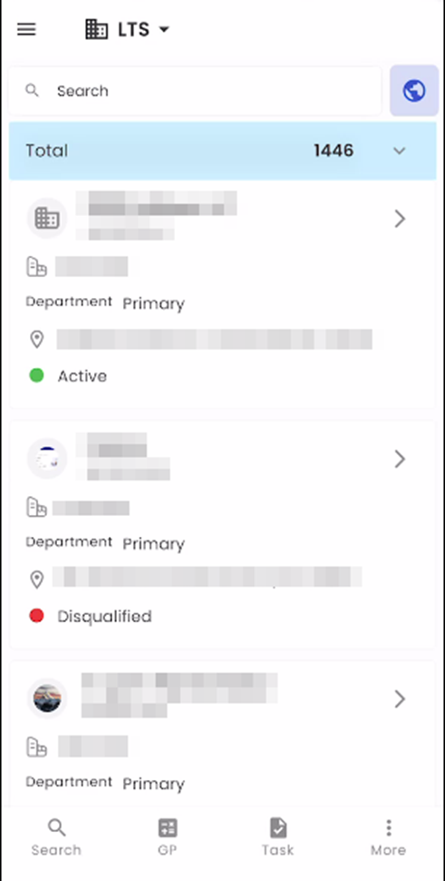
The Lead Directory, seamlessly integrated into the Zenople mobile application, offers a meticulously organized and efficient method for overseeing Lead records. Users can quickly pinpoint Leads using the Search box by conducting searches based on various criteria, including names and Lead IDs. Leads are presented in a user-friendly card view format, where each card serves as a comprehensive directory featuring essential details such as their Name, Lead ID, Office, Department, Address, and Status. Our mobile application is thoughtfully engineered to elevate the management and interaction with Lead records, delivering an intuitive and efficient solution that enhances the overall effectiveness and streamlines the recruitment process.
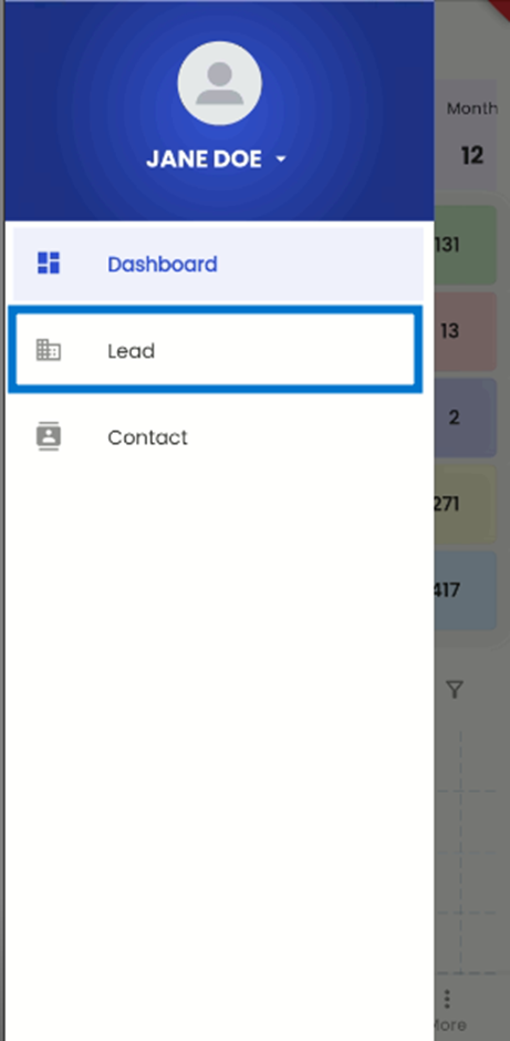
By tapping on the hamburger icon positioned at the top left corner of the LTS interface, users can access a comprehensive list of available navigational options within LTS. Upon selecting the 'Lead' navigation from this list, they are seamlessly directed to the 'Lead Directory' navigation. This intuitive navigation structure facilitates efficient access to the Lead management features within the LTS system.
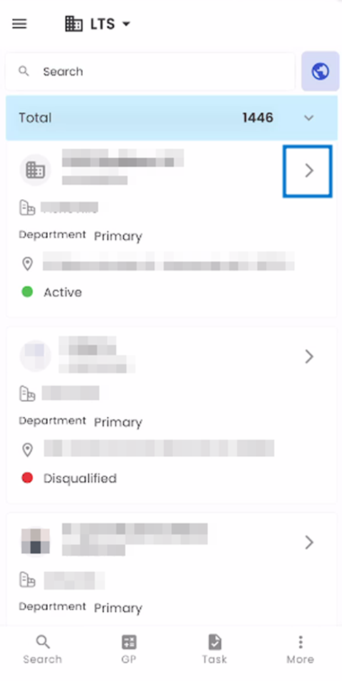
The Lead Directory page offers a user-friendly card view directory encompassing all LTS system Leads. Each Lead is presented with their dedicated card featuring essential information such as the Lead’s Name, Office, Department, Address, and Current Status. These cards provide an informative yet visually engaging overview of each Lead, ensuring that users can quickly grasp pertinent details in an aesthetically pleasing format.
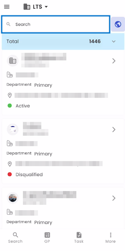
The search box at the top of the screen is a powerful tool for efficiently searching for entities within the directory. It offers users convenient access to their desired leads by allowing searches based on various criteria, including Name, Lead ID, Address, Contact Number, and more. This versatile search functionality ensures that users can quickly and effectively locate the specific leads they are looking for within the directory.
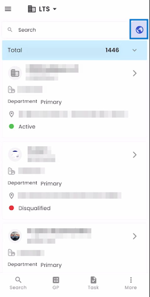
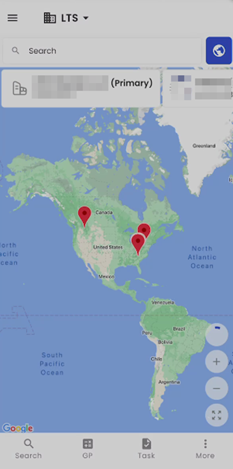
The map action alongside the Search Box serves as a gateway to the Map Navigation. This specialized navigation offers a distinctive method for visualizing leads on a map and pinpointing their locations. Users can zoom in or out of the map according to their preferences, allowing for a customized and interactive view of lead distribution based on geographical areas. This feature enhances the user experience by providing a dynamic and spatial perspective on lead data within the LTS system.
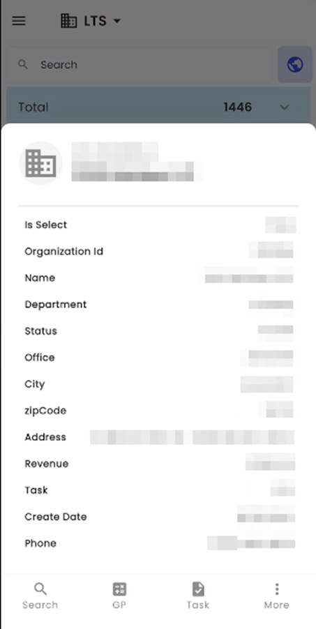
Tapping on a card triggers the appearance of a bottom slider on the screen, which conveniently displays essential information about the Lead. This information encompasses details such as their Name, Organization ID, select status, Department, Status, Office, City, Zip Code, Address, Revenue, Task, Phone, and Create Date. Should the user tap anywhere outside the bottom slider, it seamlessly retracts from the screen. This intuitive functionality allows users to easily access and review Lead information while also providing a user-friendly way to dismiss the slider when no longer needed.
Tapping on the Greater Than arrow sign within a card seamlessly directs users to the Lead Entity Detail page specific to the selected Lead. This comprehensive page offers a detailed overview of the lead, including a variety of navigational options related to that lead. It serves as a central hub where users can access a wealth of information and functions pertinent to the lead they have selected, enhancing their ability to manage and interact with lead data effectively.
Lead Entity Detail Page
The Entity Detail page is divided into three different sections. These sections are”
- The Top Bar
- Entity Detail Section
- Navigation Section
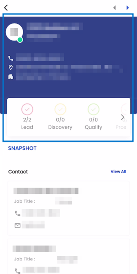
Top Bar
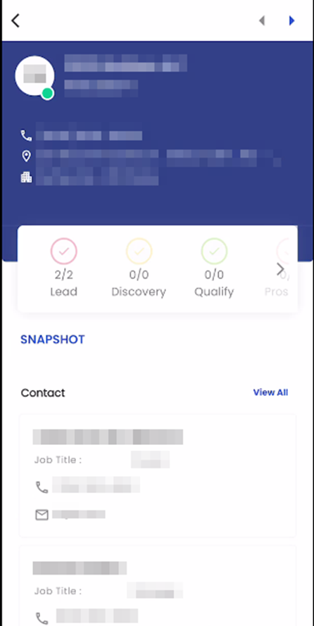
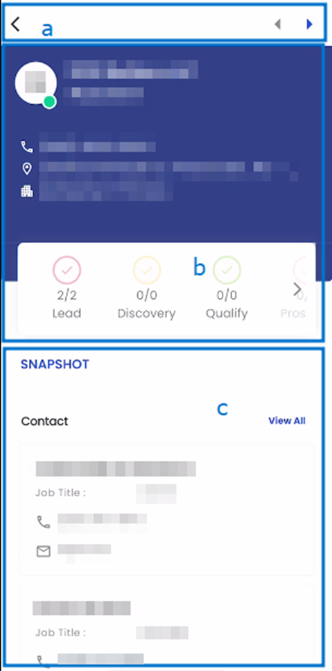
The Top Bar, situated at the very top of the Entity Detail page, features a convenient navigation tool in the form of left and right arrow icons. By clicking on these arrows, users can seamlessly switch between different lead profiles within the Lead Directory. The left arrow icon directs users to the previous lead entry based on the Lead Directory's sequence, while the right arrow icon smoothly transitions users to the next lead entry according to its placement within the directory.
Entity Detail section:
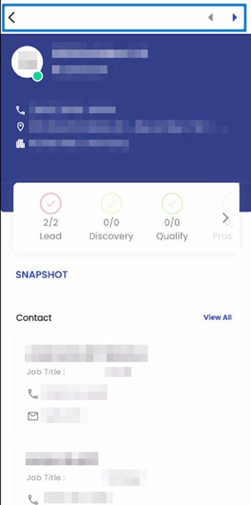
The Lead Entity Detail section serves as a comprehensive source of information about a particular Lead. Within this section, users can access vital details, starting with the Lead's profile picture, Name, and Organization ID. Furthermore, it prominently features essential contact information, including the Lead's Phone Number, Address, and Office. This detailed view provides users with a comprehensive overview of the Lead's profile and contact details, facilitating effective lead management and engagement within the system.
Navigations:
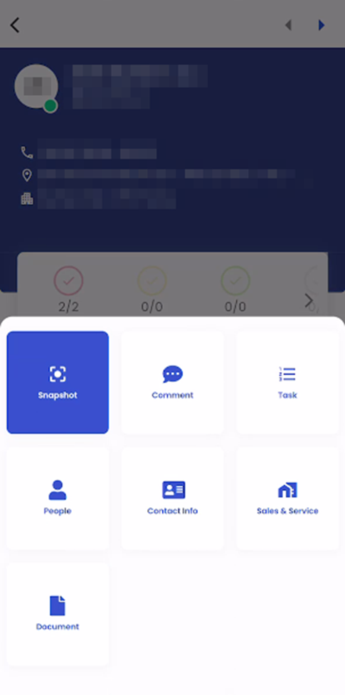
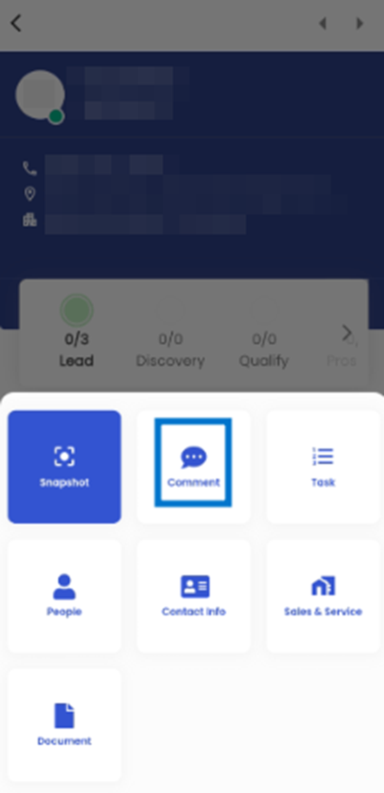
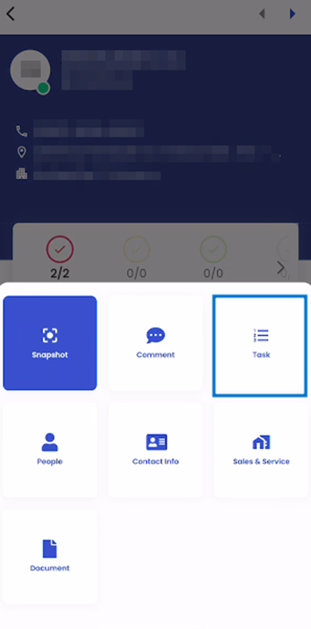
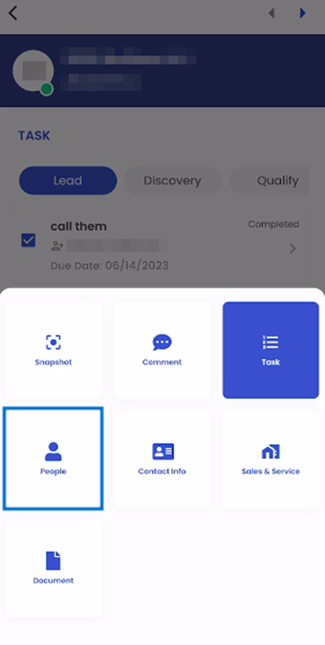
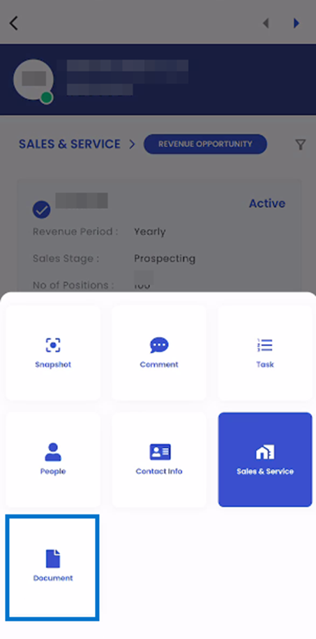
The Navigations action plays a crucial role in the Lead Entity Detail page by presenting a comprehensive list of available navigations and sub-navigations. Users can access these navigations via the navigation action, which is highlighted in the provided screenshot. This action not only displays the current navigation but also provides a list of accessible navigations when users tap on the current navigation's name. This user-friendly feature simplifies navigation within the Lead Entity Detail page, ensuring easy access to relevant information and sub-navigations.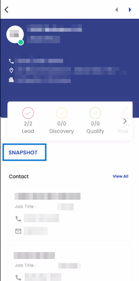
Snapshot
When the user taps on the Snapshot option in the list of navigation through the Navigation action, they are directed to the snapshot navigation.
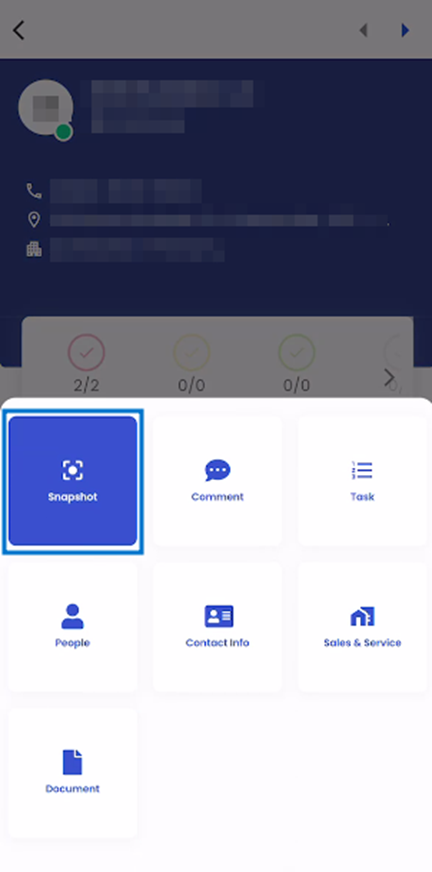
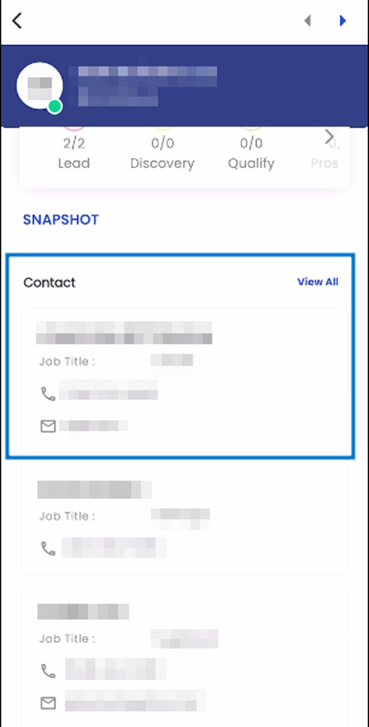
The Snapshot page is divided into distinct sections with each designed to provide the user with valuable insights into the given Lead. Each section includes a “View All” action which directs the user to the respective navigation related to the Section.
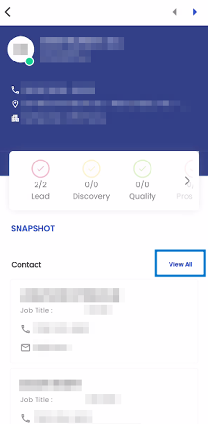
Contact:
The Contact navigation consists of a card view showing the details of the Lead’s Contact. Each contact is displayed on their respective card with their Name, Job Title, Phone Number and Email Address displayd on the card.
Contact Information:
The Contact Information Section in the Snapshot displays the Contact Information of the lead. It includes details in a card view with each card showing details of the respective contact information along with the Contact Information Type and the Contact Information.
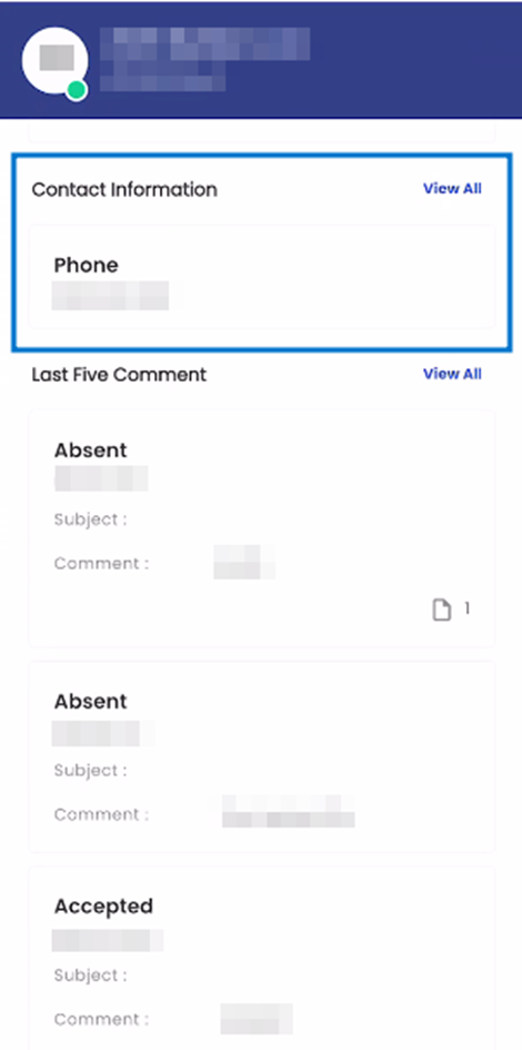
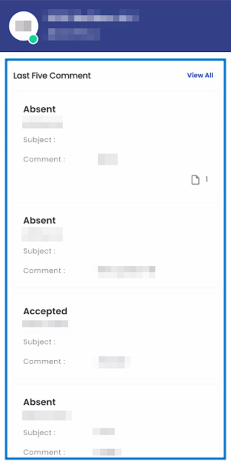
Last Five Comments
The Last Five Comments section on the Snapshot displays the last five comments related to the Lead in a card view. Each card displays the Comment Type, Comment By, Subject and Comment related to the specific comment.
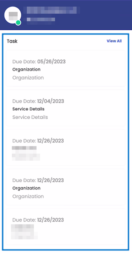
Task:
The Task section of the Snapshot shows the Task of the related entity in a Card View. Each Task will be shown on their own card with every card showing details of the task including their Due Date, Task Name, and Notes.
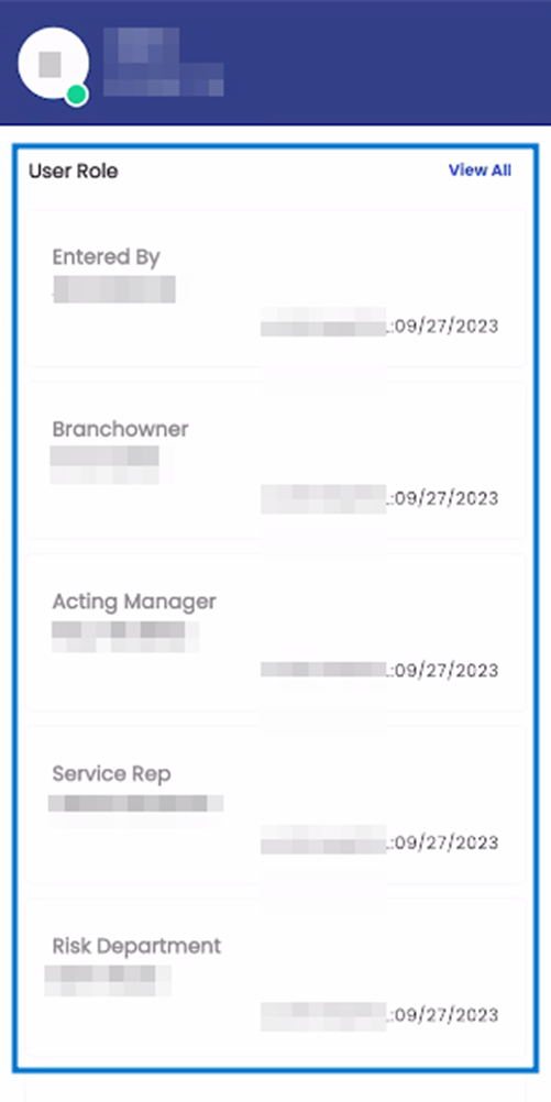
User Role:
The User Role section of the Snapshot displays a Card View of the available user roles related to the Lead. Each card includes the User Role, Name, and Insert Date related to the respective User Role.
Contact Role:
The Contact Role section of the Snapshot displays a Card View of the available Contact roles related to the Lead. Each card includes the Contact Role, Name, and Email Address related to the respective Contact Role.
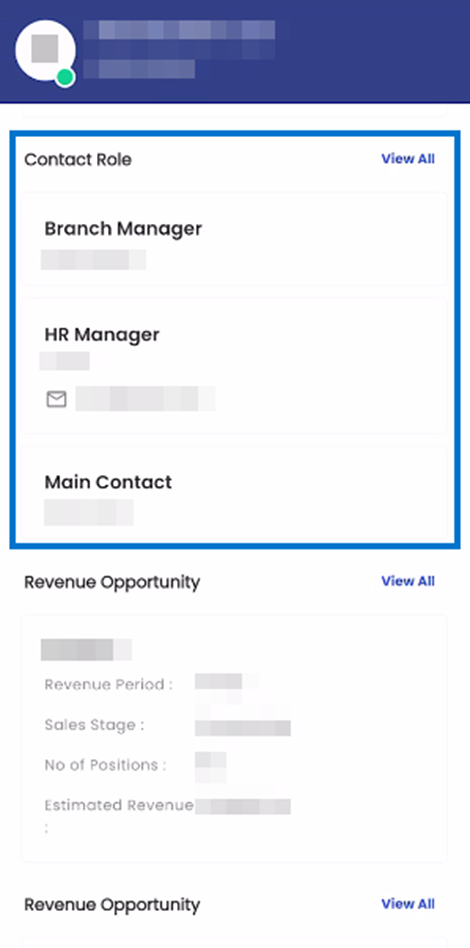
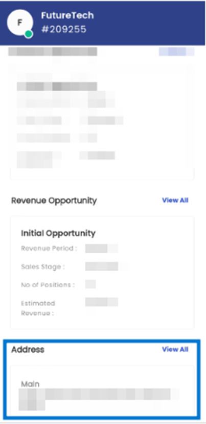
Revenue Opportunity
The Revenue Opportunity section of the Snapshot displays the Revenue Opportunities in a Card View Format. Each Card includes the Name of the Revenue Opportunity, Revenue Period, Sales Stage, Number of Positions, and Estimated Revenue.
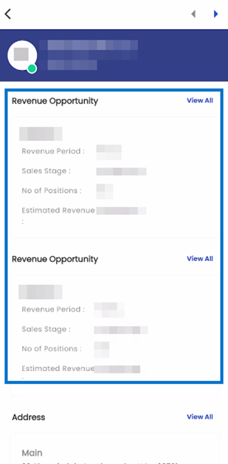
Address:
The Address section of the Snapshot navigation shows the Address information of the given Lead in a card view. Each card includes details about the Address Type and Address.
Comment:
When the user selects the comment navigation in the list of navigations, they are forwarded to the Comment navigation.
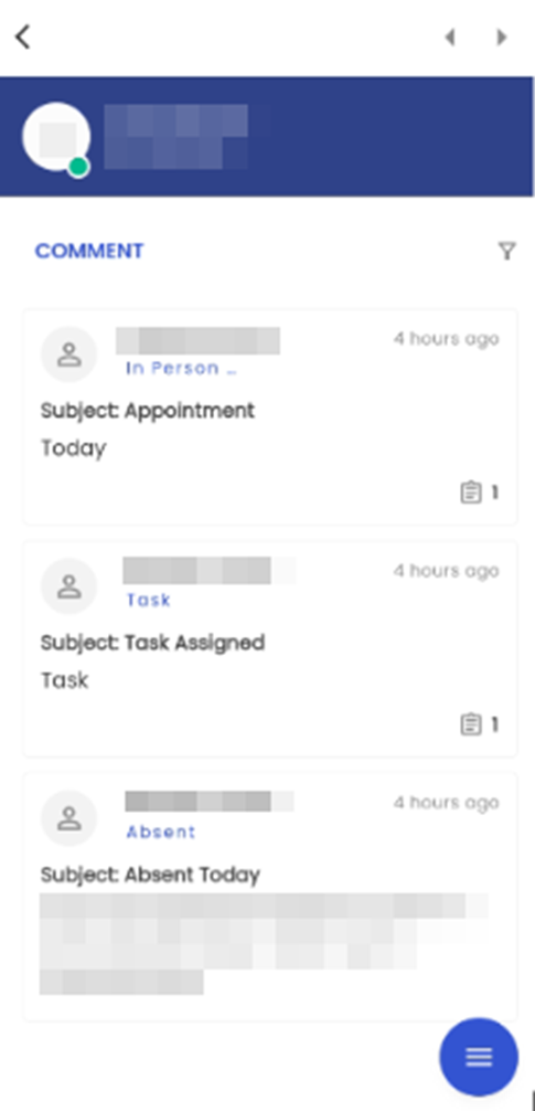
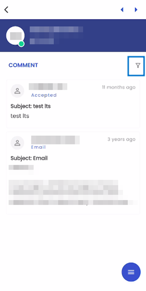
Comment navigation shows all the comments of the Lead for different comment types under different categories. The comment type and comment category can be defined on the basis of the client’s requirements. It allows users to write multiple comments associated with the Lead and also update them. Users can add and edit the comments of leads under various categories and types.
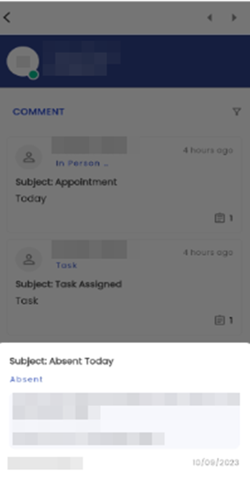
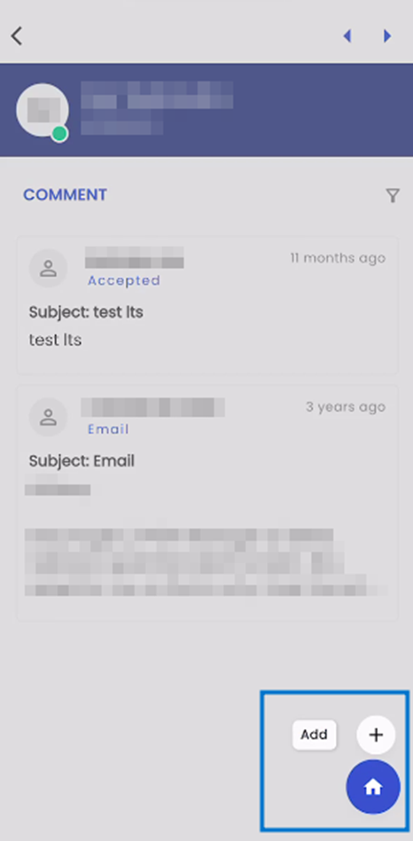
Upon entering the Comment navigation, users can readily view the comments associated with the Lead. The comments are presented in a card view, each containing information including the 'Name' of the commenter, Comment Type, the timestamp indicating how long ago the comment was posted, Subject, Comment, and icons that convey the presence of Attachments, Tasks, and Relates To.
Tapping on the comment presents the bottom slider which shows the information such as Subject, Comment Type, Comment, Name of the commenter, Date when the comment was posted, and Relates To field which shows all the navigations related to the comment.
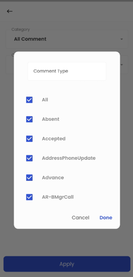
The filter button on the top right section of the screen allows the users to filter the comments that will be displayed.
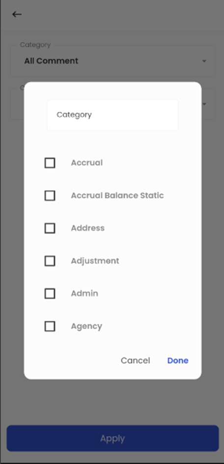
When users tap on the 'Filter' icon within the system, they are presented with two filtering options: 'Category' and 'Comment Type.' The 'Category' option allows users to filter comments based on their respective categories.
Users have the flexibility to filter comments by either selecting a specific comment category directly or by conducting a search within the available comment categories. This filtering feature ensures that users can efficiently narrow down comments to their desired categories.
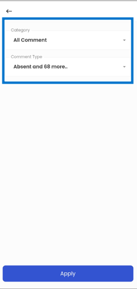
The 'Comment Type' refers to the categorization of comments, such as 'Absent,' with all comment types initially selected, allowing the Applicant’s snapshot to display all comment types, but users can customize this view using the Filter option to show specific comment types.
By tapping the floating hamburger icon located at the bottom right corner of the screen, users are presented with the 'Add' comment option.
Tapping on the 'Add' action provides users with the capability to add a new comment. Within this feature, users have the flexibility to select the 'Category,' 'Comment Type,' specify a 'Subject,' and input the actual comment content.
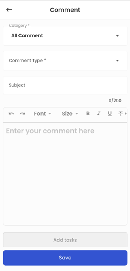
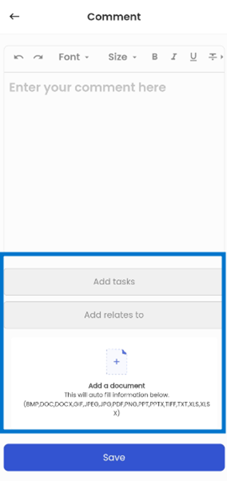
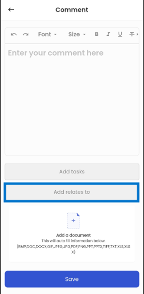
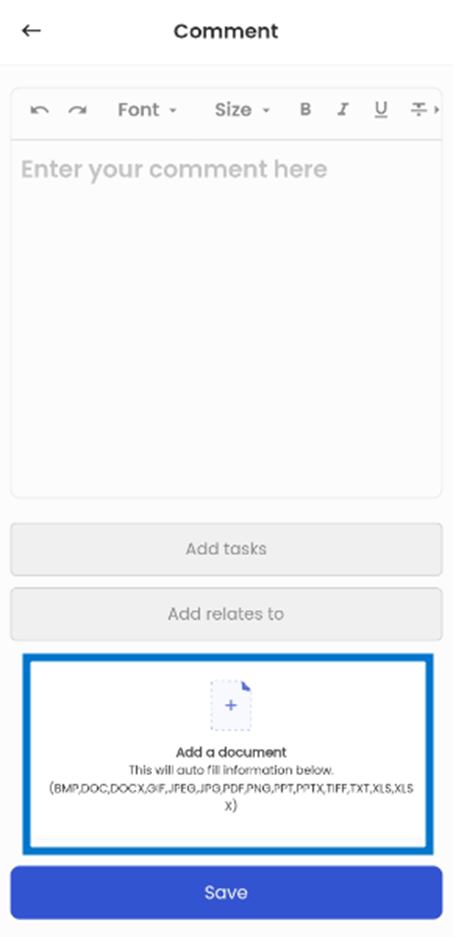
Scrolling down, the users get other options like ‘Add Tasks’, ‘Add Relates to’, and ‘Add a document’.
Task
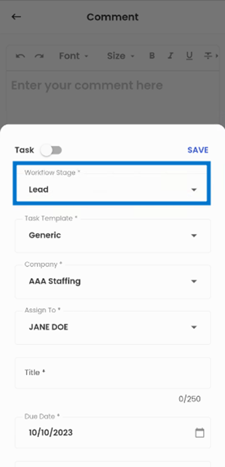
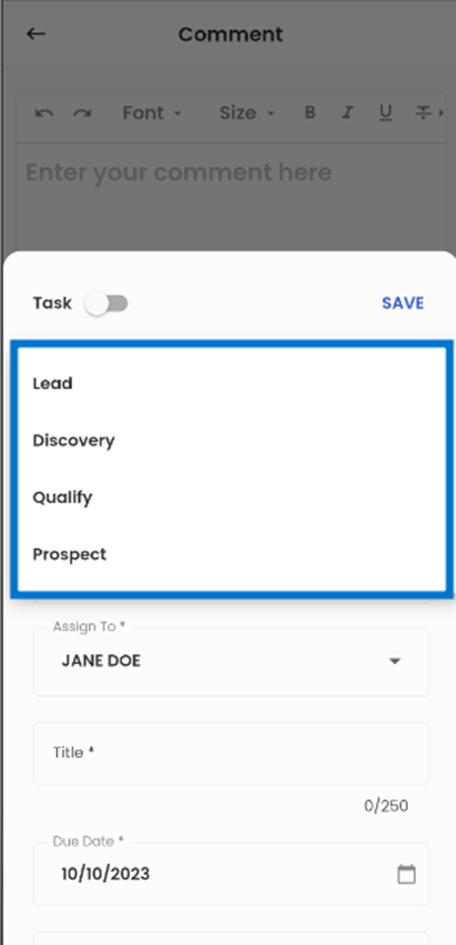
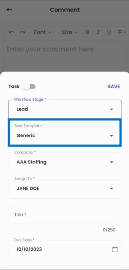
Tapping on the ‘Add Tasks’, the bottom slider appears allowing the users to add tasks. When adding the task, the user can see the options of ‘Workflow Stage’, ‘Task Template’, ‘Company’, ‘Assign To’, ‘Title’, ’Due Date’, ‘Note’, and ‘Include Task’ check box.
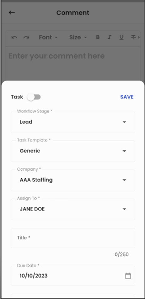
When users tap on the 'Workflow Stage' option, they gain the ability to select the specific workflow stage where they intend to add the comment task. This feature ensures that users can precisely designate the appropriate workflow stage for the comment task.
Users can tap on the 'Task Template' option to access a list of available task templates. Within this selection, users have the flexibility to choose task templates that align with their specific task. This functionality allows users to select pre-defined templates that best suit their needs.
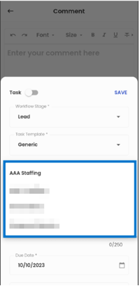
 The 'Company' option provides users with the ability to select the relevant company associated with the comment task. This feature ensures that users can accurately designate the company to which the task or comment is related.
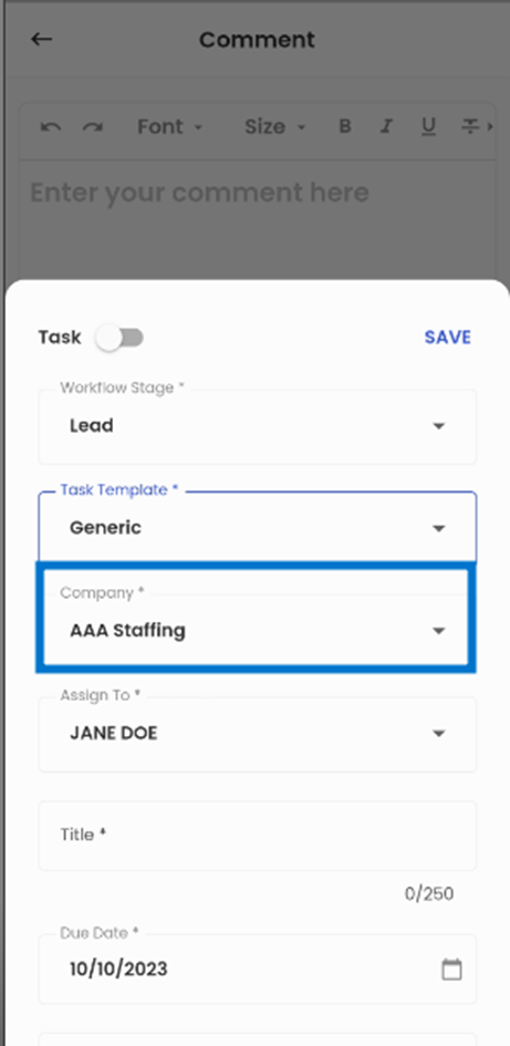
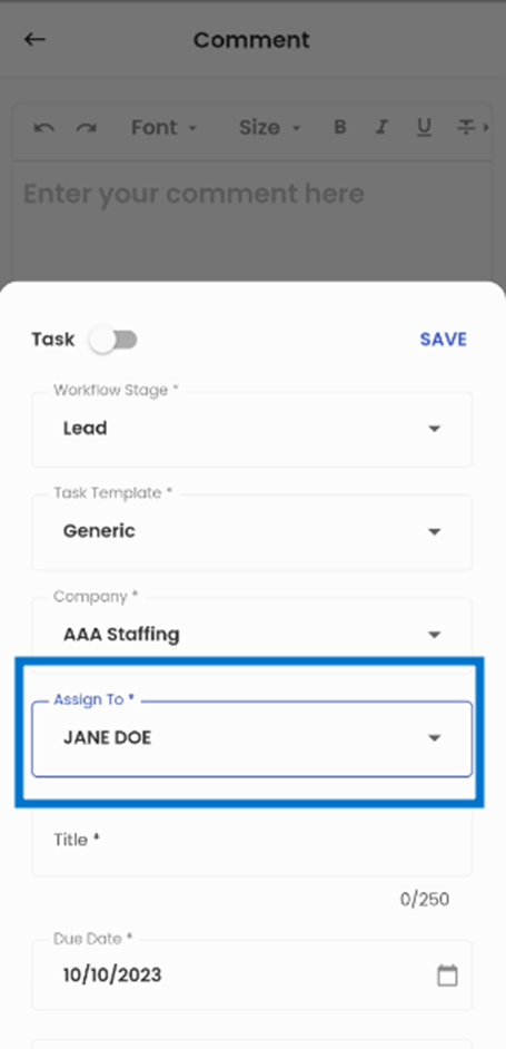
The 'Assign To' option enables users to assign comment tasks to office staff members with ease. Users can tap on this option and select from a list of available office staff to assign the comment task.
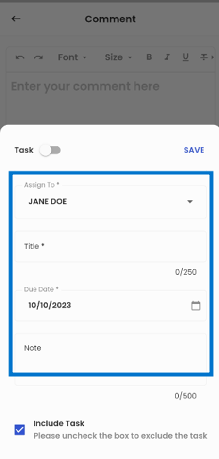
Below the 'Assign To' option, users can enter the task's 'Title,' specify the 'Due Date,' and provide any relevant 'Note' for the task. Additionally, there is an 'Include Task' checkbox available which is selected by default indicating that the task will be included when adding the comment. However, users have the flexibility to uncheck it to discard the task while adding the comment.
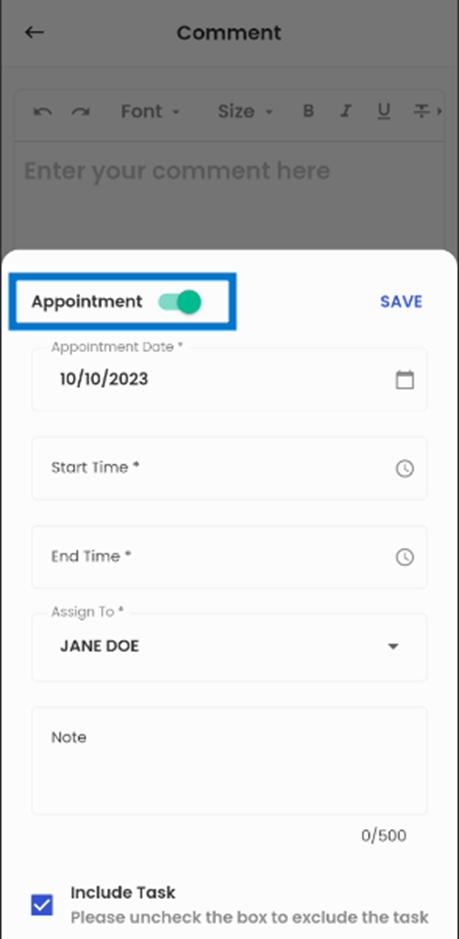
Appointment
Switching the Task toggle opens the ‘Appointment’ section which allows the user to add Appointment through the comment section. The Appointment section includes the ‘Appointment Date’, ’Start Time’, ’End Time’, ‘Assign to’, ‘Note’, and ‘Include Task’ check boxes.
The user can choose the Appointment Date and the time of the appointment from the Start Time and End Time options. The 'Assign To' option allows the user to assign tasks to the office staff by simply tapping it and selecting from a list of available office staff. The user can add notes related to the appointment from the ‘Note’ field.
The ‘Include Task’ check box indicates that that the appointment will be included when adding the comment. By default, the 'Include Task' checkbox is selected but users have the option to uncheck it to discard the appointment while adding the comment.
Relates To
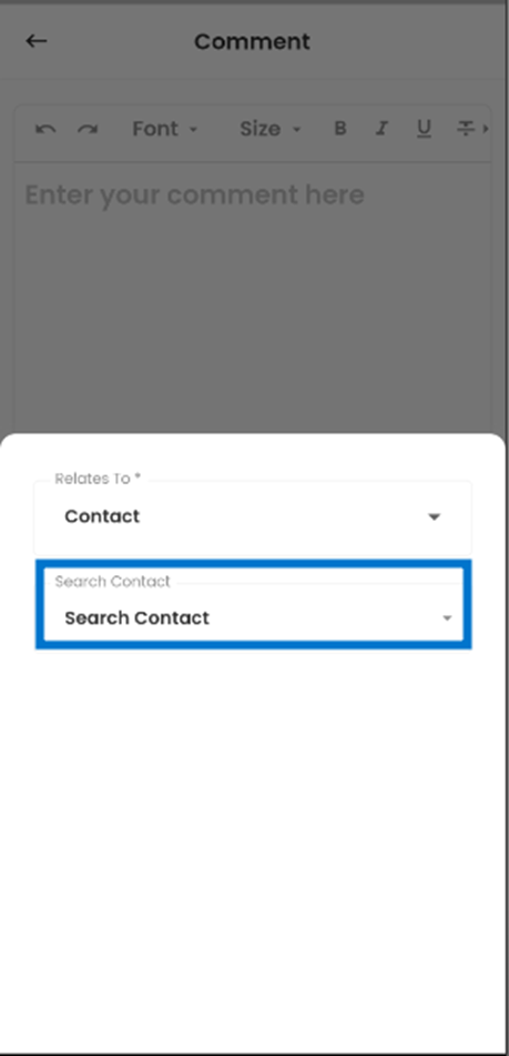
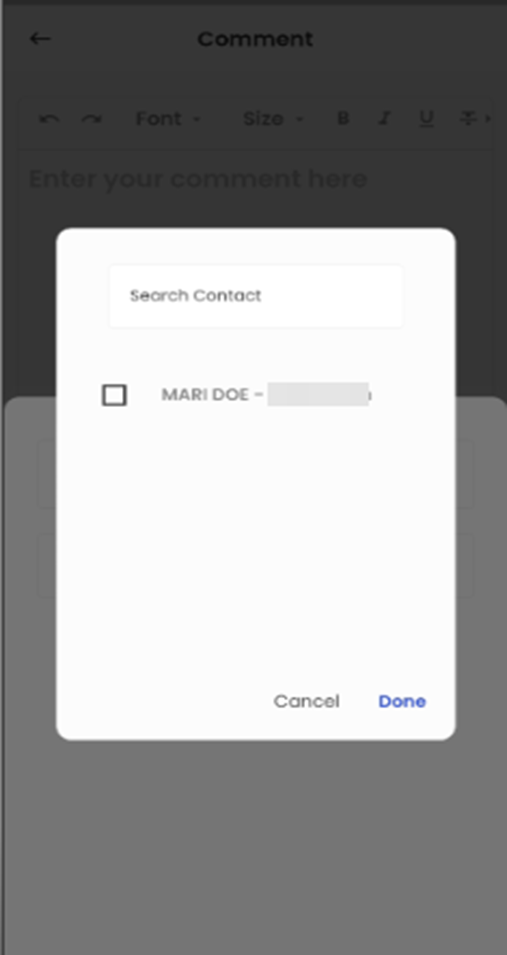
The 'Add Relates To' option allows users to associate the comment with the relevant entity. Upon selecting this option, users are presented with two choices: 'Relates To' and 'Search.' This feature allows users to link the comment to the relevant entity.
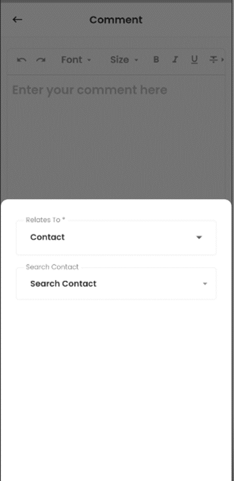
The 'Relates To' option provides users with a list of entities (navigation) to which the comment can be associated. When users tap on this option, they are presented with a list of available entities, allowing them to choose the most appropriate one to relate the comment to.
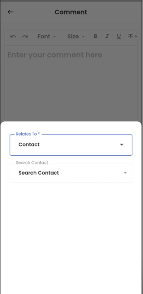
The 'Search Contact' option offers users the ability to search for the related entity (navigation) to which they want to link their comments. For instance, if a user selects 'Assignment,' the 'Search Assignment' functionality allows users to specifically choose the assignment to which their comment is relevant from a list of available options.
Document
The 'Add a Document' option allows users to attach relevant documents when adding a comment. By selecting this option, users can upload the necessary document, ensuring that pertinent information and files are easily associated with the comment.
Users have the capability to upload documents with a maximum file size of 5MB. The supported document types for upload include BMP, DOC, DOCX, GIF, JPEG, JPG, PDF, PNG, PPT, PPTX, TIFF, TXT, XLS, and XLSX. This versatile document upload feature ensures that users can efficiently add a wide range of document formats to the system, accommodating various document-related needs and preferences.
Task:
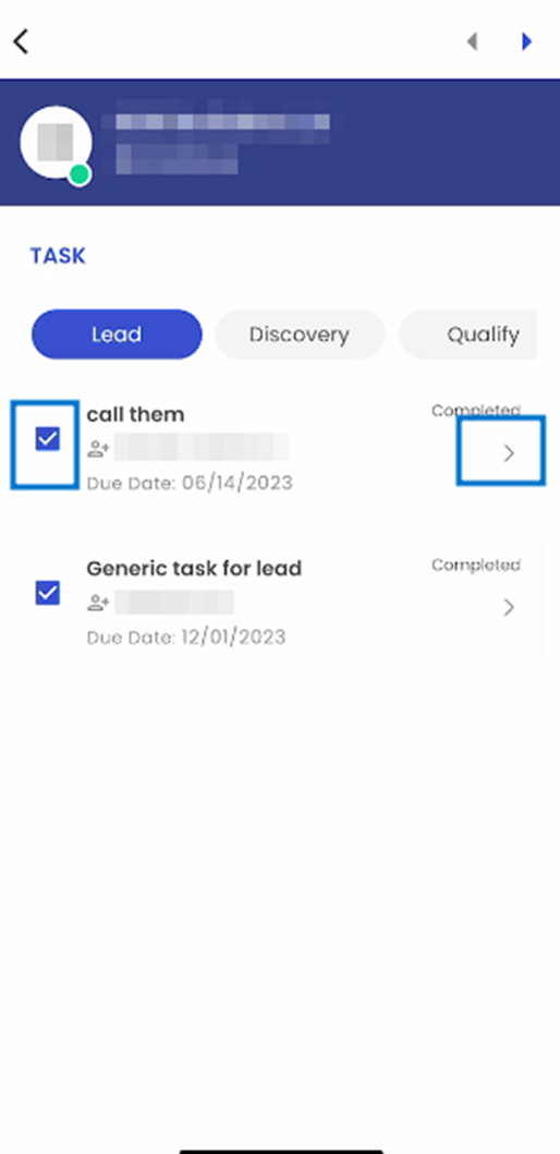
When the user taps on the Task option from the list of navigations through the Navigation action, they are forwarded to the task navigation.
Tasks are presented in a card view format, with each Task occupying its own individual card. These cards contain crucial task information, including the Task Name, Assigned To, Due Date, and the Task’s current Status.
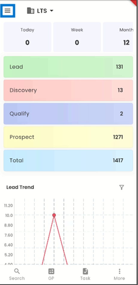
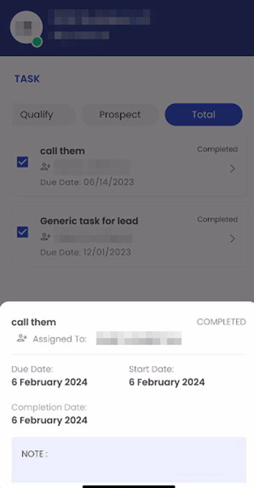
The Task navigation is organized into horizontally slidable tabs, providing users with a convenient way to filter through different stages of the Lead’s task. These tabs are the Lead Tab, Discovery Tab, Qualify Tab, Prospect Tab, and Total Tab. The tabs show the tasks respective to their Likewise, the Total tab shows all the tasks for the Lead.
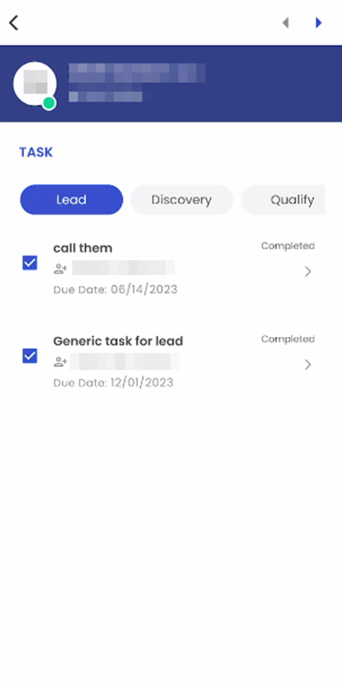
When users select a task card, they are presented with an interactive bottom slider that provides a comprehensive task overview that includes vital details such as the Task Name, Assigned To, Status, Due Date, Start Date, Completion Date, and a dedicated section for task-related Notes.
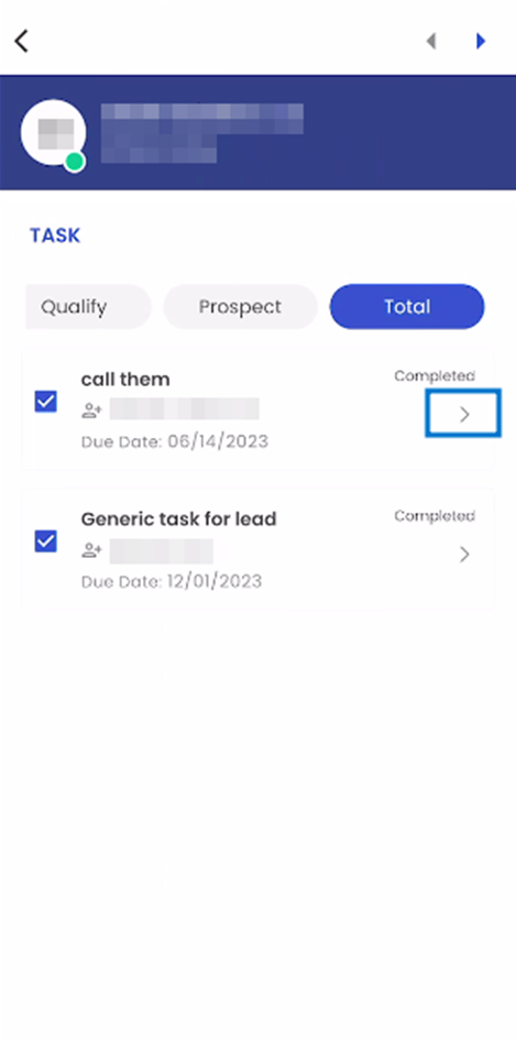
 Additionally, users can access detailed task information by tapping on the right arrow icon, allowing them to view task details categorized by Status and assignment, providing a structured and comprehensive overview of task-related data.
In the task details section, users are presented with actions at the bottom of the interface. Here, they have the option to indicate whether the intended task is to be marked as "Complete," "Forwarded," or "Archived." This feature streamlines the task management process by allowing users to specify the appropriate status and actions for each task within the system.
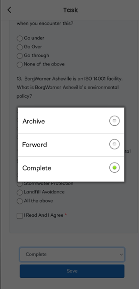
If a features checkbox on its left side. Checking the checkbox indicates that the corresponding task has been marked as completed. Likewise, unchecking the checkbox signifies that the task is now set as assigned.
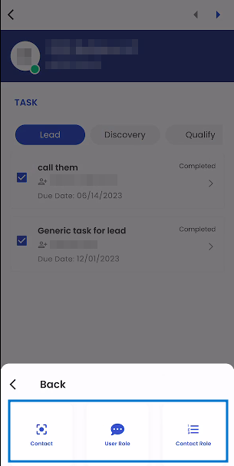
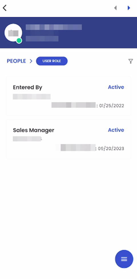
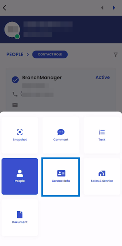
People:
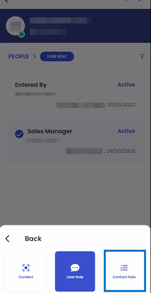
When the user taps on the People Option in the list of navigations, Users are shown the list of available sub-navigations in the People navigations. These sub-navigations are:
- Contact
- User Role
- Contact Role
Contact:
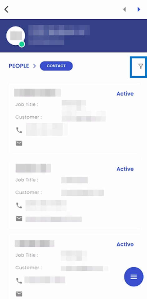
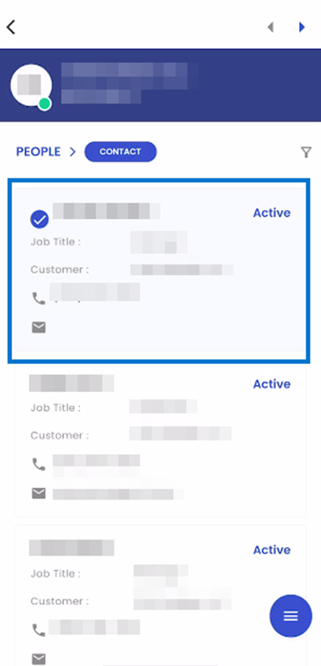
The contact navigation page is arranged in a card view. Each contact related to the given lead is displayed on their own card. Each Card consists of the Contacts Name, Job Title, Lead, Cell Phone Number, Email Address, and Status.
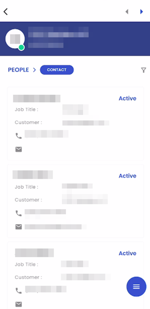
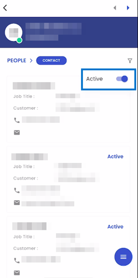
The filter icon shows the list of available filter options in the navigation. Users are allowed to toggle between Active and All contacts in the navigation. When the user sets the toggle to All, all the contact details are shown in the navigation. Likewise, if the user sets the toggle to Active, only Active contacts are displayed.
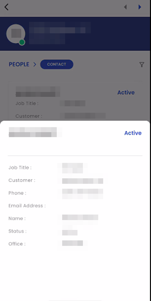
Upon tapping on a card, A bottom slider is displayed showing the information related to the given Contact. This information includes their name, status, Job Title, Phone Number, Email Address, and Office.
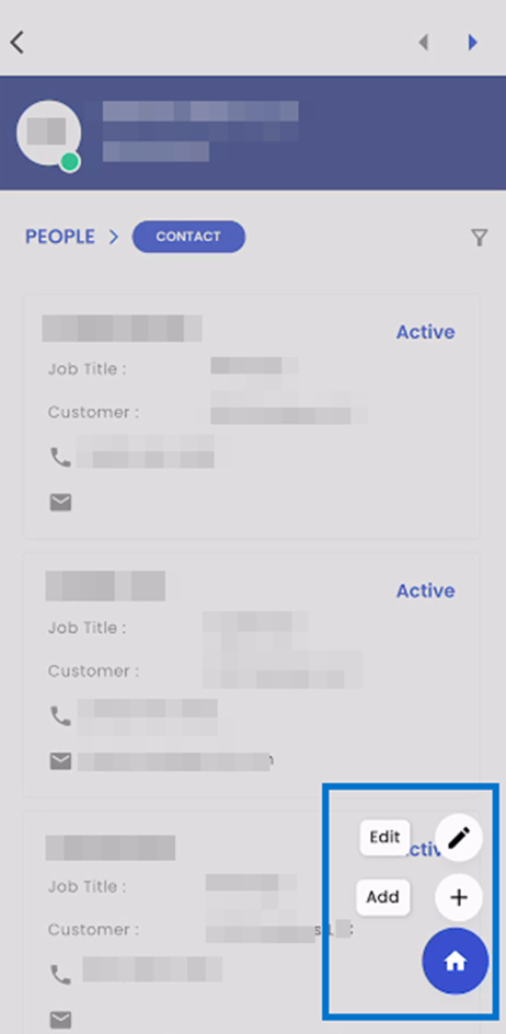
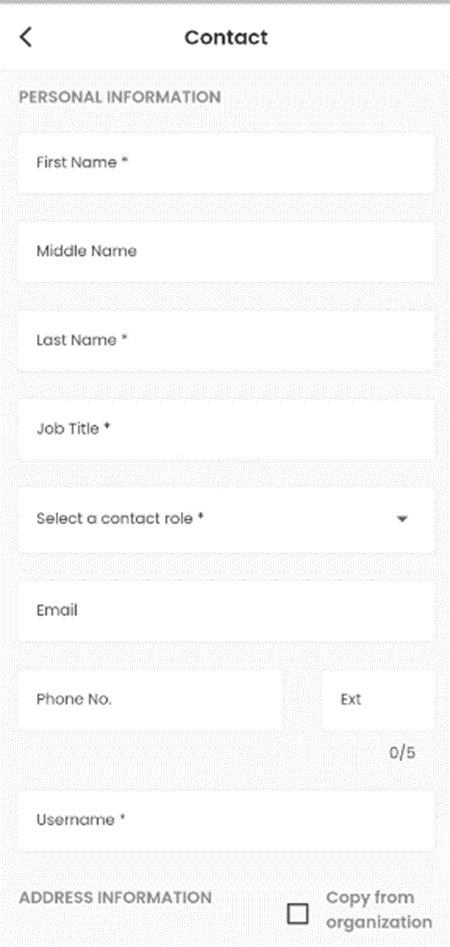
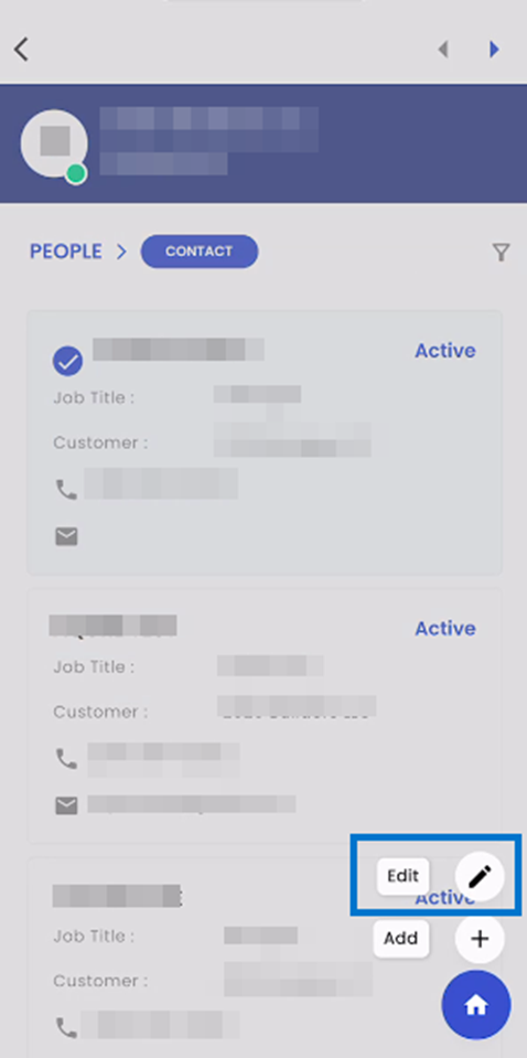
When a user taps on the hamburger icon, they are provided with several actions they can perform in the navigation. It includes add and edit. When the user taps on the add option, they are forwarded to the Add Contact navigation.
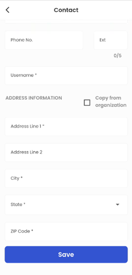
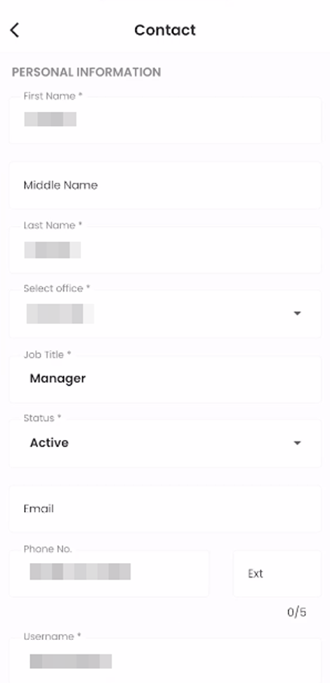
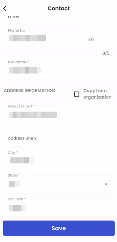
Users are asked to enter Personal information such as First Name, Middle Name, Last Name, Job Title, Select a Contact Role, Email, Phone Number, and Username. Similarly, they can Copy the address information from a Lead as well using the Copy From Lead Checkbox. Or, they can input Address Information such as Address Line 1, Address Line 2, City, State, and Zip Code and tap on Save to add a new contact.
Upon tapping on a card long, the given card is selected. Following it, when the user long taps on the hamburger icon and taps on the edit option, they are directed to the Edit Contact navigation for the selected contact.
The fields are auto-populated with the information of the selected contact. When the user edits the required details and clicks on save, the data of the given contact is updated.
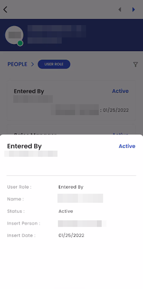
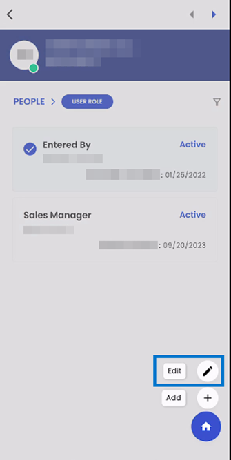
User Role
The 'User Role' navigation page is arranged in a card view. Each user role is displayed on their own card. Each Card consists of the User role, Person Name, and Status.
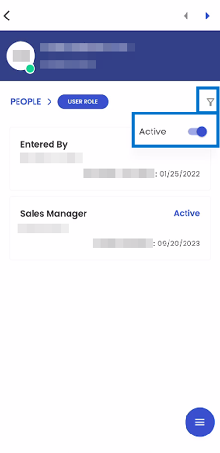
 The filter icon shows the list of available filter options in the navigation. Users are allowed to toggle between Active and All user roles in the navigation. When the user sets the toggle to All, all the user roles are shown in the navigation. Likewise, if the user sets the toggle to Active, only Active user roles are displayed.
Upon tapping on a card, A bottom slider is displayed showing the information related to the given user role. This information includes their name, status, user role, insert person, and insert date.
When a user taps on the hamburger icon, they are provided with several actions they can perform in the navigation. It includes 'Add' and 'Edit'.
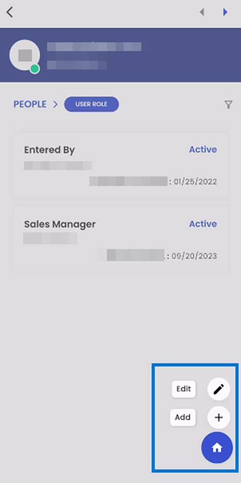
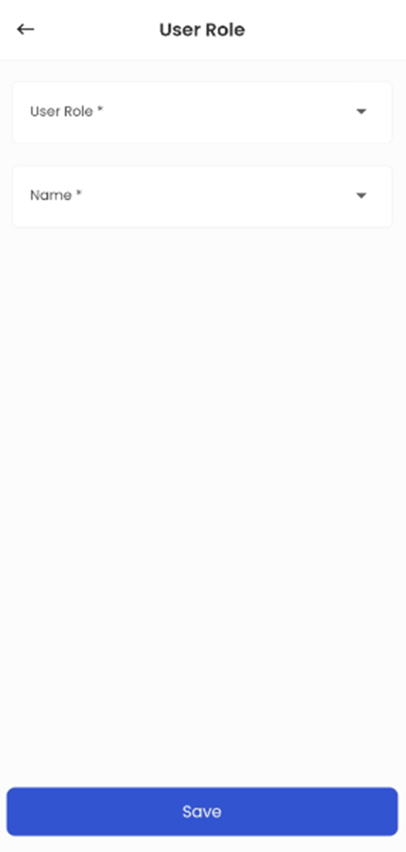
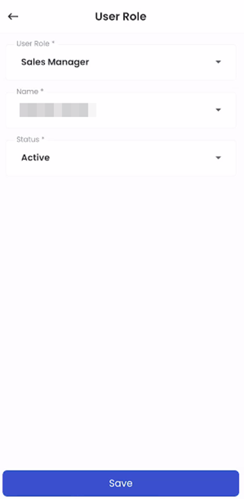
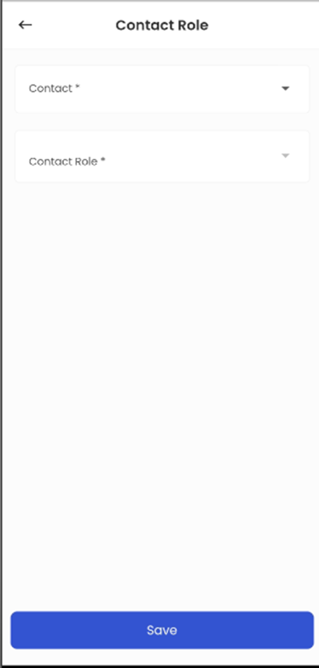
When the user taps on the add option, they are forwarded to the Add User Role navigation. User roles can only be assigned to the contacts that have been added to the organization. Users can select the User Role and Name and save the User Role.
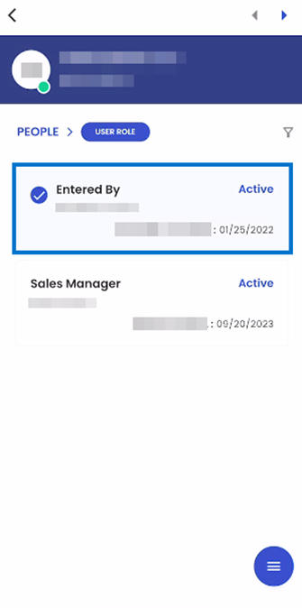
Users have the option to 'Edit' existing User Roles. To edit a user role, users can simply perform a long tap on the respective card to select it. Subsequently, they can tap on the hamburger icon, followed by selecting the edit option. This action will seamlessly direct users to the Edit User navigation for the selected contact. When the user edits the required details and clicks on save, the data of the given contact is updated.
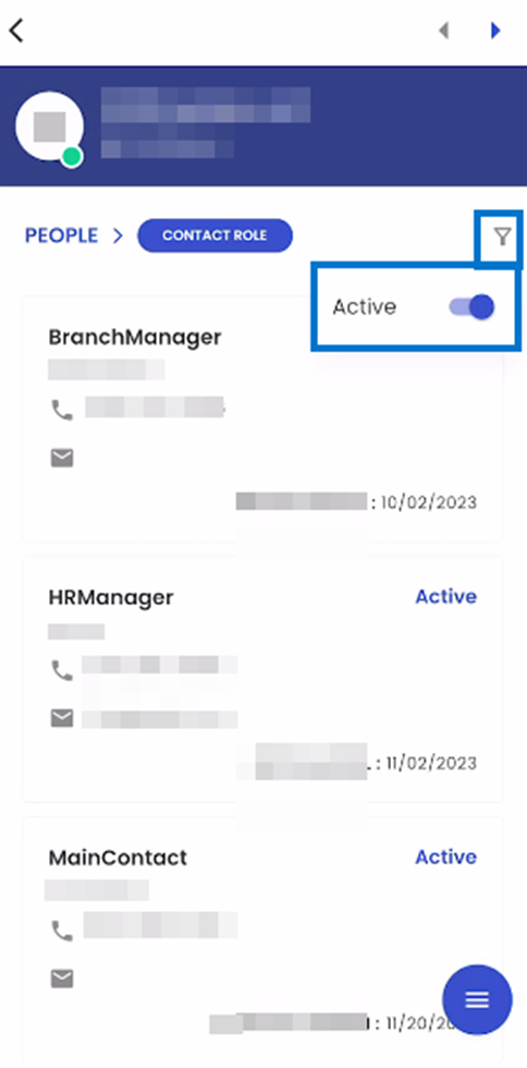
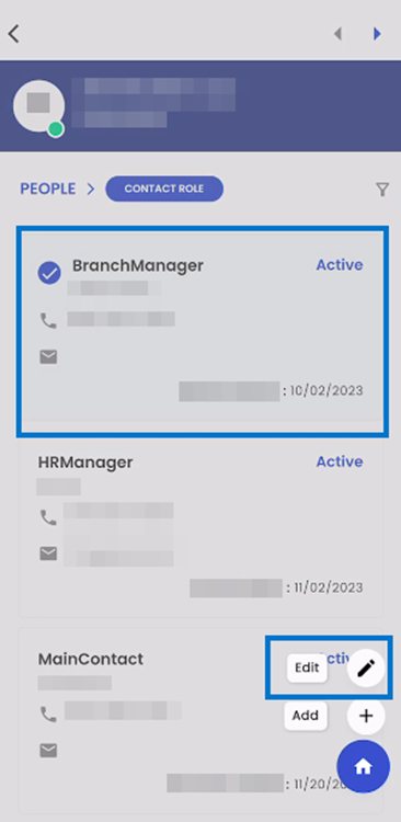
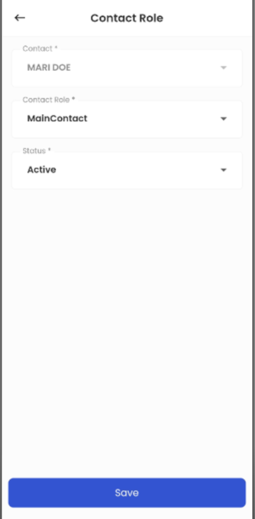
Contact Role
The ' Contact Role' navigation page is arranged in a card view. Each contact role is displayed on their own card. Each Card consists of the Contact role, Person Name, Cell Phone Number, Email Address, and Status.
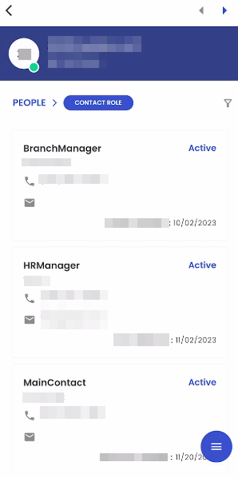
The filter icon shows the list of available filter options in the navigation. Users are allowed to toggle between Active and All contact roles in the navigation. When the user sets the toggle to All, all the contact roles are shown in the navigation. Likewise, if the user sets the toggle to Active, only Active contact roles are displayed.
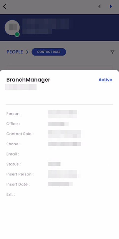
Upon tapping on a card, A bottom slider is displayed showing the information related to the given Contact role. This information includes their name, status, contact role, Phone Number, Email Address, insert person, insert date, and Office.
When a user taps on the hamburger icon, they are provided with several actions they can perform in the navigation. It includes 'Add' and 'Edit'. When the user taps on the add option, they are forwarded to the Add Contact Role navigation. Contact roles can only be assigned to contacts that have been added to the contact navigation.
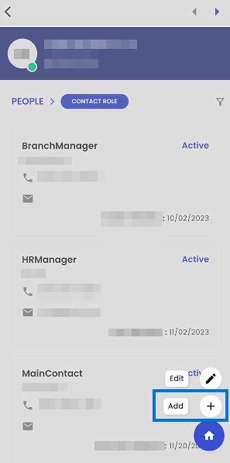
Users have the option to 'Edit' existing contact roles. To edit a contact role, users can simply perform a long tap on the respective card to select it. Subsequently, they can tap on the hamburger icon, followed by selecting the edit option. This action will seamlessly direct users to the Edit Contact navigation for the selected contact. When the user edits the required details and clicks on save, the data of the given contact information.
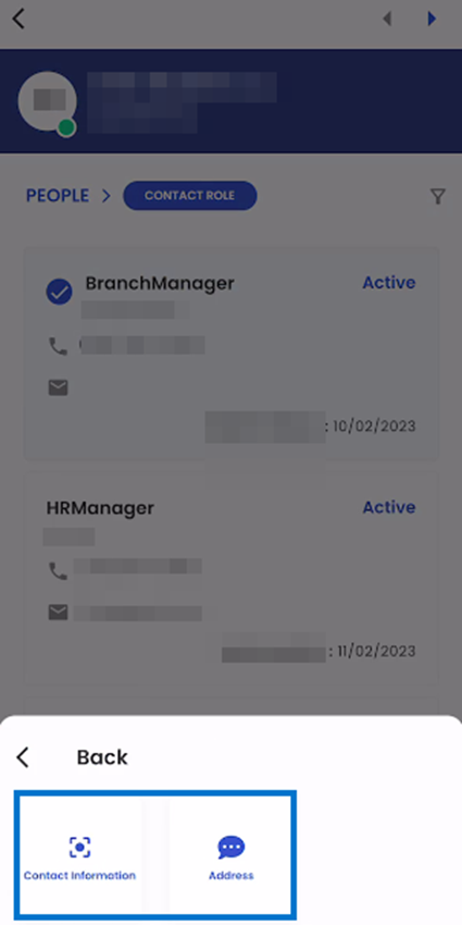
Contact Info:
When users select the Contact Info option in the list of available navigations, they are forwarded a list of available sub-navigations in the Contact Info navigation which are:
- Contact Information
- Address
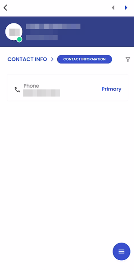
Contact Information
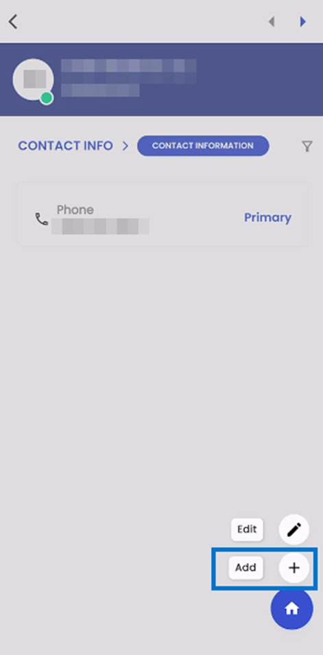
When users select the Contact Information sub-navigation, they seamlessly access the Contact Information page. Here, information is presented in a card view format, with each card displaying the contact type, associated details, and, if applicable, a "Primary" designation.
The Primary Contact Information is initially established as the first record entered the system. If the Primary Contact becomes inactive, the system automatically designates one of the Secondary Contacts as the new Primary Contact. This transition is governed by the priority assigned to Contact Information at the System Level, following a "first come, first served" basis. In cases where no system-level contact information is available, the system employs the "First Come, First Serve" method to assign a new Primary Contact Information entry.
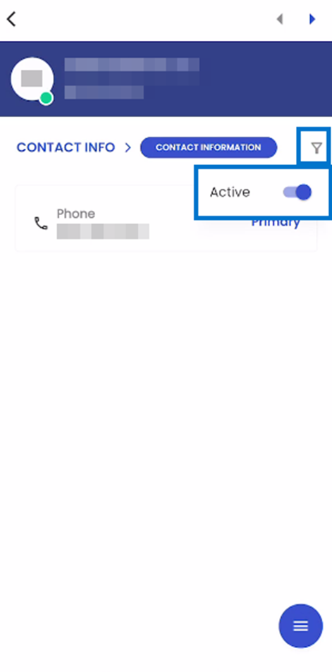
When users select the filter option within the navigation, they gain access to filtering capabilities, allowing them to refine their view of Contact Information. Through the Toggle option, users can choose between two distinct views: 'All Contact Information' and 'Only Active Contact Information.' This feature provides users with the flexibility to focus their attention on either a comprehensive overview of all contact information or specifically on active contact information, enhancing their ability to tailor their view to their specific needs within the system.
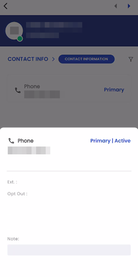
Tapping on a card within the Contact Information view triggers the appearance of a bottom slider, which conveniently displays in-depth details of the selected Contact Information. This includes vital information such as the Contact Information Type, the contact details, and any associated notes about the selected contact entry.
Moreover, when users tap outside the bottom slider interface, they are seamlessly redirected to their previous navigation state.
Located at the bottom corner of the navigation, the hamburger icon provides users with two essential options upon selection: 'Add' and 'Edit.' These options grant users the ability to either add new contact information entries or edit existing ones, enhancing their control and management over the contact details within the system.
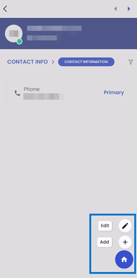
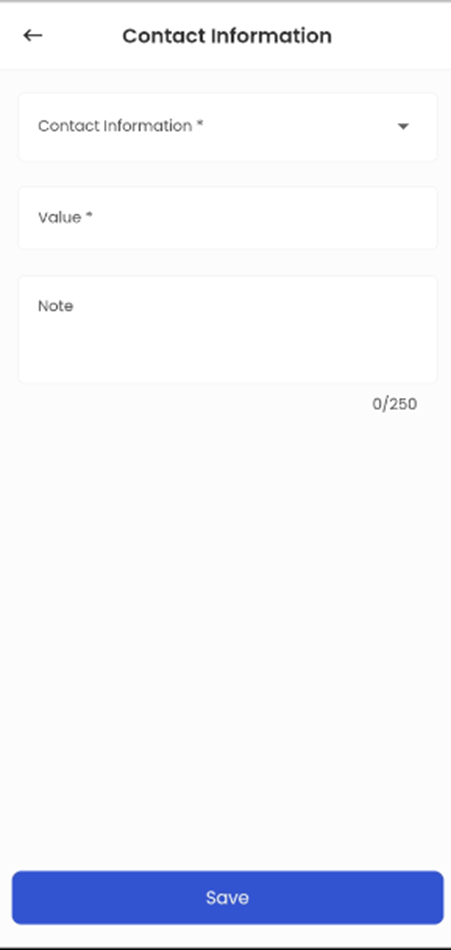
Users can use the 'Add' option to add new contact information. After clicking the 'Add' option, users are directed to 'Add Contact Information' to input all the required contact details. Upon clicking 'Save,' the system effectively incorporates the new Contact Information entry.
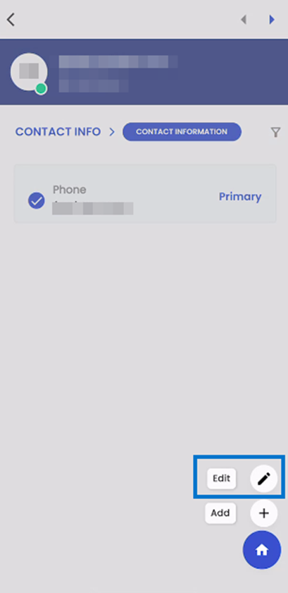
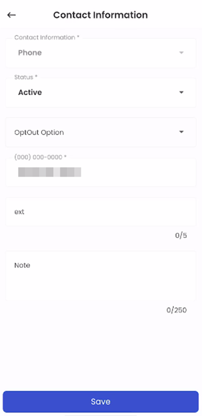
Users can select a card by doing a long tap on that specific card and note that multiple cards cannot be selected at a time. Once you've selected a card, you can tap the hamburger icon (those three lines) to see options like 'Add' or 'Edit.' If you go for 'Edit' with a card already picked, you can change the info on that card. When you're done making changes, save the Contact Information, and the system instantly updates it.
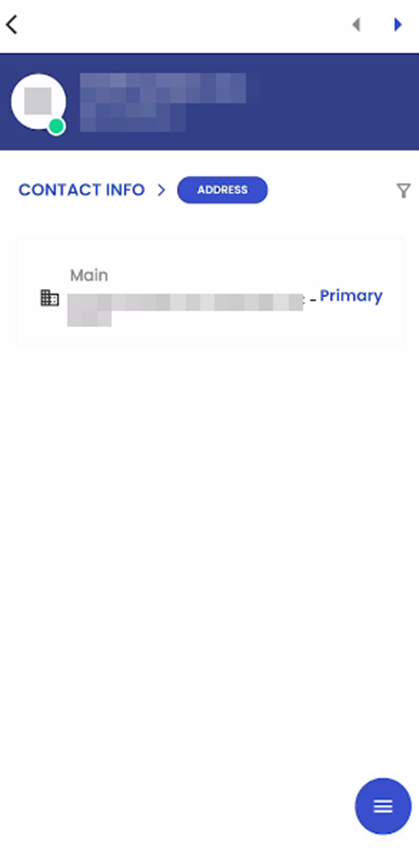
Address
If a user selects the 'Address' navigation, they are directed to the 'Address' navigation page. This streamlines their access to and control over address-related information within the system. This well-organized navigation system ensures that users can effortlessly find and manage specific sections as required, thus significantly improving their overall experience when interacting with contact details.
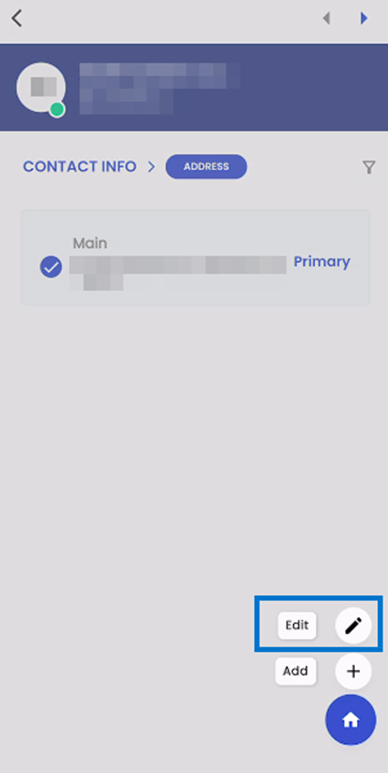
The list of addresses is displayed in a card view format, with each card containing essential details such as the address type, address particulars, and a clear indication if it is marked as the primary address. This organized presentation simplifies accessing and comprehending various addresses within the system, ensuring efficient management and precise identification of primary addresses.
The Primary Address is initially set as the first address record entered into the system. If a Primary Address is marked inactive, the system will automatically designate one of the Secondary Addresses as the new Primary Address. This transition is managed based on the priority assigned to addresses at the system level, following a "First come, First serve" basis. When no system-level address information is available, the system will utilize the "First Come, First Serve" method to allocate a new Primary Address entry.
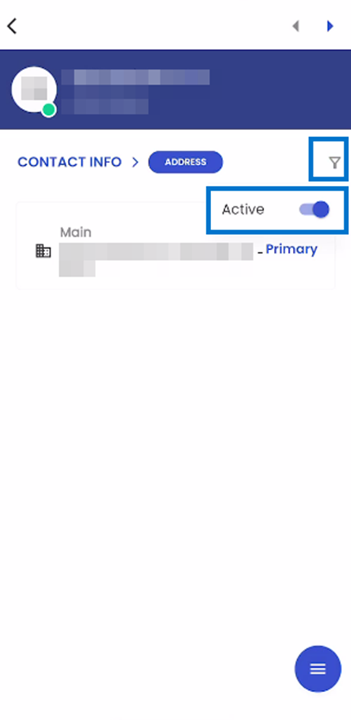
Within the 'Address' navigation, users can access a filter icon that opens a list of available filtering options. Through this filter, users have the flexibility to refine their view of addresses by toggling between 'Active Addresses' or 'All Addresses.' This user-friendly feature empowers users to customize their address view based on their specific preferences, either focusing solely on active addresses or gaining a comprehensive overview of all addresses within the system.
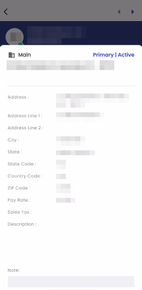
Tapping on a card within the 'Address' navigation triggers the appearance of a bottom slider, which conveniently displays the comprehensive details of the selected address. This includes essential information such as the Address, Address Line 1, Address Line 2, City, State, State Code, Country Code, Zip Code, and any accompanying notes related to the address. To remove the slider from the navigation, users can tap anywhere outside of the slider, and it will be temporarily hidden until navigated again.
Located at the bottom corner of the navigation, the hamburger icon provides users with two essential options upon selection: 'Add' and 'Edit.' These options grant users the ability to either add new addresses or edit existing ones, enhancing their control and management over address-related information within the system.
Upon selecting the 'Add' option, users are seamlessly directed to the 'Add Address' navigation. Within this interface, users can input the necessary address details, and upon clicking 'Save,' a new address entry is effectively added to the system. This streamlined process ensures the efficient inclusion of new addresses, contributing to a well-organized and comprehensive repository of address information within the system.
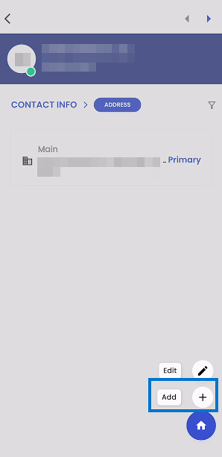
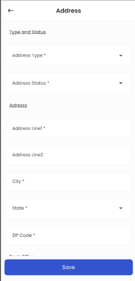
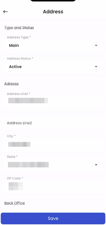
When a user performs a long tap on a card, the respective card is selected, and it's important to note that multiple cards cannot be selected at the same time. With a card being selected, users can tap on the hamburger icon to access options for 'Add' or 'Edit.' If the user chooses 'Edit' with a card already selected, they gain the ability to modify the details of the selected card. After making the desired updates, the user can save the address information, and these changes are then seamlessly reflected and updated within the system. This user-centric design ensures precise and efficient management of address details, streamlining the process of updating addresses within the system.
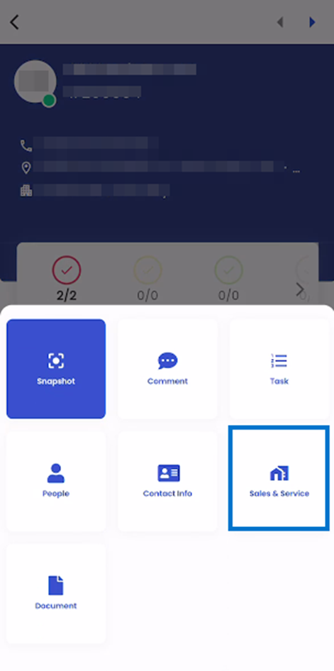
Sales and Service:
When the user taps on the Sales and Service Option, they are forwarded with the list of sub-navigations available. The sub-navigations are:
- Sales Profile
- Revenue Opportunity
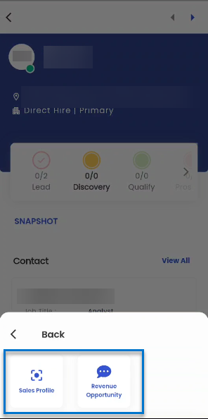
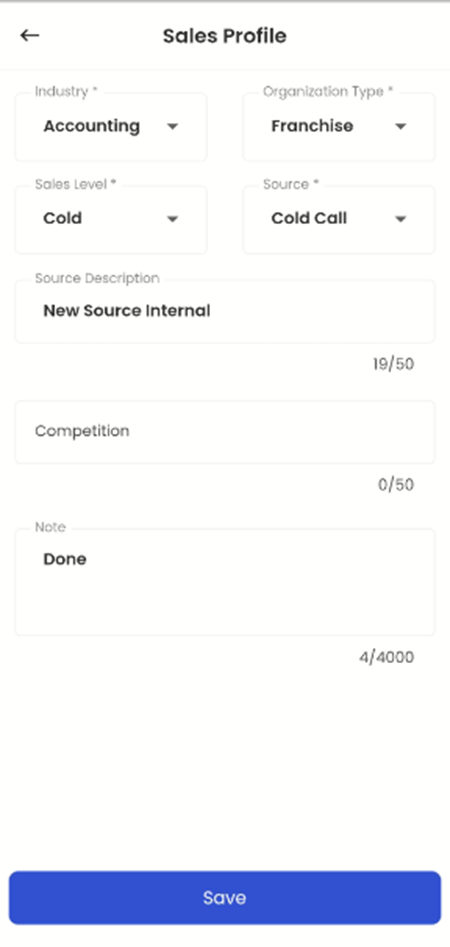
Sales Profile:
The ‘Sales Profile’ allows users to maintain various sales-related information of the Lead. This functionality provides users with a comprehensive toolset for managing and updating critical sales-related data, ensuring that they can efficiently track, and document essential information related to their contacts and interactions.
The initial navigation displays the Sales Profile-related information of the Lead in a Read-Only form. Information such as Industry, Organization Type, Sales Level, Source, Source Description, Competition, and Notes are displayed in this section. However, in case no information is added a blank screen informing that there are no records to display is shown along with the hamburger actions.
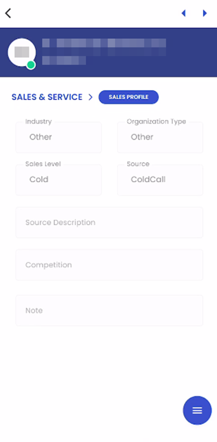
The hamburger icon in the lower right section includes the Add and Edit actions of the Sales Profile. When users have already had some details added to the Sales Profile the Add function will be blocked by the system. Similarly, if no details are added previously, the edit function will be disabled.
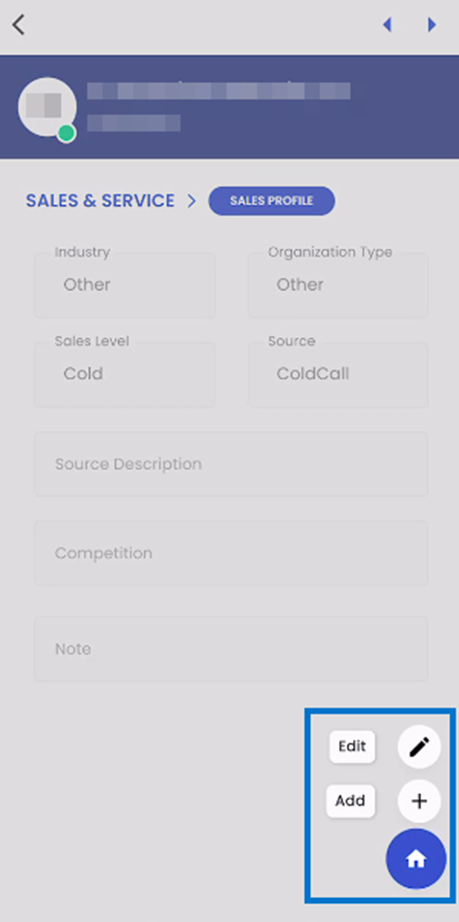
The user will select to Add or Edit Sales Profile based on whether they have already added a Sales Profile or not. When the user selects to add a Sales Profile, an empty form will be displayed. Users will be asked to input the Industry, Organization Type, Sales Level, Source, Source Description, Competition and Note and submit the form.
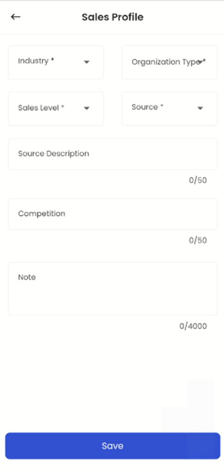
Likewise, when the user selects to edit the Sales profile, an auto-populated form with the previous details will be displayed. Users are required to update the details based on their requirement and submit the form.
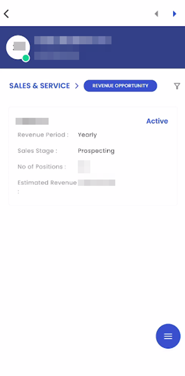
Revenue Opportunity
The ‘Revenue Opportunity’ allows users to manage and update crucial revenue-related information, facilitating accurate tracking and documentation of revenue estimates and associated periods within the system.
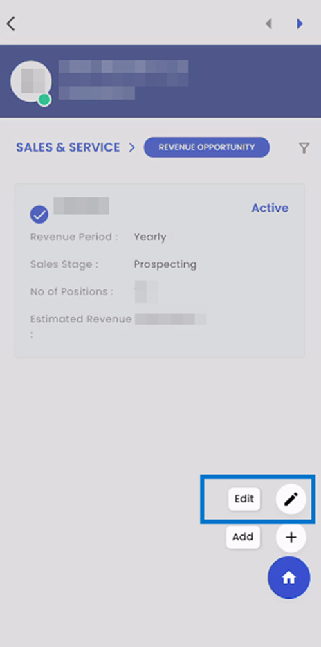
Tapping on the 'Revenue Opportunity' option redirects users to the revenue opportunity page, where they can manage, and view details related to revenue opportunities in a card view format with a card showing details of a revenue opportunity.
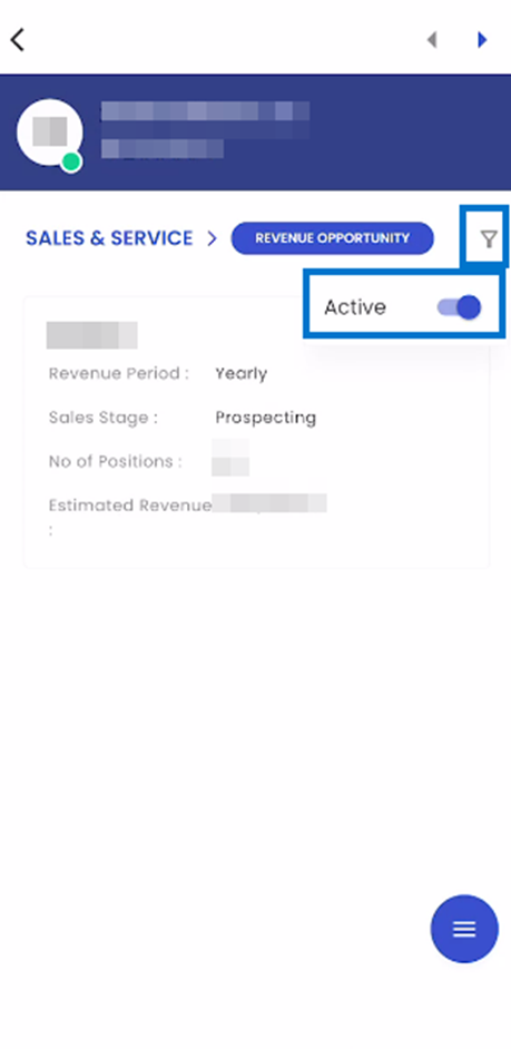
Upon tapping the filter icon, users gain access to the toggle button containing available filtering options within the navigation. Users have the flexibility to apply filters by toggling between 'Active' and 'All'. When the toggle is set to 'Active', only Revenue Opportunity Profile with an 'Active' status will be displayed, allowing for a refined view of Revenue Opportunity in this particular status. Conversely, when the toggle is switched to 'All', the navigation will show all Revenue Opportunity Profiles without any status restrictions, providing users with a comprehensive overview of all available profiles within the system.
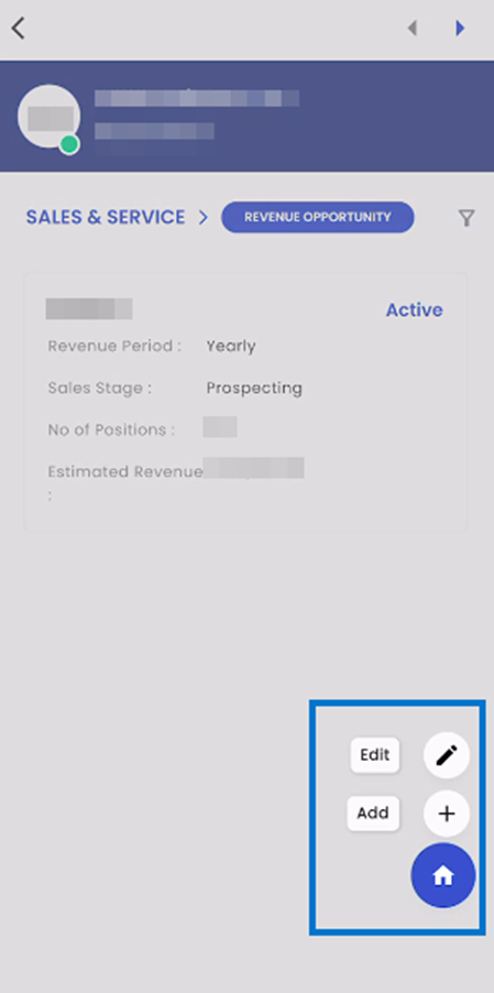
Within the Revenue Opportunity page, users can access additional options via a floating hamburger icon, which offers the choice to either 'Add' or 'Edit' the Revenue Opportunity profile.
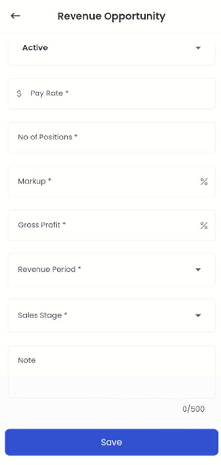
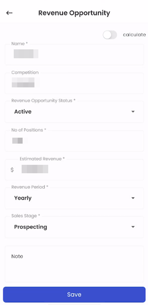
Tapping on the 'Add' option, users can add a new Revenue Opportunity profile within the system. This profile encompasses key details, including the Calculate toggle button, Name, Competition, Revenue Opportunity Status, Number of Positions, Estimated Revenue, Revenue Period, Sales Stage, and Note. This feature streamlines the process of adding essential information related to revenue opportunities. In the revenue opportunity details, the 'Name' field allows users to specify the name or title for the particular revenue opportunity. Additionally, the 'Competition' field provides users with the ability to document and track competitors associated with this revenue opportunity, offering valuable insights into competitive dynamics within the sales process.
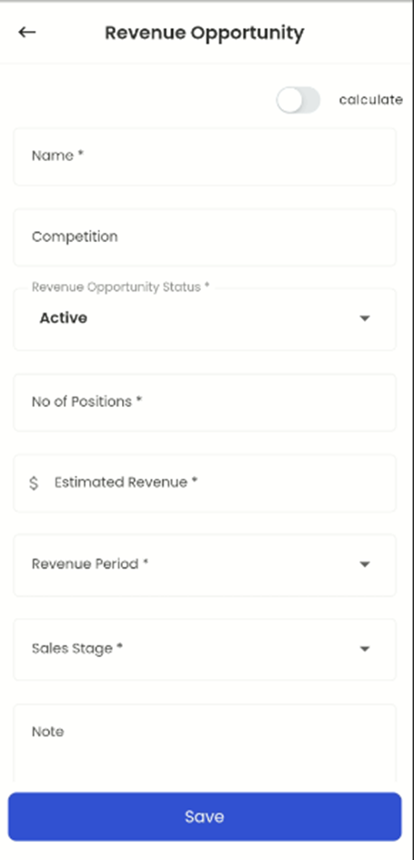
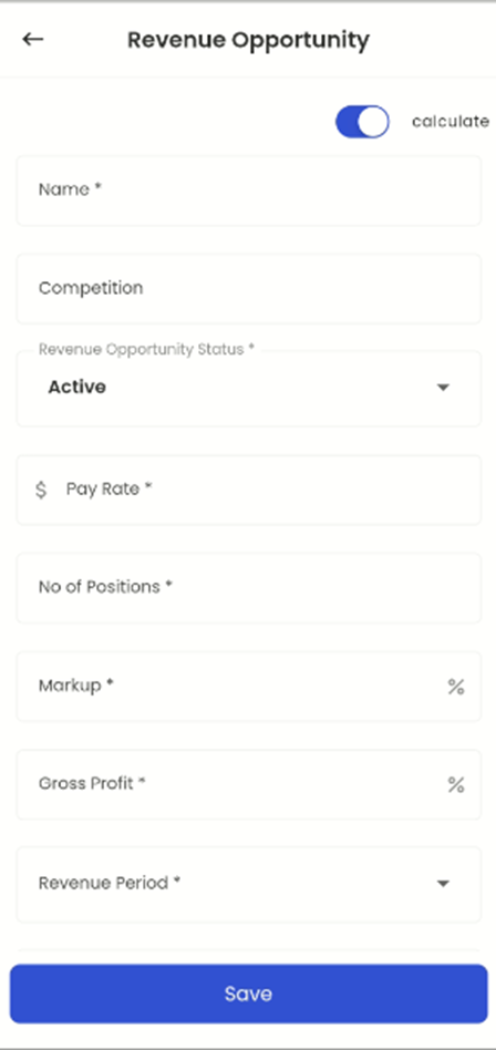
Switching the ‘Calculate’ toggle button, users can unlock additional fields such as Pay Rate, Markup, and Gross Profit. These fields provide users with the capability to calculate the revenue opportunity associated with a specific set of parameters. This feature enhances the user experience by enabling real-time revenue calculations, thereby facilitating more informed decision-making and financial planning.
When a user performs a long tap on a card, the given card is selected. If the user taps on the hamburger icon and then on the Edit option, the user will be redirected to the Edit navigation.
The edit form is auto-populated with the details of the selected revenue opportunity. When the user inputs the required change and clicks on save the given Revenue Opportunity will be updated accordingly.
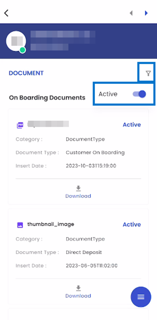
Document
Upon tapping on the Document navigation in the list of navigations user are directed to the document navigation page.
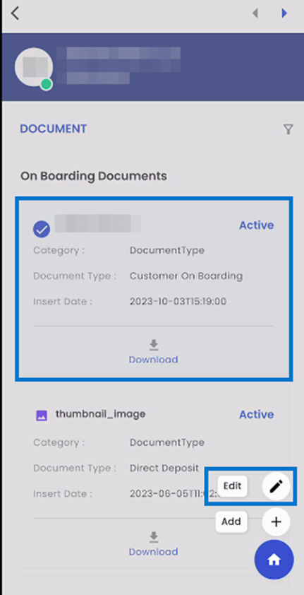
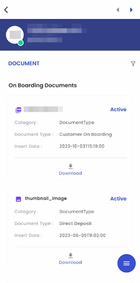
The 'Document' navigation is presented in a card-view format, with each document related to the Lead showcased in its own dedicated card. These document cards provide comprehensive details about each document, including the Document Name, Document Status, Category, Document Type, Insert Date, and an option for downloading the document. This user-friendly interface simplifies the process of managing and accessing Lead-related documents efficiently within the system.
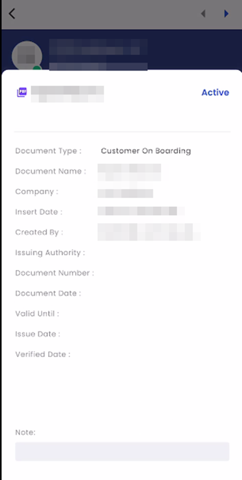
Upon tapping a document card, a bottom slider interface is activated, providing users with a detailed view of the relevant document information. Within this bottom slider, the document name and status are displayed on top; additionally, users can access crucial document details, including Document Type, Document Name, Company, Insert Date, Created By, Issuing Authority, Document Number, Document Date, Valid Until, Issue Date, Verified Date, along with any accompanying Notes.
Upon tapping the filter icon, users gain access to the toggle button containing available filtering options within the navigation. Users have the flexibility to apply filters by toggling between 'Active' and 'All'. When the toggle is set to 'Active', only documents with an 'Active' status will be displayed, allowing for a refined view of documents in this particular status. Conversely, when the toggle is switched to 'All', the navigation will show all documents without any status restrictions, providing users with a comprehensive overview of all available documents within the system.
Tapping on the floating hamburger icon available on the bottom right screen, users get access to the ‘Add’ and ‘Edit’ options. 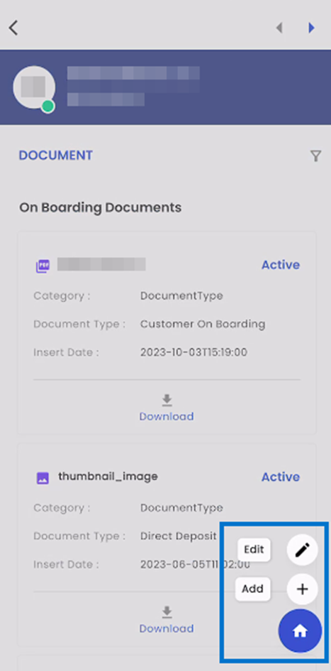
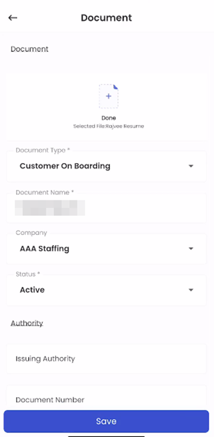
Users can add new documents to the system by simply tapping the 'Add' icon, which conveniently guides them to the Add ‘Document' navigation. Within this navigation, users can initiate the document addition process by selecting the 'Add a Document' option. This approach streamlines the process of uploading and managing documents within the system, enhancing overall document management efficiency. Users have the capability to upload documents with a maximum file size of 5MB. The supported document types for upload include BMP, DOC, DOCX, GIF, JPEG, JPG, PDF, PNG, PPT, PPTX, TIFF, TXT, XLS, and XLSX. This versatile document upload feature ensures that users can efficiently add a wide range of document formats to the system, accommodating various document-related needs and preferences.
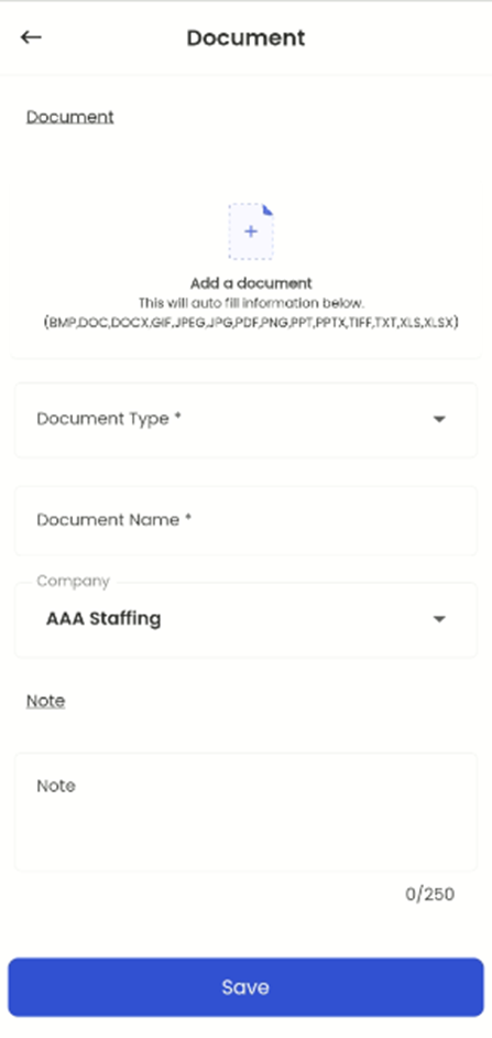
On long pressing the document card, the user can select the document. Following this selection, tapping on the hamburger icon, the user can edit the document by tapping on the ‘Edit’ option. Upon selecting the 'Edit' option, users are granted the capability to make revisions and updates to the document's details. This action forwards them to a dedicated editing page, where they can modify various document attributes, including the Document File, Document Type, Document Name, Company, Status, and Note. This feature offers users the flexibility to maintain accurate and up-to-date document records within the system.