Tiles
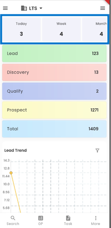
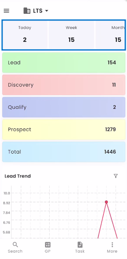
Tiles are streamlined visual representations that occupy a prominent place at the top of the screen, granting users rapid and convenient access to vital Leads-related data. These intuitive tiles serve as a gateway to comprehending Lead activity in depth. Users can swiftly navigate through various options, such as viewing Leads created today, this week, this month, and this year. These tiles empower users to effortlessly engage with and gain insights into their Leads management processes.
Leads Tracking System (ATS) has three main navigations. They are:
- Dashboard
- Lead
- Contact
A simple long tap on any of the tiles grants users access to a contextual menu that provides versatile sorting options. This menu empowers users to effortlessly organize and filter Leads data. They can choose to view Leads created today, this week, this month, or this year, tailoring their insights to specific timeframes. This intuitive feature enhances user control and simplifies data navigation within the system.
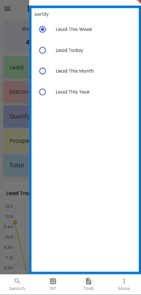
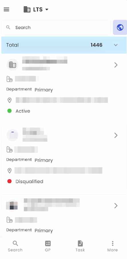
The records count of the selected option will appear on the tile.
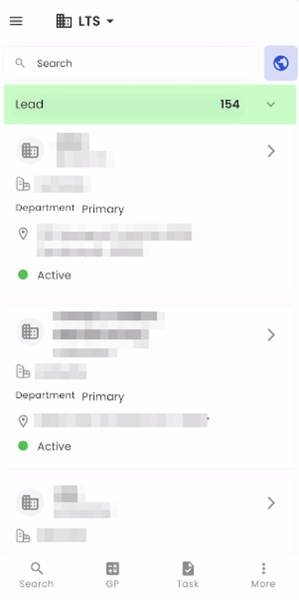
Tapping on any tile will seamlessly redirect the user to the Lead directory, where the details of the Lead corresponding to the selected tile will be prominently displayed. This streamlined navigation ensures that users can effortlessly access and review Lead information based on their selection.
Workflow
The section, that follows the Tiles section is known as the workflow section. This section includes all the stages of LTS. The stages in LTS are Lead, Discovery, Quality, Prospect, and Total.
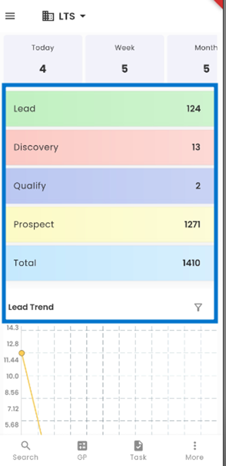
The LTS workflow is visually presented in a stack, each stack representing a specific stage within the lead tracking process. These stages include Lead, Discovery, Qualify, Prospect, and Total. The count displayed on each tile signifies the total number of leads currently within that particular stage. By clicking on a specific stage tile, users are seamlessly redirected to view the detailed information of leads within that stage.
Within each stage, various tasks associated with the leads are outlined, and these tasks can be assigned to relevant team members. When users tap on a specific workflow tile, they are automatically directed to the lead directory, which filters and displays leads exclusively from the selected workflow stage. Conversely, selecting the Total option presents all leads within the system, offering a comprehensive view of all available leads for efficient management and tracking.
Charts
The users can view the charts section on the landing page positioned below the Tiles of LTS dashboard, presenting users with two charts namely the Time Graph and the Donut Chart. The default configuration showcases the Lead Trend chart, providing insights into leads’ trends over time, and the Lead Distribution By Office chart, which offers a graphical overview of Lead distribution with respect to different offices.
The dashboard provides a variety of two chart options namely the Time Graph, and Donut Chart. The users can select from a choice of two different Lead tile types using the ‘Filter’ option. This flexibility ensures that users can tailor the display to their specific preferences and requirements.
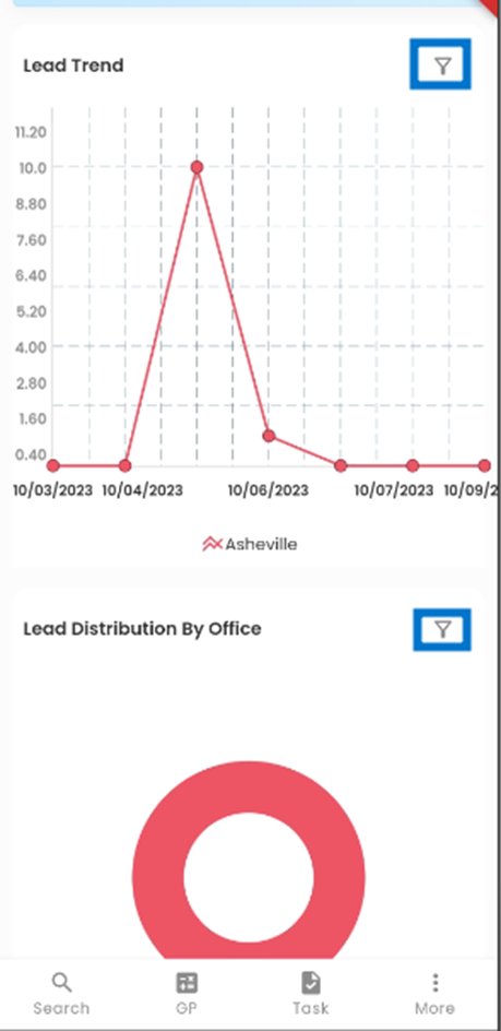
Tapping on the ‘Filter’ icon allows the user to choose from various Leads Charts.
The user can choose from various Lead Chart Options Namely Lead Trend, and Lead Distribution by Office.
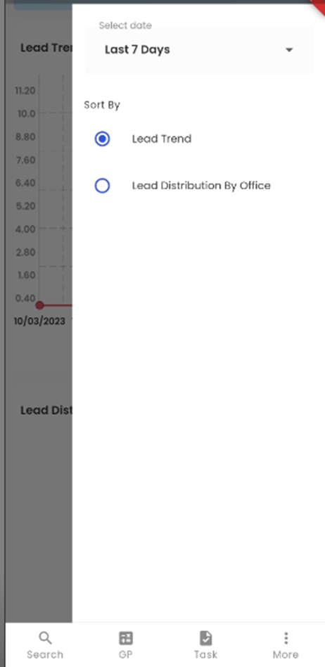
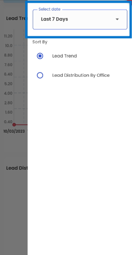
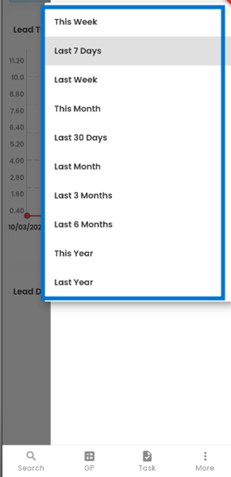
The ‘Select Date’ filter allows the user to choose from different timelines such as This week, Last 7 Days, and so on, influencing the information displayed on the chart. By default, users can initially view charts covering the 'Last 7 Days’.
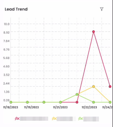
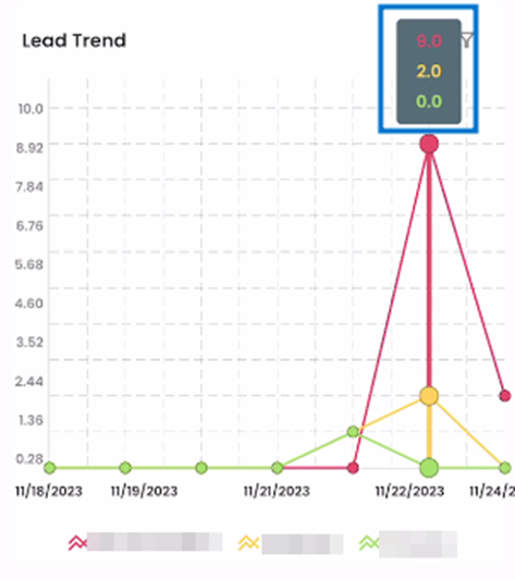
Lead Trend
The Lead Trend chart represents the timeline of the number of Leads that are registered into the Zenople system for different offices for the date selected. The different color lines represent each office which is mentioned in the legend below the chart. The chart's vertical axis indicates the number of applicants whereas the horizontal axis indicates the dates.
By tapping on the dots within the charts, users can instantly access a box displayed above the dot, revealing the number of Leads associated with the specific date, and facilitating a quick and convenient data overview.
This chart enables users to promptly view the dates with the highest and lowest Lead counts, providing a clear visual representation of Lead activity over time.
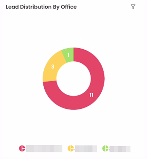
Lead Distribution by Office
The ‘Lead Distribution by Office’ is denoted by a donut chart. The number in the chart indicates the number of Leads and each color indicates the specific office which is specified below the chart. This is handy for comparing the records and drawing valuable conclusions quickly.