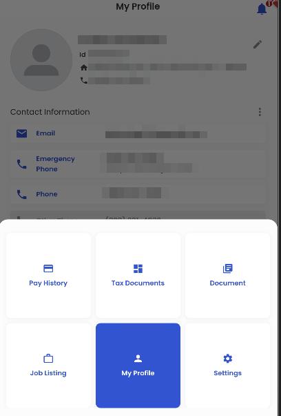
Job Listing
Tapping on the ‘More’ navigation shows the ‘Job Listing’ navigation.
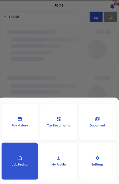
Tapping on the ‘Job Listing’ navigation allows users to view all the jobs posted in the Zenople Job Portal.
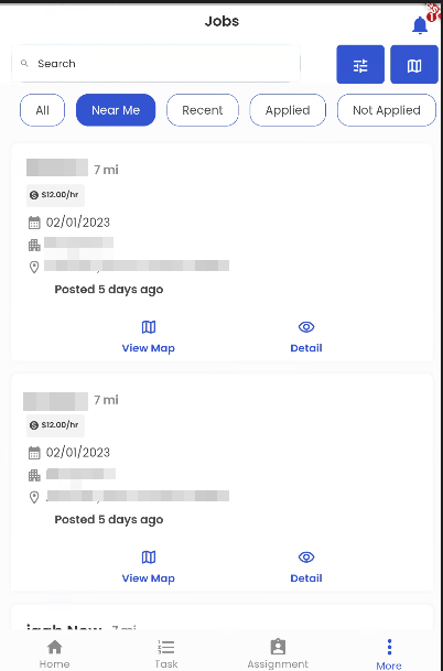
Employees can browse the jobs by typing the matching job titles in the ‘Search Bar’ available.
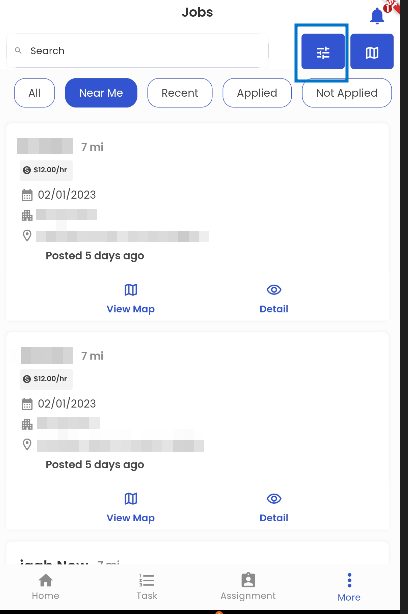
Besides the search bar, there are two buttons ‘Job Filter’ and ‘Map View’.
Below the search bar, there are 5 buttons namely ‘All’, ‘Near Me’, ‘Recent’, ’Applied’, and ‘Not Applied’ which help to filter the jobs as per their names.
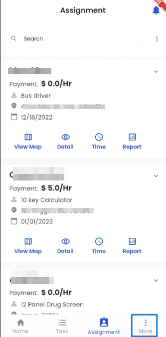
The summary of the Job is displayed in a card view where the information Job Title, Radius(distance), Pay Rate, Job Start Date, job Office, Work site address, and the posted day difference is displayed.
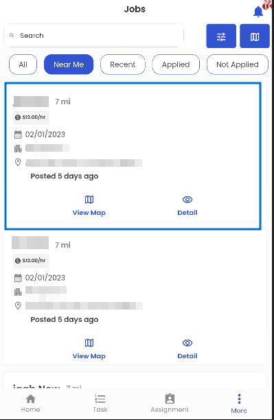
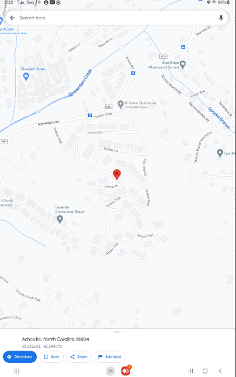
The ‘View Map’ button available at the bottom of the Card view navigates the candidate to the Job’s worksite address in the Map view.
‘Details (Eye view)’ action displays all the further details of the job in a descriptive manner.
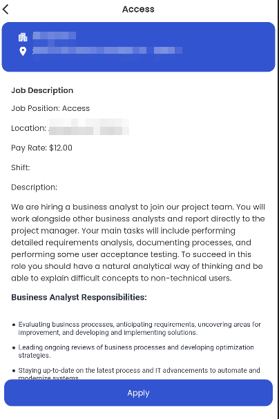
Users can apply to the job by tapping on the ‘Apply’ action available on the screen post the ‘Detail(eye-view)’action.
Tapping on the ‘Filter’ button on the top right corner opens the ‘Job Filter’.
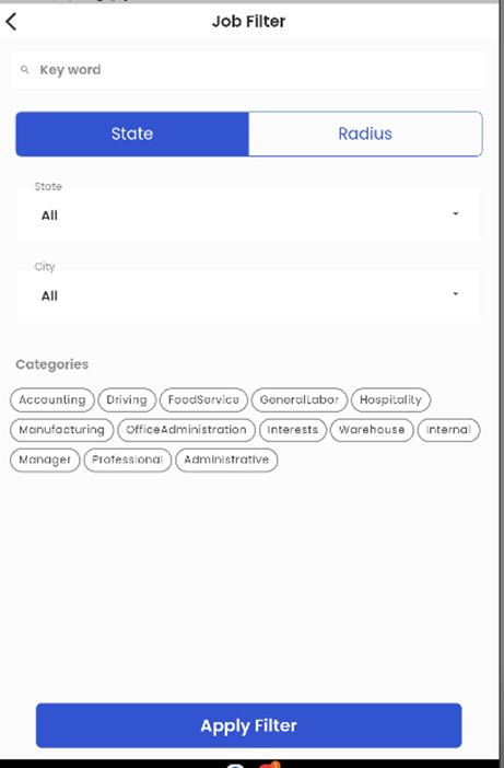
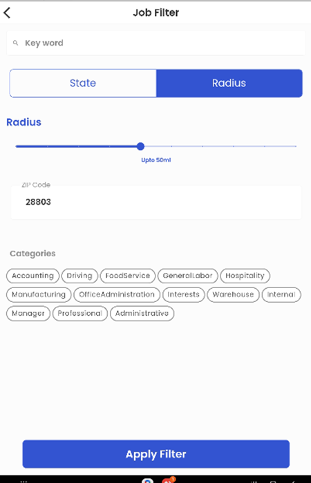
Employees can use this filter action to search the jobs based on the State and Radius.
Both of these options facilitate the applicants to search the jobs by entering the Job titles in the Search bar.
On searching the jobs, and toggling to the State option, employees can enter the state and city and then select the category as per their requirement.
Likewise, on searching the jobs, and toggling to the Radius option, employees can drag the radius slider to allocate the distance (in miles) from their current location, enter the zip code, and then select the category as per their requirement.
After setting any of the setups described above, employees can tap on the ‘Apply Filter’ button to implement the settings and make the job search likewise.
My Profile
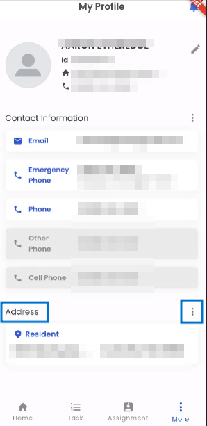
My Profile presents the profile of the employee that contains their detailed information. It is divided into 3 sections namely: My Profile, Contact Information, and Address.
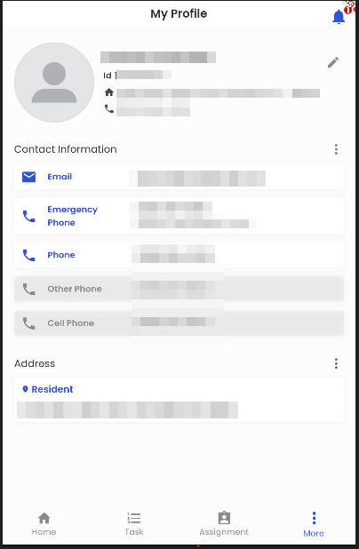
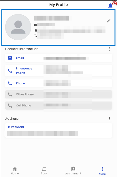
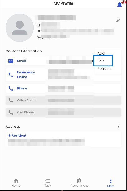
The users can view their details on the profile card. They can view their name, ID, address, and phone number on the card.
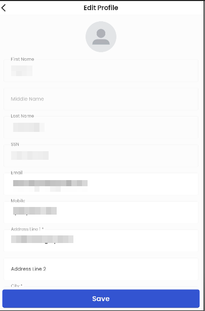
My Profile section displays the information of the user. The pencil icon available beside the profile allows users to edit their personal information.
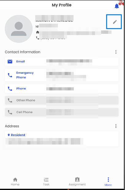
Contact Information
The contact Information section displays the Mobile and Email address of the user.
Dim contact denotes inactive contact.
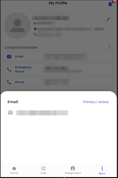
The users can click on the contact information, address, and documents and get a pop-up screen showing the title of the information as ‘Email’, information, and its type as ‘Primary’ and status as ‘Active’.
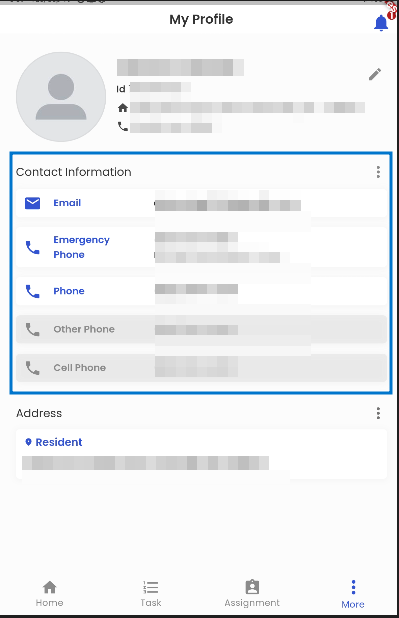
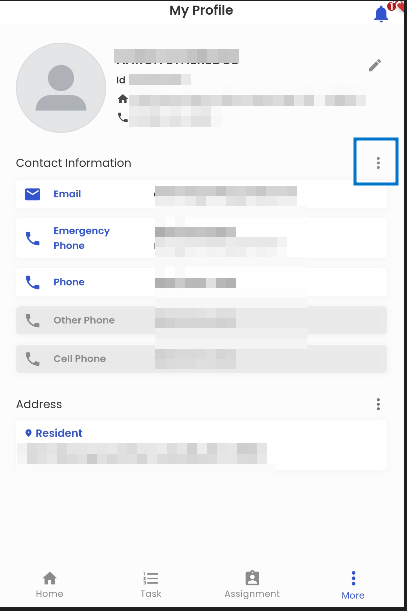
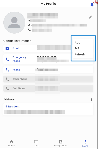
The vertical ellipsis of the Contact Information section allows the user to Add, Edit, and Refresh their contact information.
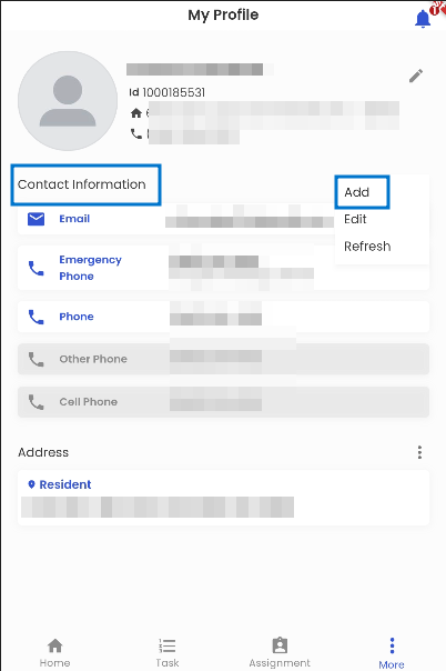
Employees can add new contact information by Tapping on the ‘Add’ option.
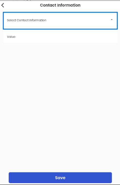
Tapping on the ‘Select Contact Information’ allows users to select from a list of contact types.
The ‘Value’ section contains the contact information.
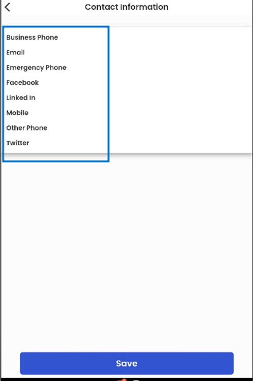
Tapping on the ‘Select Contact Information’ opens a list of contact information which are namely; business phone, email, emergency phone, and so on. The user can choose from the available contact types to select the type of contact that they want to add.
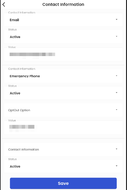
The employee can edit their contact information by tapping on the ‘Edit’ option. It enables the user to edit the type of contact, information, and status of the particular contact.
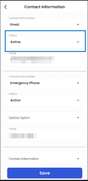
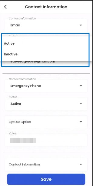
The user can edit the ‘Status’ of their contact information. They can mention if their specific contact point is either ‘Active’ or ‘Inactive’.
The active status of the contact information is shown in normal text whereas the inactive status is dimmed in the contact information card view on ‘My Profile’ section.
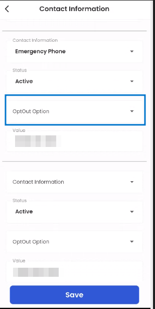
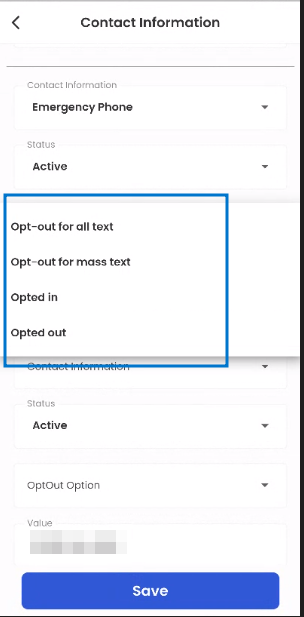
The opt-out/opt-in feature is provided to the users from the ‘OptOut Option’. Tapping the option allows the users to select various actions to either Opt-out or Opt-in as per their requirement.
The users can choose to opt out from receiving texts again.
Email cannot be opt-out, only numbers can be opt-out by the user.
Address
The Address section displays the address of the user and mentions the address type i.e., ‘Resident’.
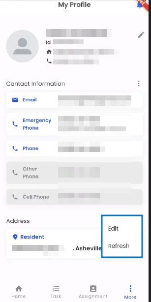
The vertical ellipsis of the Address section allows the users to ‘Edit’ their address and ‘Refresh’.
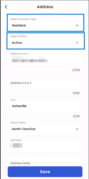
Tapping on the ‘Edit’ option, the user can edit their address.
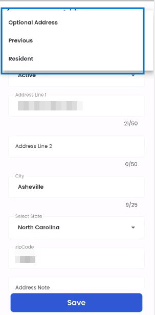
Tapping on the ‘Select Address Type’ allows the users to choose from either their ‘Previous’ or ‘Resident’ address.
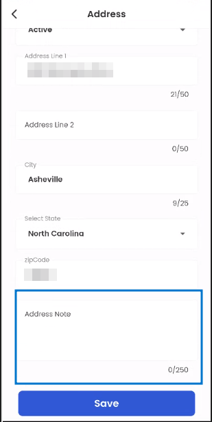
Scrolling down the ‘Edit’ address page, the users can view the ‘Address Note’ box. It allows the users to input notes regarding their address. The address note can be 250 characters long.
Setting
Users are privileged to use the ‘Settings’ navigation in the mobile platform which is not available in the web platform.
.png)
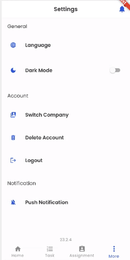
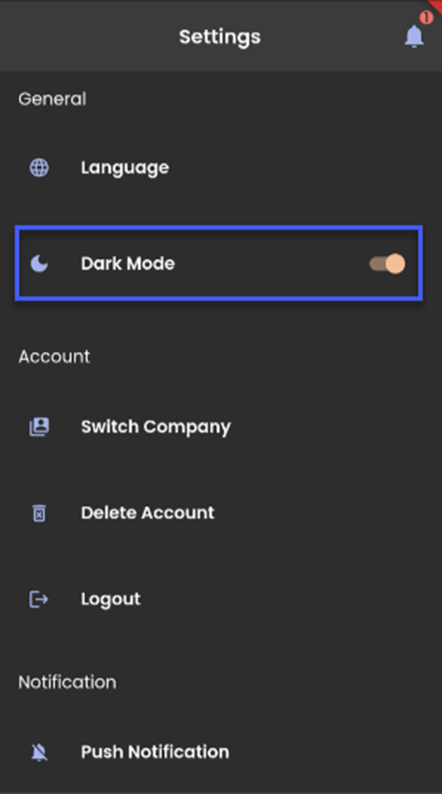
Settings navigation is basically divided into 3 sections namely; General, Account, and Notification.
The general section consists of Language and Dark Mode actions.
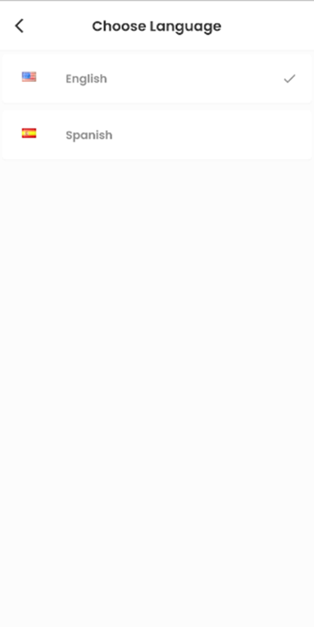
Language action allows users to select the language between English and Spanish.
Dark Mode is a toggle action, which when turned on changes the entire theme of the application into the dark mode.
The account section consists of Switch Company, Delete Account, and Logout actions.
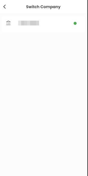
Users are allowed to switch the company if they are engaged in multiple companies by tapping the ‘Switch Company’ action and selecting the available company.
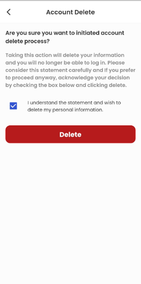
Tapping on the ‘Delete Account’ action, users get directed to the Account Delete screen where detailed information about the action is well described.
After reading the information, there is a checkbox action available to acknowledge the action to be conducted, and further tap on the ‘Delete’ button to delete the account.
Users get an elapsing toaster message on tapping the ‘Delete’ action without acknowledging (ticking)the checkbox message.
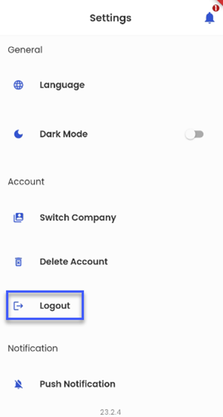
Logout action allows the users to log out of their current logged-in session.
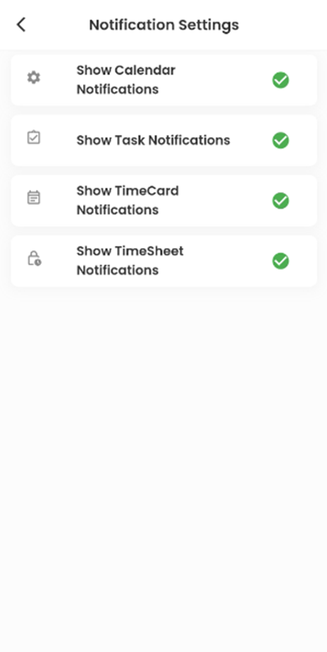
Notification Settings contains the following radio buttons :
- Show Calendar Notifications: When enabled, notifications related to the user’s Calendar events are displayed in the Bell icon.
- Show Task Notifications: When enabled, notifications related to the user’s Task are displayed in the Bell icon.
- Show TimeCard Notifications: When enabled, notifications related to TimeCard are displayed in the Bell icon
- Show TimeSheet Notifications: When enabled, notifications related to TimeSheet are displayed in the Bell icon.