Applicant Directory
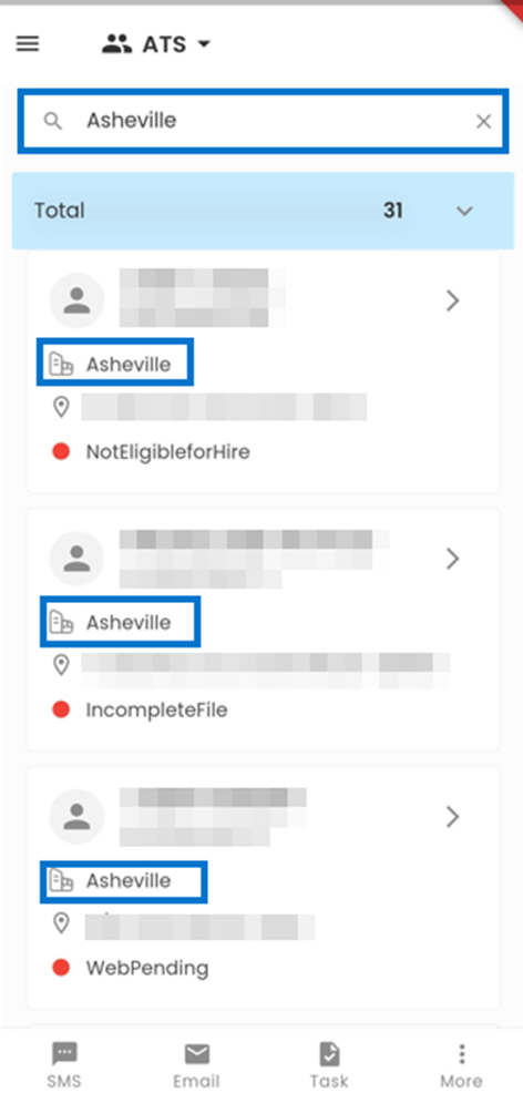
The Applicant Directory provides a highly efficient and streamlined approach to managing applicant records. Utilizing the Search box, users can effortlessly locate applicants by searching for their names, User IDs, and any other relevant information. Each applicant's card showcases vital information, encompassing their Profile Picture, Name, Person ID, Office, Address, and Status. Our mobile application is designed to enhance the management and interaction with applicant records, offering an intuitive and efficient solution.
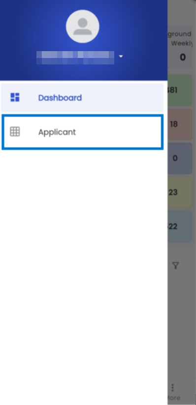
When you select the Hamburger icon, as shown in the figure below, you will be presented with the ATS navigations. Upon tapping the "Applicant" side navigation, you will be seamlessly redirected to the Applicant Directory.
The initial screen displayed is the Applicant Directory page, which showcases a Card View of the registered Applicants. Each Applicant within the system is represented by an individual card, containing relevant information, such as their Profile Picture, Name, Person ID, Office, Address, and Status..png)
The search box enables users to perform comprehensive searches for applicants within the ATS. Users have the flexibility to search for applicants by various options, including their Names, Person IDs, Phone Numbers, Offices, and other relevant information, providing a versatile and efficient search capability.
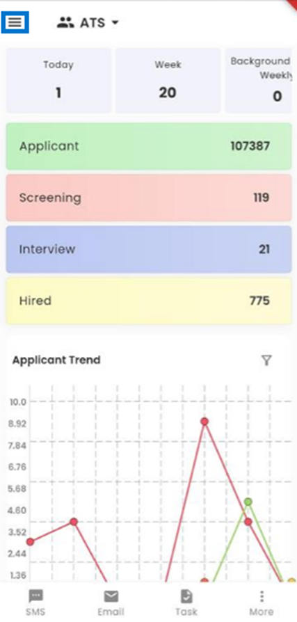
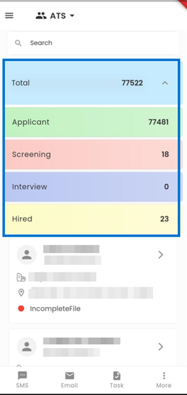
Tapping on the current workflow grants access to an expanded view of the ATS Workflow. In this section, users can effectively filter and examine applicants at various stages within ATS, including Applicant, Screening, Interview, and Hired stages. The 'Total' segment of the workflow, which is the default selection, conveniently presents a comprehensive overview of all ATS applicants across all stages.
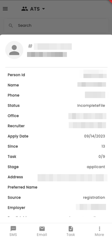
Upon tapping any card of the directory, the system will promptly unveil a bottom slider, offering comprehensive details regarding the selected applicant. This includes relevant information such as their Profile Picture, Person ID, Name, Phone Number, Status, Office, Recruiter, Apply Date, Since, Task, Stage, Address, Preferred Name, Source, and Employer, providing users with a thorough overview of the applicant's profile.
When a user taps any area of the screen outside the bottom slider section, the bottom slider gracefully slides out of view, and the user is seamlessly returned to the Applicant Directory page. This intuitive feature ensures a smooth and user-friendly navigation experience within the application.
(1).png)
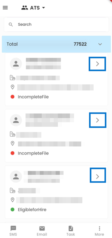
When you tap on the arrow (Greater than) icon located on each card within the directory page, you will be redirected to the Applicant Entity Detail page corresponding to the selected entity, allowing for more in-depth exploration and management of applicant-specific information.
Applicant Detail
The Applicant Entity Detail page offers an in-depth overview of an individual applicant's profile. Upon entering this page, users are presented with a navigation interface, as illustrated in the accompanying screenshot, allowing them to efficiently access various aspects of the applicant's information and interactions.
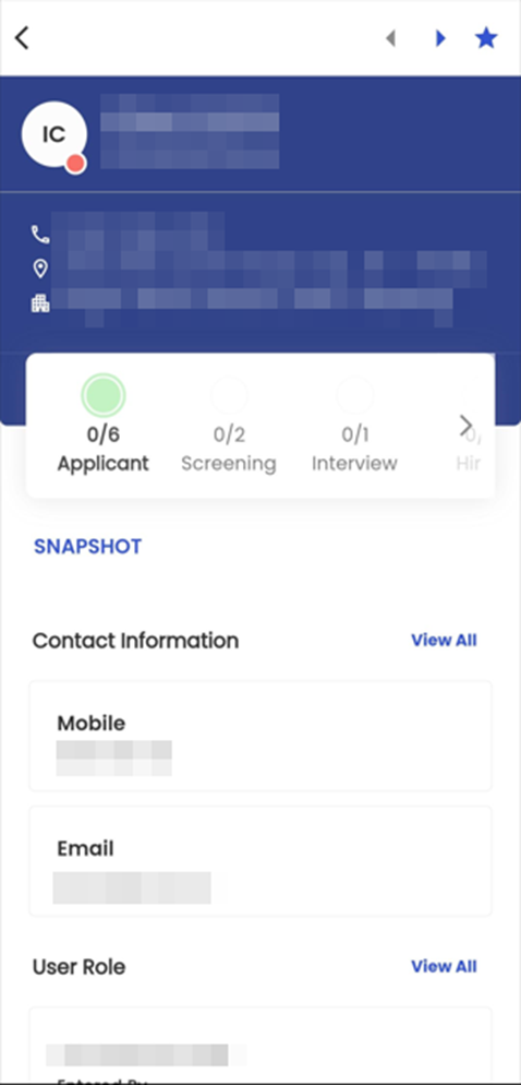
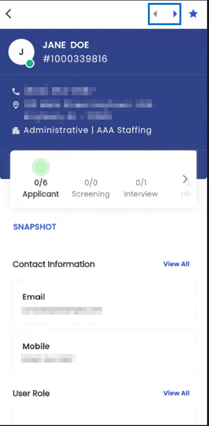
The Left and Right Arrows located at the top of the screen facilitate easy navigation for users, enabling them to seamlessly switch between the Entity Detail pages of different applicants. Users can cycle through applicants in the order they appear within the directory, ensuring quick access to individual applicant profiles.
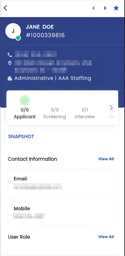
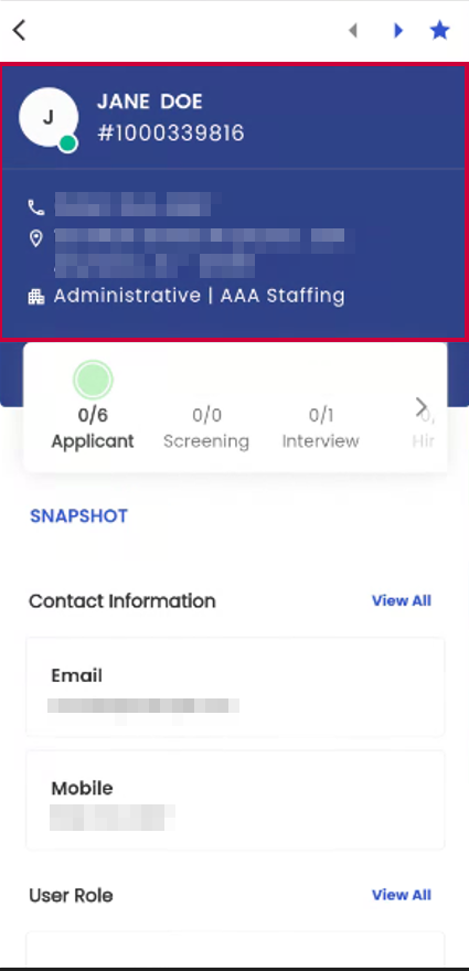
Within the Entity Details Section, users can access essential information about the applicant, including their Name, Person ID, Contact Number, Address, and Office, all presented alongside their Profile Picture.
The colored dots displayed next to the Profile Picture section of the Applicant provide a quick visual indication of the applicant's status within the system. Specifically, a green dot signifies an applicant's "Active" status, an orange dot indicates "Inactive" status and a red dot represents a "Terminated" status. This color-coded system offers an efficient and intuitive way to distinguish an applicant's current standing at a glance.
This section provides a concise yet informative overview of the applicant's details. Additionally, it showcases the Skills possessed by the applicant, offering valuable insights into their qualifications and expertise.
The screenshot below provides a visual representation of the applicant's progression through various stages, along with the corresponding task completion status at each stage. It offers insights into the number of completed tasks and those pending at each specific stage, encompassing the Applicant Stage, Screening Stage, Interview Stage, Hired Stage, and Total Stage.
The number of tasks is displayed in a fractional way. The numerator denotes the completed tasks whereas the denominator denotes the total number of tasks assigned at the given stage. When a user taps on any of these stages, they gain access to the applicant's tasks at that particular stage, facilitating detailed task management and monitoring within the application.
.png)
(1).png)
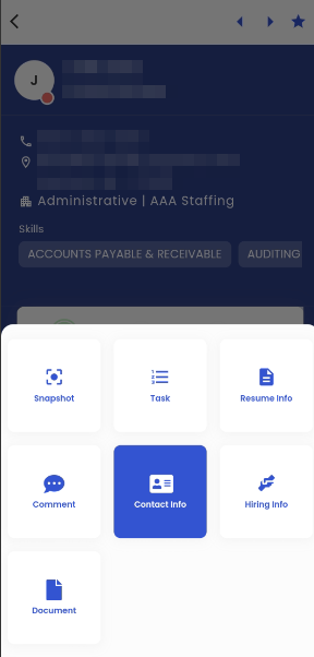
The highlighted section within the provided screenshot indicates the current navigation context of the employee. Tapping on this section presents the user with a menu displaying the available navigation options within the Entity Detail page. By selecting their desired navigation from this menu, users are seamlessly directed to the respective section, ensuring convenient and efficient access to the information and features they require.
.png)
.png)
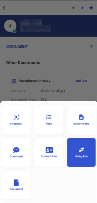
Snapshot
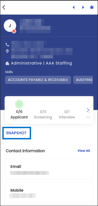
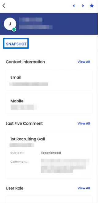
The Snapshot is the initial navigation presented to users when they enter the Applicant Entity Detail page. Within the Snapshot navigation, there are several sub-navigation options, with one of them being the Contact Information section. This section provides users with a comprehensive overview of the applicant's contact details, offering easy access to vital contact information related to the applicant.
.png)
When a user taps on the ‘View All’ action, users will be seamlessly redirected to the ‘Contact Information’ sub-navigation within the ‘Contact’ navigation. This intuitive action allows users to access and explore the complete set of contact details associated with the applicant.
.png)
.png)
The Last Five Comment section within the Snapshot provides a concise overview of the last five comments that have been added to the applicant's profile. In cases where there are more than five comments, only the most recent five comments are displayed within this section, ensuring a streamlined and focused presentation of the most current interactions and updates relevant to the applicant.
.png)
When a user taps on the 'View All' action within the Last Five Comment section, they will be directed to the ‘Comment’ navigation specific to the selected applicant. This action enables users to access and review the complete history of comments and interactions associated with that particular applicant, offering a comprehensive perspective on their communication and engagement within the application.
.png)
.png)
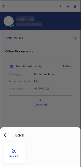
The User Role section within the Snapshot provides a comprehensive view of the User Roles associated with the selected applicant. This includes details such as the user's name, role, insert person, and insert date, all presented in a user-friendly card view format. Each card represents a distinct User Role assigned to the applicant, encompassing roles such as Entered By, Recruiter, WC Admin, Coordinator, and more, offering a detailed overview of the applicant's interactions and associations within the system.
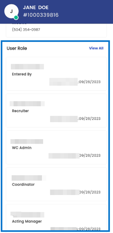
When a user taps on the "View All" action within the User Role section of the Snapshot, they will be seamlessly directed to the ‘User Role’ sub-navigation located within the Hiring Info navigation. This action enables users to access and explore all the user roles associated with the applicant, providing a comprehensive overview of their roles and associations relevant to the applicant.
The Task section presents a card view that highlights the pending tasks within the Applicant stage. Each task is displayed on its individual card, providing a clear and organized overview. Each card includes essential details such as the Due Date, Name, and Description of the task, ensuring users have all the necessary information to manage and prioritize their tasks effectively.
.png)
.png) Upon tapping the 'View All' action within the Task section, users will be directed to the Task navigation specific to the chosen applicant. This action allows users to access and review the complete list of tasks associated with that particular applicant, facilitating efficient task management and tracking within the application.
Upon tapping the 'View All' action within the Task section, users will be directed to the Task navigation specific to the chosen applicant. This action allows users to access and review the complete list of tasks associated with that particular applicant, facilitating efficient task management and tracking within the application.
The Address section presents information concerning the applicant's address details in a user-friendly card-view format. Each card includes the Address Type and the complete address of the applicant, ensuring users have easy access to their address information.
.png)
.png)
Upon tapping the 'View All' text within the Address section, users will be directed to the Address sub-navigation located within the Contact Info navigation. This action allows users to access and explore all available address information related to the applicant, providing a comprehensive overview of their contact details within the application.
In the Document section of the snapshot, document details are neatly presented in a card view format. Each card provides key information such as the Document Type, Inserted Date, Created By, and the current status, indicating whether the document is active or inactive. This organized presentation allows users to readily access and review document-related information in a clear and concise manner, streamlining their document management tasks within the system.
When users tap on the "View All" action within the Document section, they will be seamlessly redirected to the Document navigation specific to the applicant. This navigation feature provides users with a convenient and straightforward way to access and explore the full range of documents associated with the selected applicant, facilitating efficient document management and review within the system.
.png)
.png)
Task
When a user taps on the 'Snapshot' action, as depicted in the provided screenshot, a bottom slider appears, showcasing the list of available navigation options. If the user chooses the 'Task' navigation from this menu, they will be seamlessly directed to the Task navigation, allowing for quick access to and management of tasks associated with the applicant.
.png)
.png)
The Task navigation is organized into horizontally slidable tabs, providing users with a convenient way to navigate through different stages of the applicant's task management. These tabs represent various stages, including Applicant, Screening, Interview, Hired, and Total. Each tab functions as a filter, displaying tasks specifically related to the respective stage, while the "Total" tab provides an overview of all tasks associated with the applicant across all stages, ensuring comprehensive task management and monitoring.
.png)
.png)
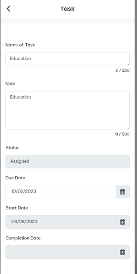
When an applicant selects a task card, they are presented with an interactive bottom slider that provides a comprehensive task overview. This feature includes vital details such as the Task Name, Assigned To, Status, Due Date, Start Date, Completion Date, and a dedicated section for task-related Notes. This enhancement empowers applicants with efficient task management capabilities, facilitating easy access to critical task information for better comprehension and action within our system.
.png)
Tasks are presented in a card view format, with each task occupying its own individual card. These cards contain crucial task information, including the Task Name, Assigned To, Due Date, and the Task’s current Status. Additionally, users can access detailed task information by tapping on the right arrow icon, allowing them to view task details categorized by status and assignment, providing a structured and comprehensive overview of task-related data.
.png)
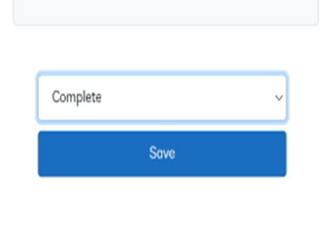
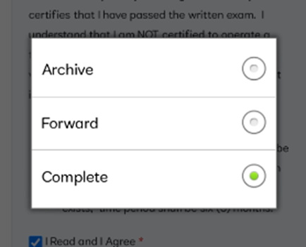
In the task details section, users are presented with a set of actions located at the bottom of the interface. Here, they have the option to indicate whether the intended task is to be marked as "Complete," "Forwarded," or "Archived." This feature streamlines the task management process by allowing users to specify the appropriate status and actions for each task within the system.
Comment
Comment navigation shows all the comments of the applicant for different comment types under different categories. The comment type and comment category can be defined on the basis of the client’s requirements. It allows users to write multiple comments associated with the applicant and also update them. Users can add and edit the comments of applicants under various categories and types.
(1).png)
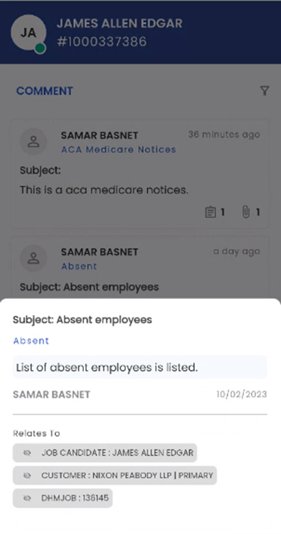
Upon entering the Comment navigation, users can readily view the comments associated with the applicant. The comments are presented in a card view, each containing information including the 'Name' of the commenter, Comment Type, the timestamp indicating when the comment was posted, Subject, Comment and icons that convey the presence of Attachments, Tasks, and Relates To.
Tapping on the comment presents the bottom slider which shows the information such as Subject, Comment Type, Comment, Name of the commenter, Date when the comment was posted, and Relates To field which shows all the navigations related to the comment.
.png)
In the bottom slider associated with each comment, users can conveniently access information regarding any attachments and tasks that are linked to that specific comment.
.png)
The filter button on the top right section of the screen allows the users to filter the comments that will be displayed.
.png)
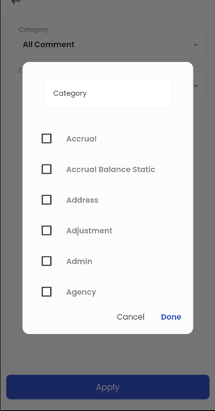
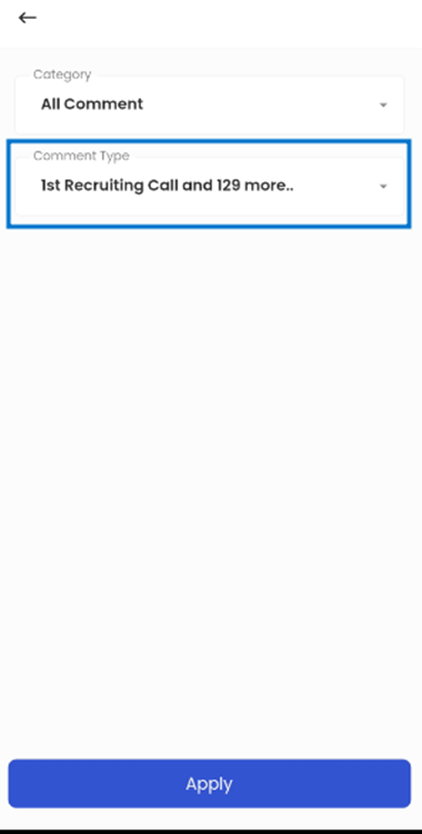
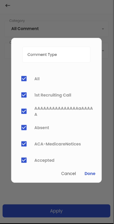
Tapping on the ‘Filter’ icon, the user gets two options to choose from namely; Category and Comment Type. The ‘Category’ option allows the user to filter the Category of comment.
The user can select from various comment categories by either selecting the comment category or by searching the comment.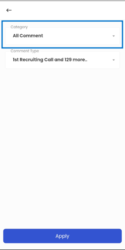
The 'Comment Type' refers to the categorization of comments, such as 'Absent,' with all comment types initially selected, allowing the Applicant’s snapshot to display all comment types, but users can customize this view using the Filter option to show specific comment types.
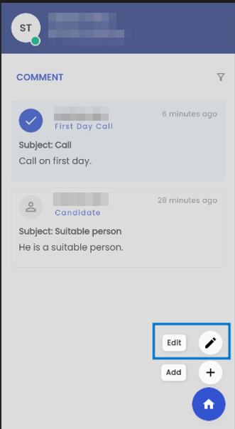
Tapping on the floating hamburger icon available on the bottom right of the screen, the users get the options to ‘Edit’ and ‘Add’ comments.
.png)
.png)
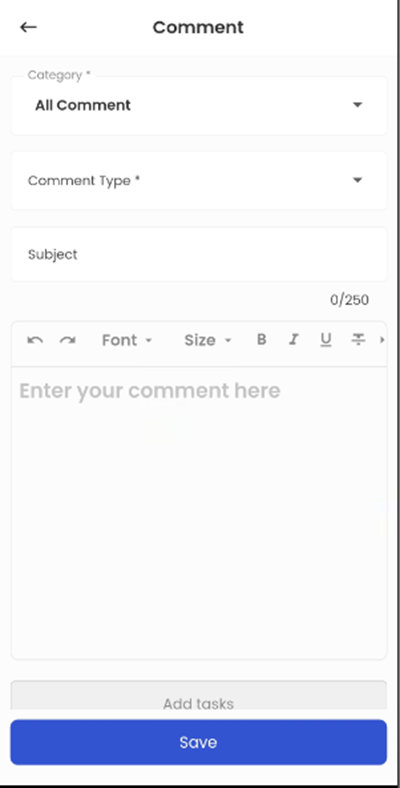
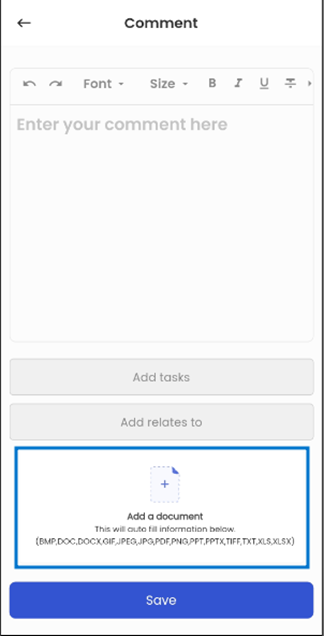
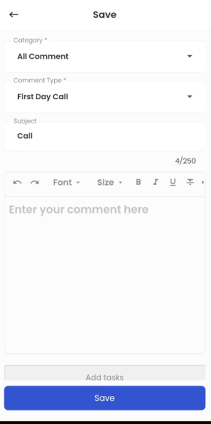
Tapping on the ‘Add’ action, the user can add a new comment. The user can select the ‘Category, ‘Comment Type’, Subject, and the Comment.
.png)
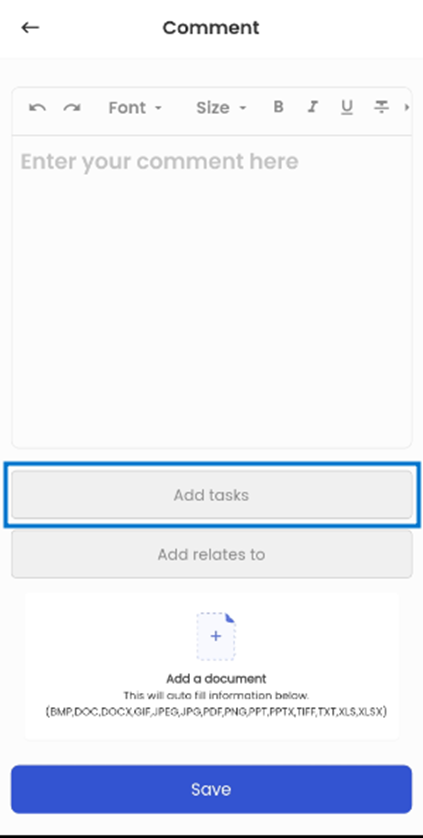
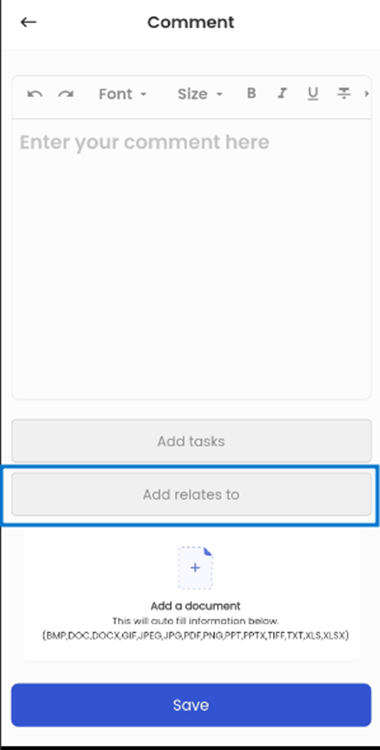
Sliding down, the users get other options like ‘Add Tasks’, ‘Add Relates to’, and ‘Add a document’.
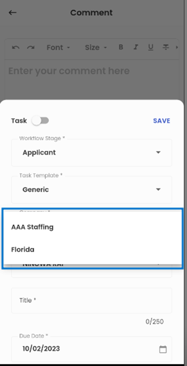
Tapping on the ‘Add Tasks’, the bottom slider appears allowing the users to add task. When adding the task, the user can see the options of ‘Workflow Stage’, ‘Task Template’, ‘Company’, ‘Assign To’, ‘Title’, ’Due Date’, ‘Note’, and ‘Include Task’ check box.
.png)
Tapping on the ‘Workflow Stage’, the user can select the Workflow where the user wants to add the comment task.
.png)
The user can tap on the ‘Task Template’ and get a list of task templates available from which the user can select task templates which is relevant to the task as per the requirement.
.png)
The ‘Company’ option allows the user to choose the company relevant to the comment.
.png)
The 'Assign To' option allows the user to assign tasks to the office staff by simply tapping it and selecting from a list of available office staff.
.png)
Below the ‘Assign To’ option, the user can insert the title in the ‘Title’ field which refers to the Title of the task, the ‘Due Date’ of the task, ‘Note’ for the task and the ‘Include Task’ check box is available as well.
The ‘Include Task’ check box indicates that that the task will be included when adding the comment. By default, the 'Include Task' checkbox is selected but users have the option to uncheck it to discard the task while adding the comment.
The user can save all the changes by clicking on the ‘Save’ button.
.png)
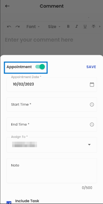
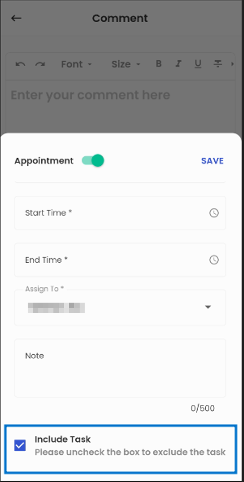
Switching the Task toggle button opens the ‘Appointment’ section which allows the user to add Appointment through the comment section. The Appointment section includes the ‘Appointment Date’, ’Start Time’, ’End Time’, ‘Assign to’, ‘Note’, and ‘Include Task’ checkboxes.
The user can choose the Appointment Date and the time of the appointment from the Start Time and End Time options. The 'Assign To' option allows the user to assign tasks to the office staff by simply tapping it and selecting from a list of available office staff. The user can add notes related to the appointment from the ‘Note’ field.
The ‘Include Task’ check box indicates that that the appointment will be included when adding the comment. By default, the 'Include Task' checkbox is selected but users have the option to uncheck it to discard the appointment while adding the comment.
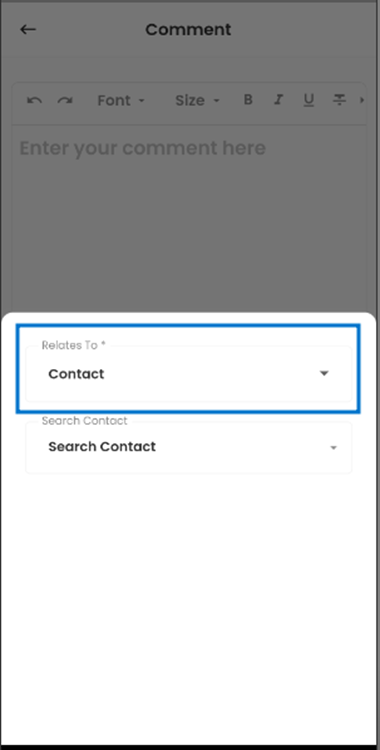
The ‘Add Relates To’ option allows the user to tag the comment to the relevant Entity. Upon tapping the option, the user gets two options of ‘Relates To’ and ‘Search’.
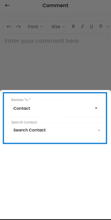
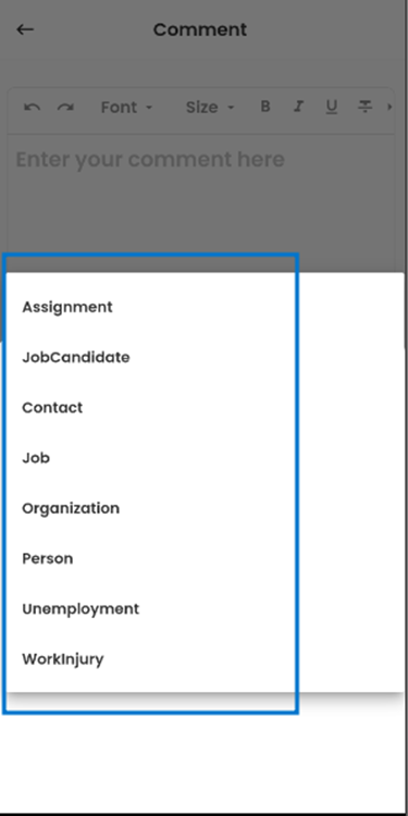
The ’Relates To’ option shows the entity (navigation) to which the comment can be related. Tapping on the option, the user gets a list of navigations to which the comment can relate.
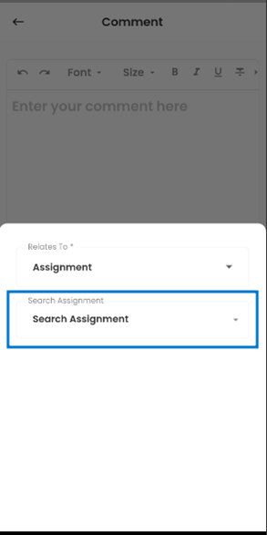
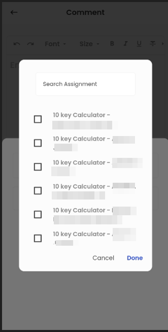
The 'Search' option allows the user to search the related entity (navigation) for their comment; for instance, if the user selects 'Assignment' then the 'Search Assignment’ enables users to pick the specific assignment their comment relates to from a list of available options.
The 'Add a Document' option enables users to attach relevant documents while adding a comment; by tapping on this option, users can seamlessly upload the desired document.
To edit the comment, the user should long press to select it, then click the Hamburger icon and tap 'Edit.' All the functionalities available in the comment sections can be edited by the user.
Contact Info
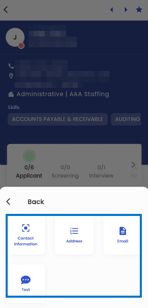
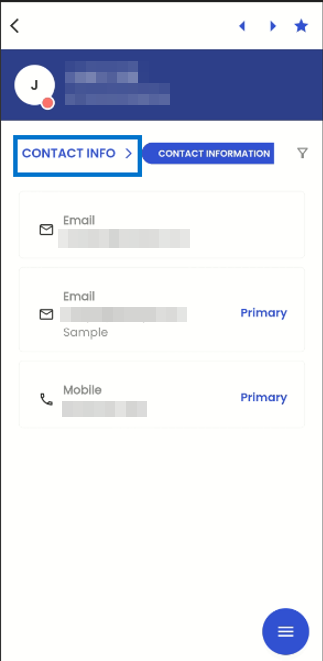
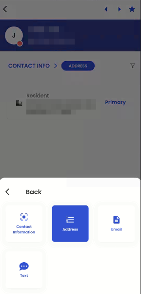
Within the entity detail page, users can seamlessly navigate the Contact Info Navigation. By tapping the 'Navigation' action, a bottom slider menu emerges, presenting users with a comprehensive list of available navigational options. Selecting the 'Contact Info' navigation from this list directs users to a submenu featuring various sub-navigations within the Contact Info section. These sub-navigations encompass Contact Information, and Address providing users with a structured and intuitive approach to access and manage various aspects of contact-related information within the system.
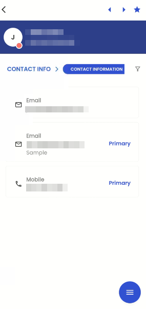
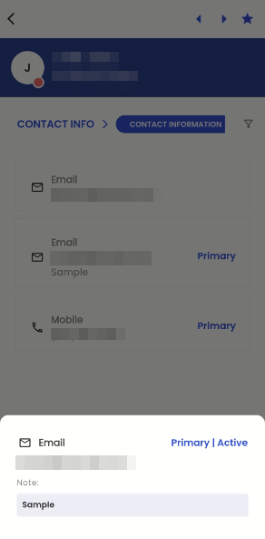
Upon selecting the Contact Information sub-navigation, users are seamlessly directed to the Contact Information page, which offers a card view presenting all available contact information within the system. Each card within this view displays the type of contact and the corresponding contact details, and, if applicable, denotes a contact as "Primary" when it has been designated as such. This organized display ensures users can easily access and comprehend contact-related information, facilitating efficient communication and contact management within the system.
The Primary Contact Information is initially established as the first contact information record entered into the system. In the event that a Primary Contact is marked as inactive, the system will automatically designate one of the Secondary Contacts as the new Primary Contact. This transition will be managed based on the priority assigned to Contact Information at the System Level, following a "First come First Serve" basis. In situations where no System Level contact information is available, the system will employ the "First Come First Serve" method to allocate a new Primary Contact Information entry.
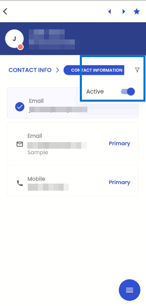
When users select the filter option within the navigation, they gain access to filtering capabilities, allowing them to refine their view of Contact Information. Through the Toggle option, users can choose between two distinct views: 'All Contact Information' and 'Only Active Contact Information.' This feature provides users with the flexibility to focus their attention on either a comprehensive overview of all contact information or specifically on active contact information, enhancing their ability to tailor their view to their specific needs within the system.
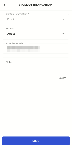
Tapping on a card within the Contact Information view triggers the appearance of a bottom slider, which conveniently displays the comprehensive details of the selected Contact Information. This includes crucial information such as the Contact Information Type, Contact Information, and any accompanying notes related to the selected contact entry. This user-friendly feature ensures that users can access and review specific contact details with ease and precision, enhancing their experience when managing contact information within the system.
When a user taps outside the bottom slider interface, they are seamlessly redirected to the previous navigation state. This intuitive functionality ensures a smooth and user-friendly experience, allowing users to easily return to their previous point of interaction within the system.
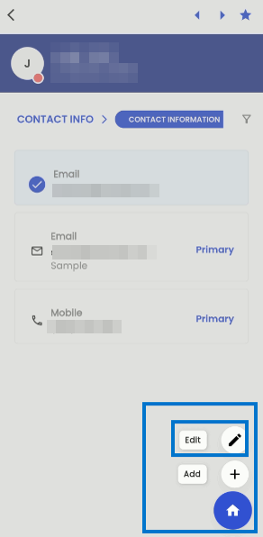
Located at the bottom corner of the navigation, the hamburger icon provides users with two essential options upon selection: 'Add' and 'Edit.' These options grant users the ability to either add new contact information entries or edit existing ones, enhancing their control and management over the contact details within the system.
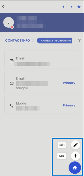
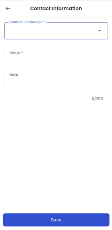
By selecting the 'Add' option, users are seamlessly directed to the 'Add Contact Information' navigation. Within this interface, users can input the necessary Contact Information details, and upon clicking 'Save,' the new Contact Information entry is effectively added to the system. This streamlined process ensures the efficient inclusion of new contact details, contributing to an organized and comprehensive repository of contact information within the system.
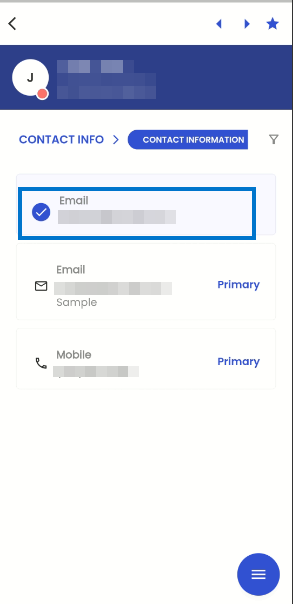
When a user performs a long tap on a card, that specific card is selected, and it's important to note that multiple cards cannot be selected simultaneously. With a card selected, users can tap on the hamburger icon to access options for 'Add' or 'Edit.' If the user chooses 'Edit' with a card already selected, they gain the ability to modify the details of the selected card. After making the desired updates, the user can save the Contact Information, and these changes are then seamlessly reflected and updated within the system. This user-centric design ensures precise and efficient management of contact details, streamlining the process of updating Contact Information.
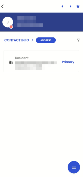
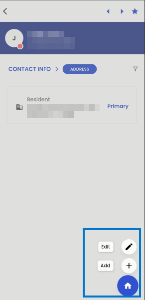
Upon selecting the 'Contact Info' action within the navigation, users are presented with a menu containing available sub-navigations within the 'Contact Info' section. If a user chooses to select the 'Address' option from this menu, they will be seamlessly directed to the 'Address' navigation page. This allows for easy access and management of address-related information within the system, making it convenient for users to handle and update address details as needed. This structured navigation approach ensures users can easily navigate to specific sections as needed, enhancing their experience when interacting with contact details.
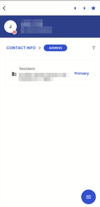
Within the 'Address' navigation, users can access a filter icon that opens a list of available filtering options. Through this filter, users have the flexibility to refine their view of addresses by toggling between 'Active Addresses' or 'All Addresses.' This user-friendly feature empowers users to customize their address view based on their specific preferences, either focusing solely on active addresses or gaining a comprehensive overview of all addresses within the system.
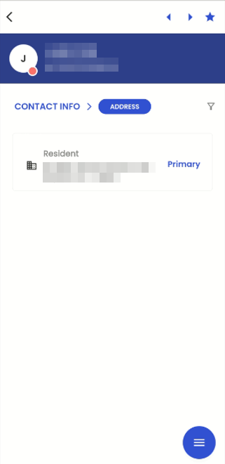
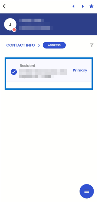
The list of addresses is presented in a card view format, with each card containing details such as the type of address, address particulars, and an indication if the address is designated as the primary one, clearly mentioned on the card. This structured presentation simplifies the process of accessing and comprehending various addresses within the system, ensuring efficient management and clear identification of primary addresses.
The Primary Address is initially established as the first address record entered into the system. In the event that a Primary Address is marked as inactive, the system will automatically designate one of the Secondary Addresses as the new Primary Address. This transition will be managed based on the priority assigned to Addresses at the System Level, following a "First come First Serve" basis. In situations where no System Level address information is available, the system will employ the "First Come First Serve" method to allocate a new Primary Address entry.
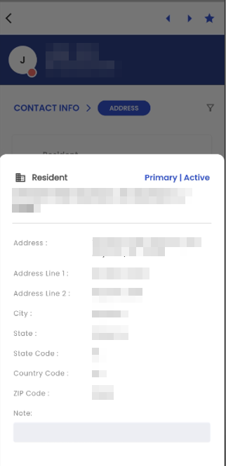
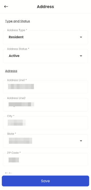
Tapping on a card within the 'Address' navigation triggers the appearance of a bottom slider, which conveniently displays the comprehensive details of the selected address. This includes essential information such as the Address, Address Line 1, Address Line 2, City, State, State Code, Country Code, Zip Code, and any accompanying notes related to the address. To remove the slider from the navigation, users can tap anywhere outside of the slider, and it will be temporarily hidden until navigated again, ensuring an unobstructed and user-friendly viewing experience for address details within the system.
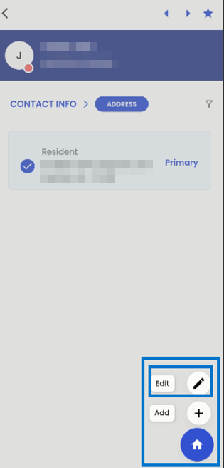
Located at the bottom corner of the navigation, the hamburger icon provides users with two essential options upon selection: 'Add' and 'Edit.' These options grant users the ability to either add new addresses or edit existing ones, enhancing their control and management over address-related information within the system.
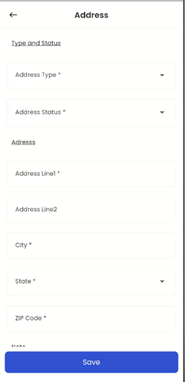
Upon selecting the 'Add' option, users are seamlessly directed to the 'Add Address' navigation. Within this interface, users can input the necessary address details, and upon clicking 'Save,' a new address entry is effectively added to the system. This streamlined process ensures the efficient inclusion of new addresses, contributing to a well-organized and comprehensive repository of address information within the system.
When a user performs a long tap on a card, the respective card is selected, and it's important to note that multiple cards cannot be selected concurrently. With a card being selected, users can tap on the hamburger icon to access the option for 'Edit.' If the user taps on the 'Edit' option with a card already selected, they gain the ability to modify the details of the selected card. After making the desired updates, the user can save the address information, and these changes are then seamlessly reflected and updated within the system. This user-centric design ensures precise and efficient management of address details.
Hiring Info
Hiring Info' navigation is the gateway to crucial information pertaining to user roles. This feature empowers users by providing them with the capability to both augment and revise these role-related details. When users access the 'Hiring Info' section, they are presented with the option to manage and fine-tune their 'User Roles.'
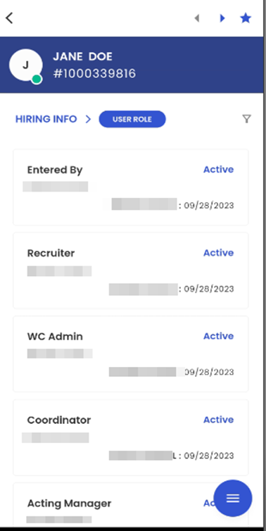
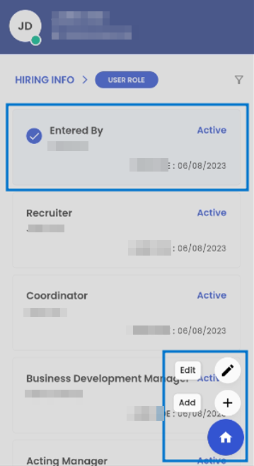
Upon tapping on the ‘User Role’ sub-navigation, the users are directed to the details of the user roles. This navigation displays the users who are directly involved with the applicant like Entered by, Recruiter, WC Admin, Acting Manager, and so on. This allows the user to add and edit multiple user role details of the applicant.
The User Role card view displays the User role such as ‘Entered by’, the Name of the office staff below the user role, the status of the user role as ‘Active’, and the date when the role was entered.
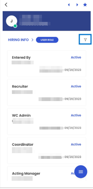
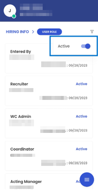
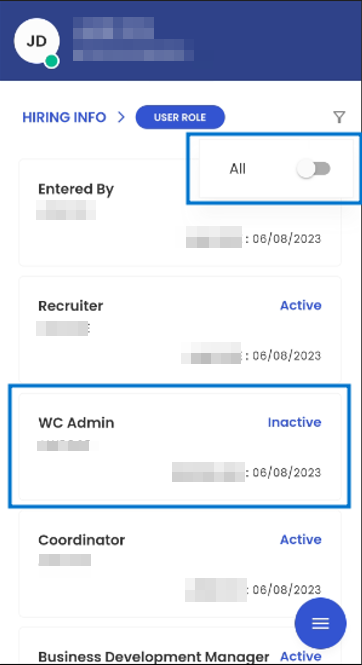
Tapping on the ‘Filter’ action the users get the toggle button. When the toggle button is switched to ‘Active’ then it shows all the User Roles that have Active status. By switching the toggle button to ‘All’, the users can view the ‘All’ User Roles with both Active and Inactive statuses.
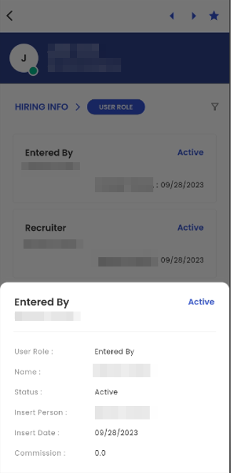
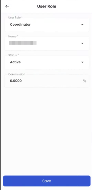
Tapping on the User Role card view, the bottom slider displays the details such as the User role and name of the office staff, Status, Insert Person, Insert Date, and commission charged by the office staff.
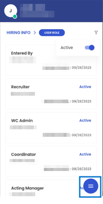
Tapping on the hamburger icon available on the bottom right, the user will get the option to ‘Edit’ and ‘Add’ the user roles. To edit a User Role, the user should long press and then click the Hamburger icon and tap 'Edit.'
Tapping on the ‘Edit’ option, the users can edit the existing user roles. The user can edit the ‘User Role’ and ‘Name’ of the office staff, the status of the user role, and the commission. The User Role, Name, and Status are mandatory fields.
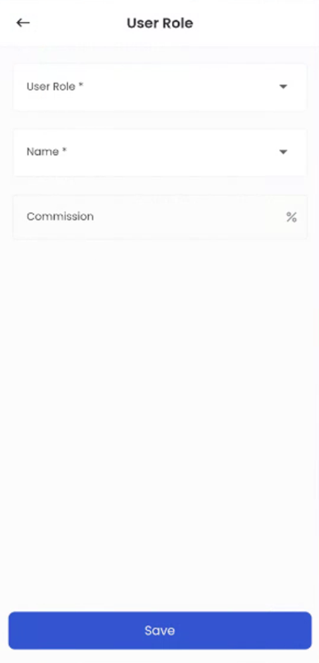
Tapping on the ‘Add’ option, the users can Add a new User Role. While adding a new User Role, the users have to mention the User Role and Name of the office staff and the commission.
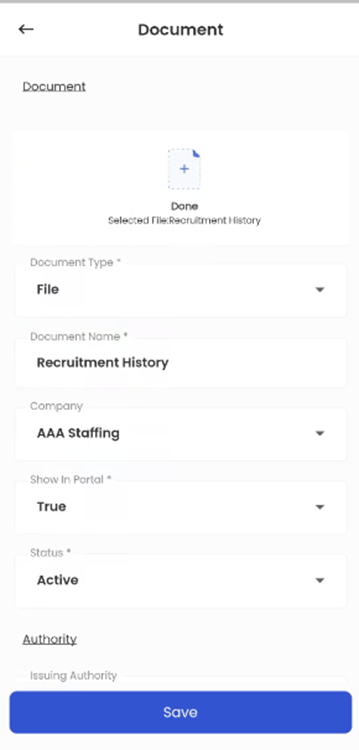
Document
Tapping on the 'Navigation' action within the interface prompts a list displaying all available navigational options within the Applicant Entity Detail page. Users can select 'Document' from this list which initiates a specific document-related navigation, allowing users to conveniently access and manage applicant documents within the system.
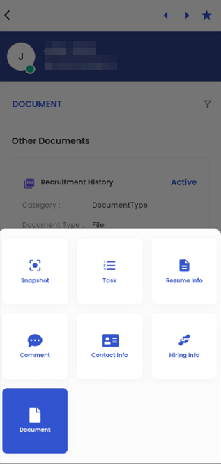
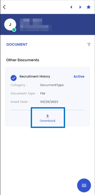
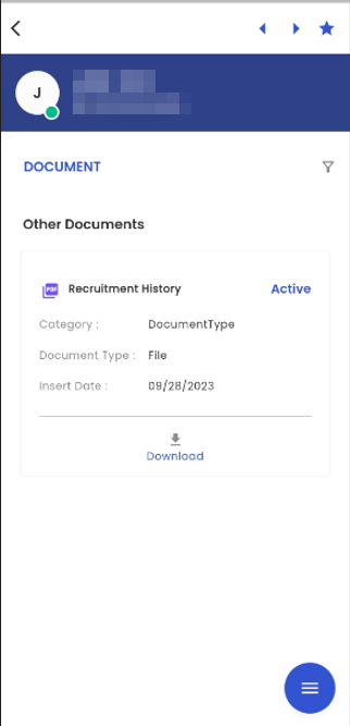
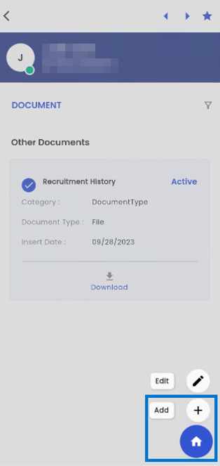
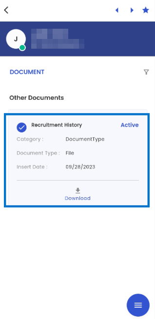
The 'Document' navigation is presented in a card-view format, with each document related to the applicant showcased in its own dedicated card. These document cards provide comprehensive details about each document, including the Document Name, Category, Document Type, Insert Date, Document Status, and an accessible option for downloading the document. This user-friendly interface simplifies the process of managing and accessing applicant-related documents efficiently within the system.
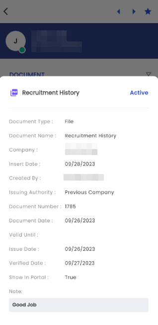
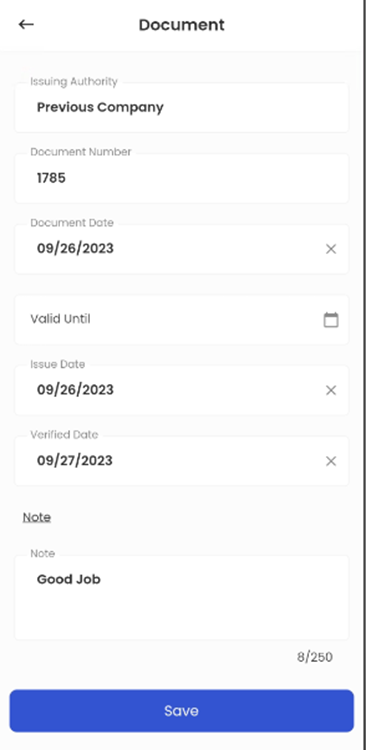
Upon tapping a document card, a bottom slider interface is activated, providing users with a detailed view of the relevant document information. Within this bottom slider, users can access crucial document details, including Document Type, Document Name, Company, Insert Date, Created By, Issuing Authority, Document Number, Document Date, Valid Until, Issue Date, Verified Date, Show in Portal, along with any accompanying Notes. Additionally, the document's current status is prominently displayed, offering users a comprehensive overview of the document's attributes and status within the system. This feature enhances document management and facilitates quick access to essential information for informed decision-making.
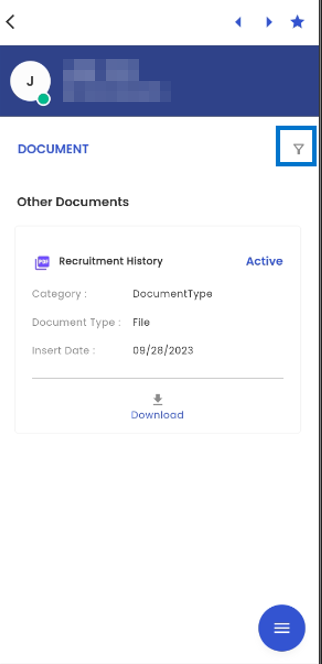
Upon tapping the filter icon, users gain access to a menu containing available filtering options within the navigation. Users have the flexibility to apply filters by toggling between 'Active' and 'All'. When the toggle is set to 'Active', only documents with an 'Active' status will be displayed, allowing for a refined view of documents in this particular status. Conversely, when the toggle is switched to 'All', the navigation will show all documents without any status restrictions, providing users with a comprehensive overview of all available documents within the system.
Users have the option to add documents by accessing the hamburger icon on the screen. When they select the 'Add' icon within this menu, they are seamlessly redirected to the 'Add Document' navigation, facilitating the document uploading process. Additionally, if users tap the Home Icon displayed on the screen, they will be redirected back to the main Document Navigation page, ensuring effortless navigation and access to documents within the system. This intuitive interface design streamlines document management and user interactions.
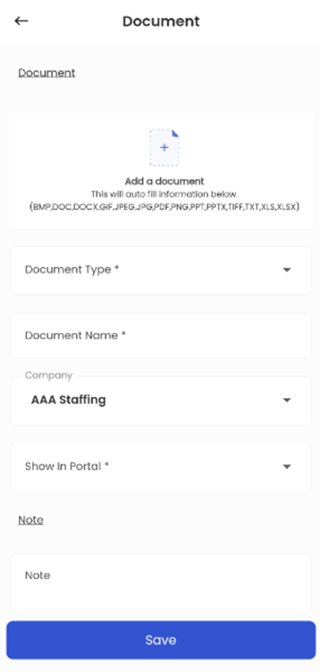
Users can seamlessly add new documents to the system by tapping the 'Add' icon, which directs them to the 'Add Document' navigation. Within this interface, users can upload a file, select a document type, input the document name, specify the associated company, set the 'Show on Portal' status, add relevant notes, and then save the document. This streamlined process ensures efficient and organized document management within the system, facilitating the addition of new documents with ease and accuracy.
When a user performs a long tap on a document card, they gain the ability to select a specific document. Following this selection, tapping on the hamburger icon, the list of available options is shown. Within this menu, users are presented with choices such as 'Add' and 'Edit.'
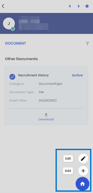
Upon selecting the 'Edit' option, users are granted the capability to make revisions and updates to the document's details. This action forwards them to a dedicated editing page, where they can modify various document attributes, including the Document File, Document Type, Document Name, Company, 'Show in Portal' status, Document Status, Issuing Authority, Document Number, and other relevant document information. This feature offers users the flexibility to maintain accurate and up-to-date document records within the system, ensuring the integrity of their document management processes.
By tapping the 'Download' option in the card view, users are granted the capability to download the respective document directly onto their device. This user-friendly feature facilitates easy access to and retrieval of documents, ensuring that users can conveniently store and reference the document on their own devices as needed.