Overview
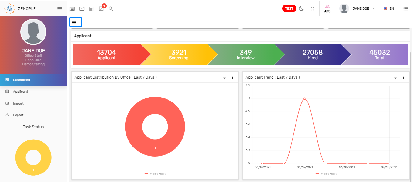
The first landing page of the ATS is the dashboard.
The dashboard displays the various tiles, workflow, and graphs of the ATS application that helps in records visualization and analysis. Users can see various tiles, workflows, applicant trends, and applicant distribution by office charts.
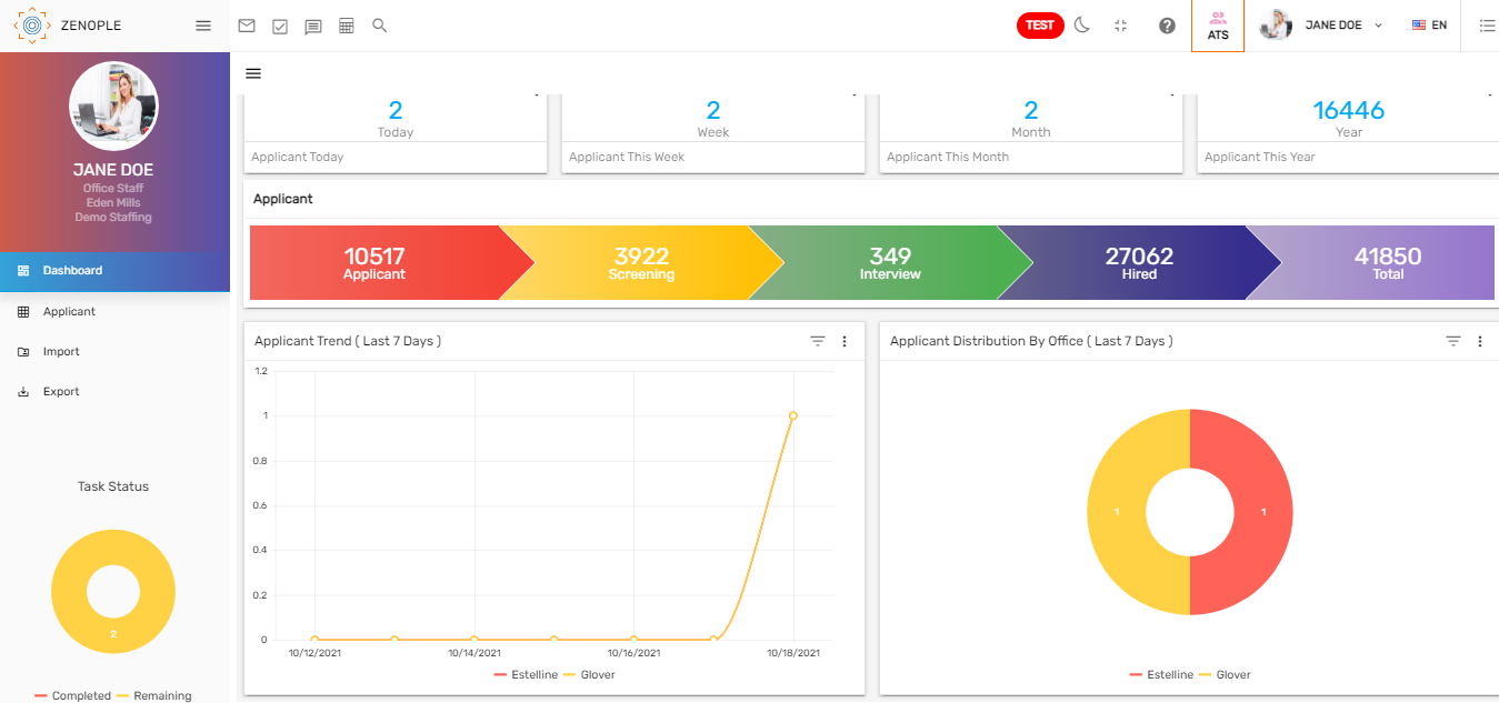
Tiles
Tiles are the numeric representation of information. There are various tiles on the top of the screen. Users can view the information like applicant created today, applicant created this week, applicant created this month and applicant created this year. Tiles are customizable and can be added upon the user’s request.

Clicking on the verticle ellipsis, the 'Applicant Today', 'Applicant This Week', 'Applicant This Month', and 'Applicant This Year' options can be selected.

 The records count of the selected option will appear on the tile.

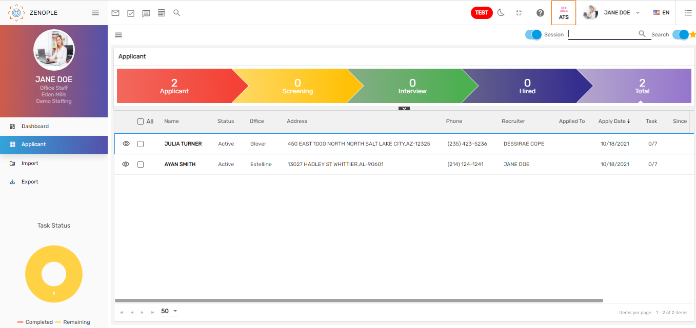
Clicking on any tile will redirect to the applicant directory. It will show the details of the applicant depending on the tile selected.

Workflow
The workflow of ATS is displayed below the tile. Applicant workflow consists of various stages under it. The count shows the total number of applicants under each stage and clicking on the stage will redirect to the applicant's detail. It consists of the applicant details. The tasks of the applicants are defined under each stage.
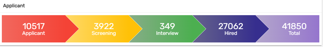
The workflow stages can be customized as per the client's requirements.
Trend Lines
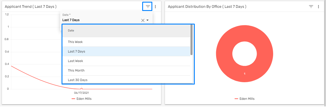
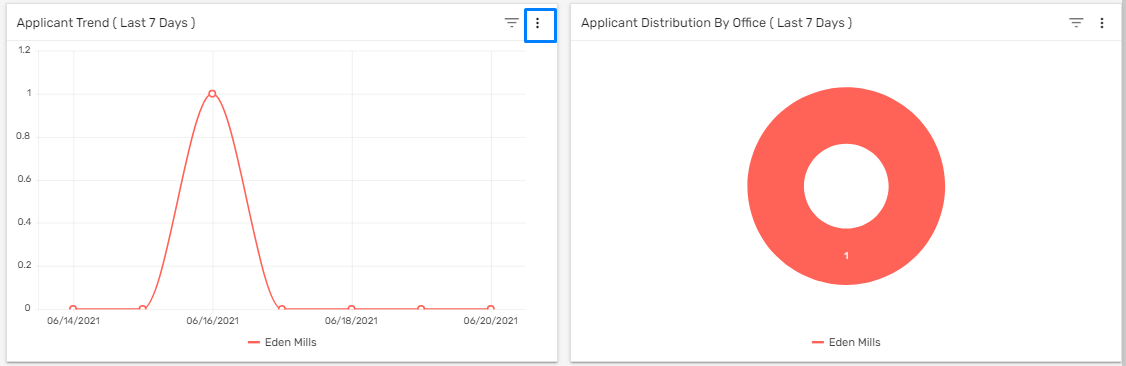
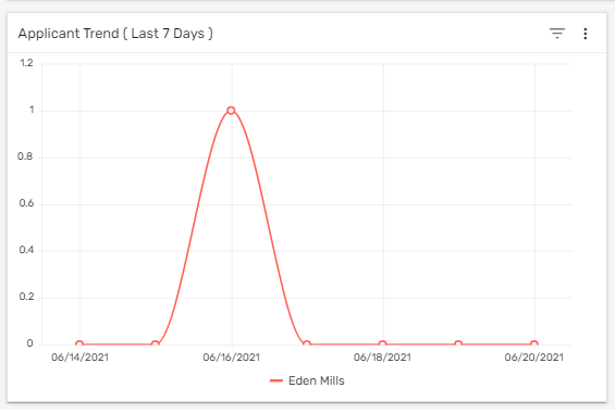
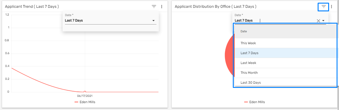
The trend lines in the dashboard show the graphic comparison of the number of the applicant created as per different offices in a period of time. Users can filter the trend line chart of applicants by date like 'Last 7 Days', 'This Week', 'Last Week', 'This month', 'Last 30 Days', etc.
This represents the timeline of the number of applicants that are registered into the Zenople system for different offices for the date selected.
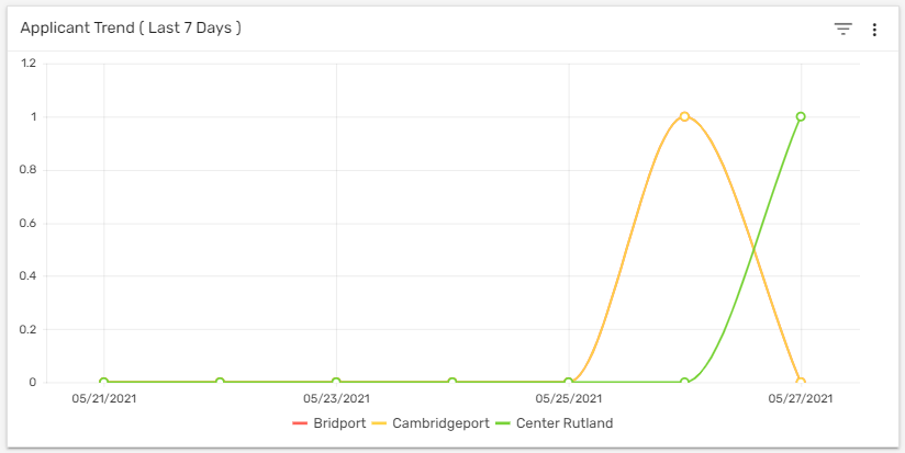
The filter option in the trend line is used to filter the applicant trend by different date options.
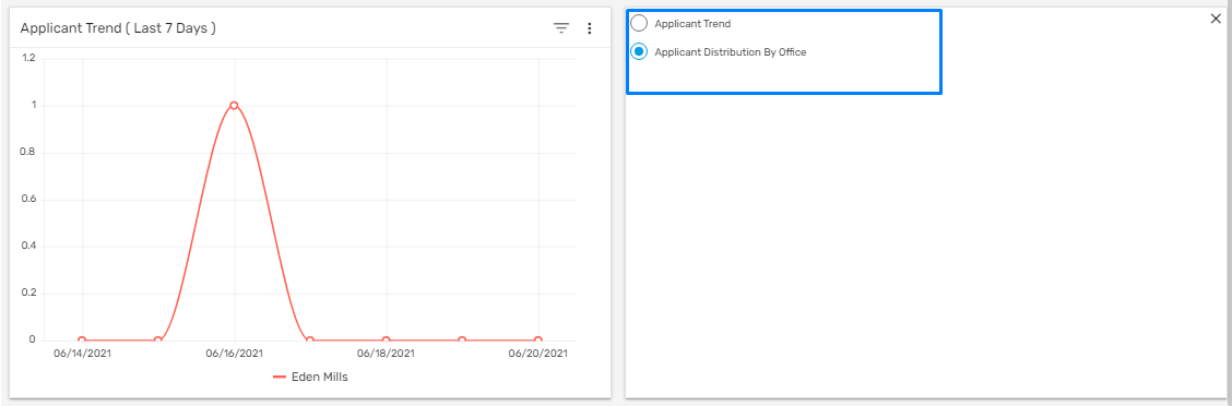
Clicking on the verticle ellipsis, either of the options 'Applicant Trend' or 'Applicant Distribution By Office' can be selected.
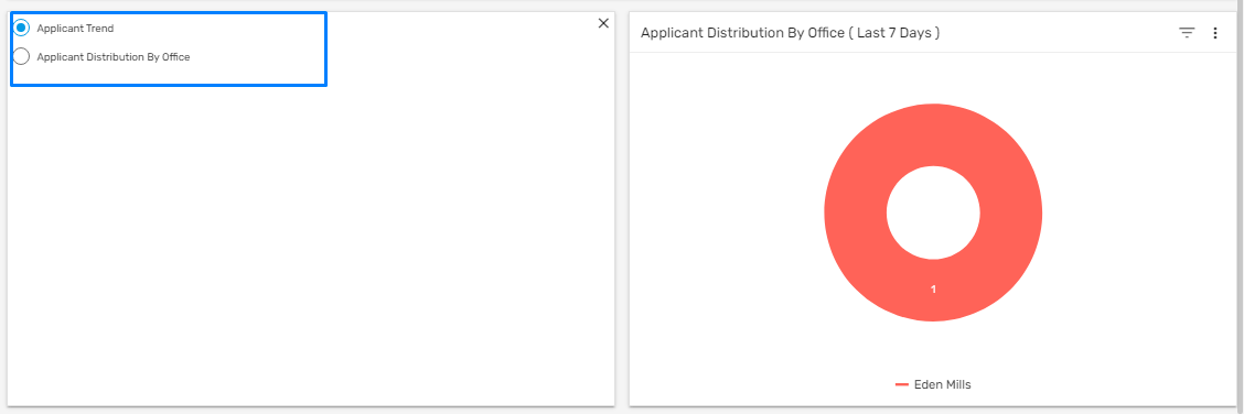
Depending on the selected option, the trend or donut chart records will reflect.
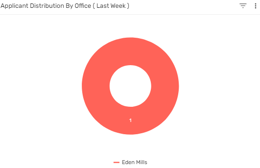
Donut Chart
The donut chart of 'Applicant Distribution by Office' shows the number of applicants as per the office on the selected date. The default date is set as the 'Last 7 Days,' Users can filter the chart of the applicant by date like 'Last 7 Days,' 'This Week,' 'Last Week,' 'This Month,' 'Last 30 Days,' etc. This is handy for comparing the records and drawing valuable conclusions quickly.
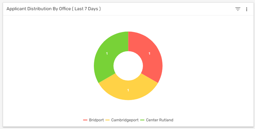 The filter option in Donut chart is used to filter the applicant distribution by office, as per the selected date.
 Clicking on the verticle ellipsis, either of the options 'Applicant Trend' or 'Applicant Distribution By Office' can be selected.
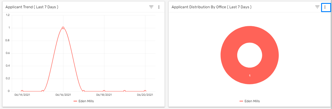 Depending on the selected option, the trend or donut chart records are displayed.
Filter
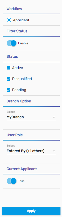
ATS includes a filter option that helps in searching for a new hire quickly. This filter will display the applicant on the basis of the selected option on the dashboard. This filter feature can be used from the hamburger icon.
 The filter consists of different options like 'Workflow', 'Filter Status', 'Status', 'Branch Option', 'User Role',and 'Current Applicant'.
The user needs to enable the filter status, to use other filter options. The options can be customized as per the client's requirements.
Task Status
'Task Status' shows the count of the tasks completed and the tasks remaining. Users can view the count from the donut chart.
