Feature added to Employee Portal
The following features have been added to Employee Portal.
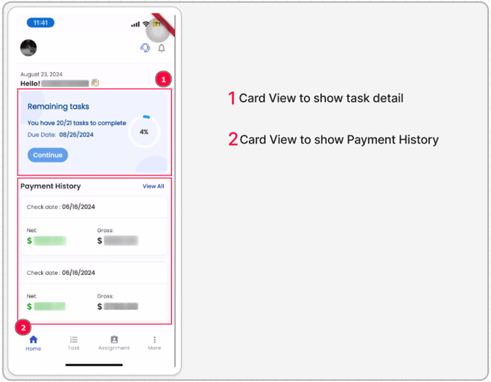
Redesign Employee Portal Home Page
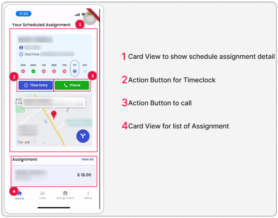
Zenople Mobile application introduces a new design for the employee portal home page in the. The redesign will retain all existing functionalities while offering a more modern and visually appealing layout. The updated design aims to improve user experience by enhancing navigation, readability, and ease of access to key features, ensuring that employees can still perform all tasks efficiently within the revamped interface.
Revamp Timeclock Navigation in the Employee Portal
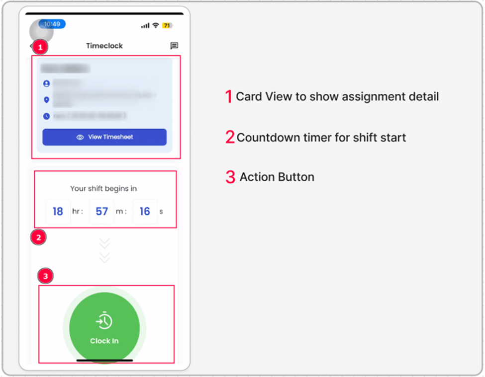
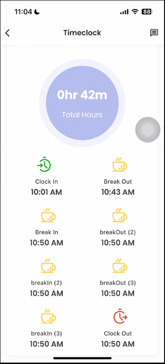
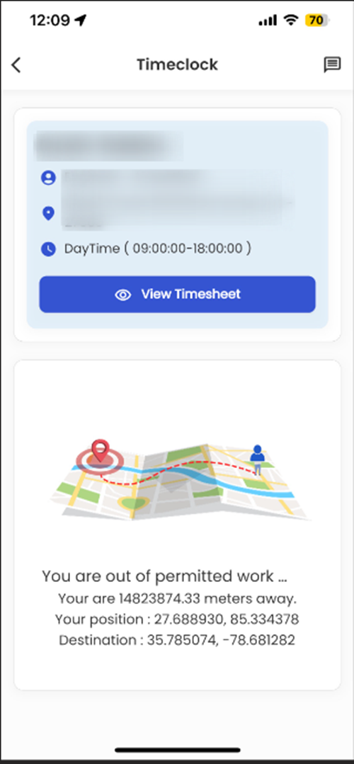
Zenople Mobile application involves a complete revamp of the timeclock navigation within the employee portal. The updated design will streamline the user experience, making it easier for employees to clock in/out, view their time entries, and manage their work hours. The new navigation structure will be more intuitive and user-friendly, enhancing overall accessibility and efficiency for employees using the timeclock feature.
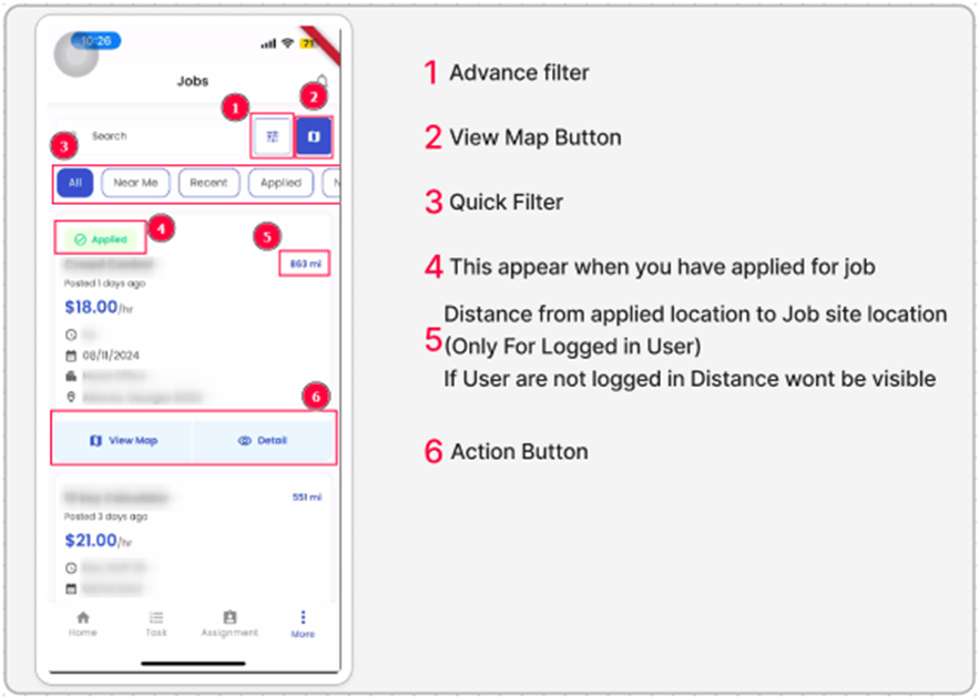
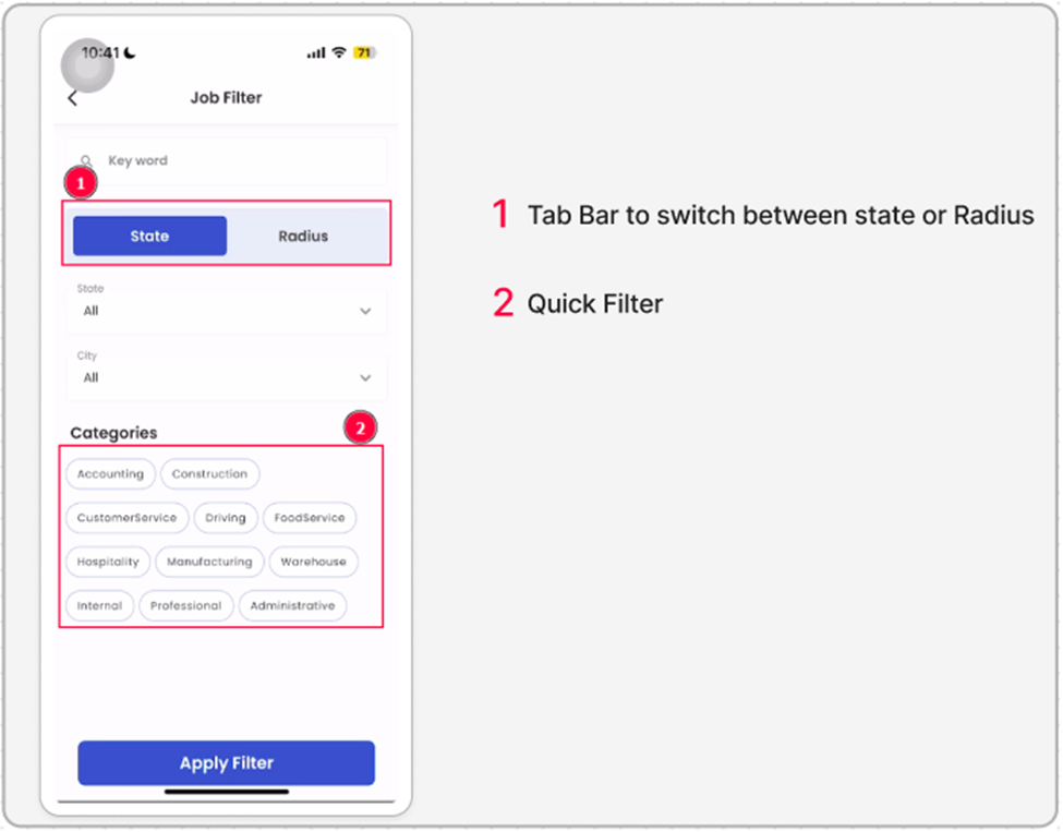
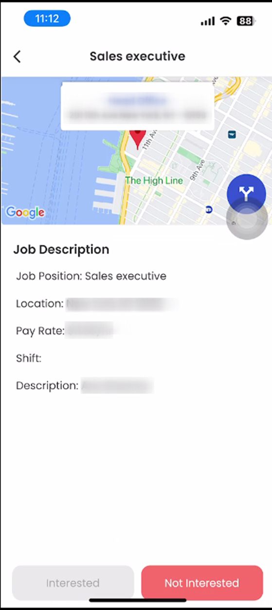
Redesign Job Listing, Entity Detail Page, and Job Filter Detail Page
A new design is introduced for the Job Listing, Job Listing Entity Detail Page, and Job Filter Detail Page in the employee portal of the Zenople Mobile application. The redesign will follow a modern layout while preserving all existing functionalities. The update aims to provide an improved user experience by enhancing visual appeal, usability, and navigation across these pages, ensuring that employees can continue to access job-related information seamlessly within the newly designed interface.
