Overview
The dashboard displays various tiles, workflow, and graphs of the SPM application that helps in the visualization and analysis of the records. Users can see various 'Tiles,' 'Workflows,' 'Sales Trends,' and 'Sales Distribution by Office Charts.'
.png)
Tiles
Tiles are the numeric representation of information. There are various tiles on the top of the screen. Users can view information like 'Target Created Today,' 'Target Created This Week,' 'Target Created This Month,' and 'Target Created This Year.' Tiles are customizable and can be added upon the user’s request.
.png)
Users can select the 'Target Today,' 'Target This Week,' 'Target This Month,' and 'Target This Year' by clicking on the vertical ellipsis.

Clicking on the tiles will redirect to the sales directory and it will show the details of the target depending on the tile selected.
Workflow
The workflow of SPM is displayed in the tiles below. The sales workflow consists of various stages. The count displays the total number of targets under each stage. The tasks of the targets are defined under each stage and tasks may be assigned to any user as required. There are five stages of workflow in SPM. They are:
- Target
- Proposal
- Credit
- New Client
- Total
.png)
1. Target
This is the first step of SPM and all the targets are recorded in this stage.
2. Proposal
In this stage, the targets are presented with various proposals, formal documentation, and agreements.
3. Credit
In this stage, the credits of targets are analyzed based on the company’s requirements to qualify as a client.
4. New Client
The targets are presented with proposals and their credits are analyzed. After meeting the requirements they qualify and then they are declared as a new client. These new clients fall under this stage.
5. Total
All the data of the above stages can be viewed in this stage.
Note: The workflow stages can be customized as per the client's requirements.
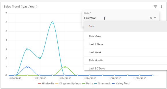
Trend Lines
Trend lines in the dashboard show the graphic comparison of the number of sales target added into the Zenople system according to different offices in a period of time. The default date is set as the 'Last 7 Days.' Users can filter the trend line of the sales target tracked down by date like 'Last 7 Days, 'This Week,' 'Last Week,' 'This Month,' 'Last 30 Days,' etc. Also, users can select an office in the trend lines to see the number of sales records under a particular office in the selected time.
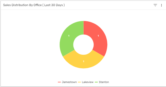
Donut Chart
The donut chart of 'Sales Distribution by Office' shows the number of sales as per the office on the selected date. The default date is set as the 'Last 7 Days.' Users can filter the chart of the work injuries by date like 'Last 7 Days,' 'This Week,' 'Last Week,' 'This Month,' 'Last 30 Days,' etc. The donut chart is handy for comparing the records and also valuable in concluding quickly.
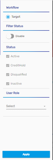
Filter
It consists of a filter option that helps in searching for a target quickly. This filter will display the sales based on the selected option on the dashboard. This filter feature can be used from the hamburger icon.
The filter consists of different options like 'Workflow,' 'Filter Status,' 'Status,' and 'User Role.' Users need to enable the filter status, to use other filter options. The options can be customized as per the client's requirements.
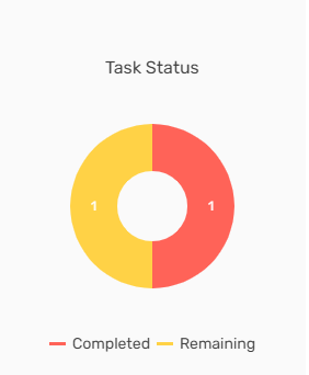
Task Status
'Task Status' shows the count of completed and remaining tasks. Users can view the count from the donut chart.