New Hire Portal
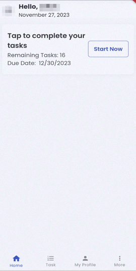
The default landing page for the new hire portal is set as the ‘Home’ navigation where the users can view the greetings on the top card section of the application along with the current date.
The top right corner of the screen consists of the bell icon which displays the number of notifications for the user.

Home
Home navigation consists of four sections namely Profile, Task, Job section, and bottom navigation.
On tapping the profile picture, the user can view their profile. It directs users to the ‘Profile’ navigation.
On the job card view, new hires can directly tap the ‘Start Now’ button to initiate their tasks. It consists of the number of remaining tasks and the due date of the tasks.
Beneath the Task card, there lies a Job card section from where the users can view the available jobs by tapping anywhere in the card. This card directs to the Job Listing bottom navigation.
The bottom navigation consists of ‘Home’, ‘Task’, ‘Job Listing’, and ‘More’ navigations.
On tapping the ‘More’ bottom navigation, other navigations like ‘My Profile', 'Document’, and ‘Settings’ are displayed.