Features added to Employee Portal
The following features have been added to Employee Portal.
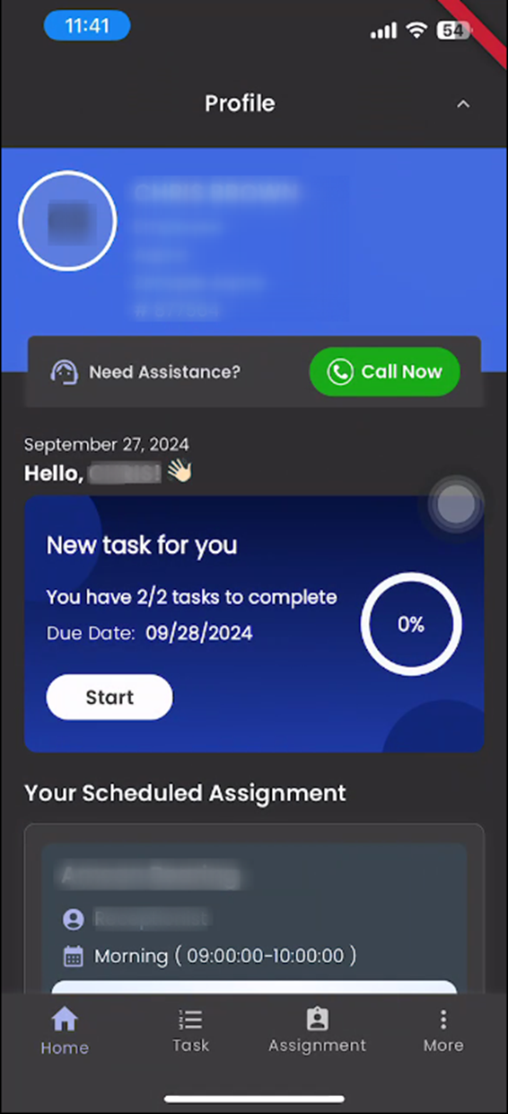
Revamp Call Support Page in Employee Portal
We have revamped the Call Support page in the Employee Portal . The updated UI includes changes to the profile card design and introduces a new "Call Now" button, enhancing the user experience and making support more accessible. These improvements aim to provide a more intuitive and visually appealing interface for users seeking support through the portal.
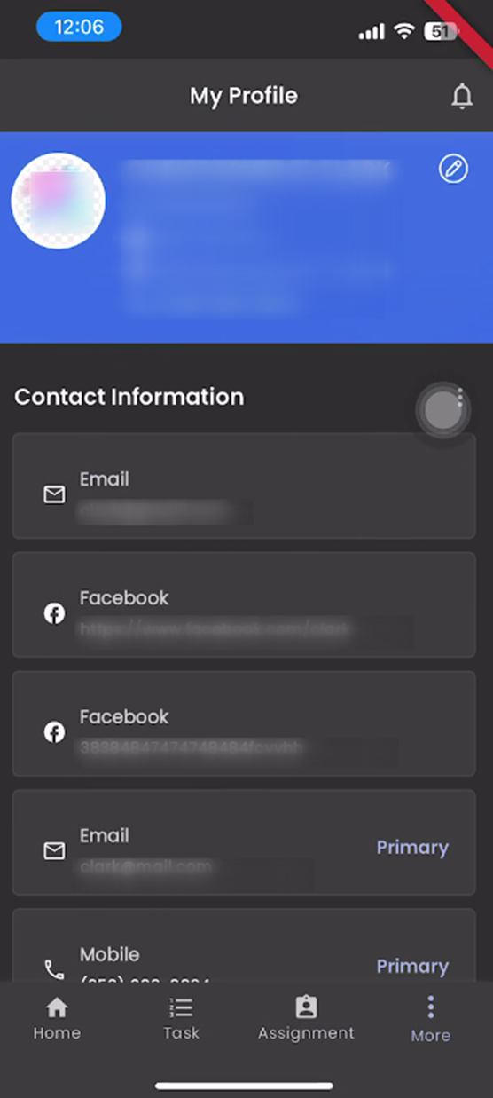
Revamp My Profile Page in Employee Portal
The "My Profile" page in the Employee Portal is redesigned, focusing on an enhanced user experience and visual appeal. The new design introduces a detailed profile card with refined UI elements, including an updated layout and a modernized edit icon. The overall interface refinement ensures a cleaner, more intuitive, and user-friendly experience, making it easier for employees to view and update their personal information.
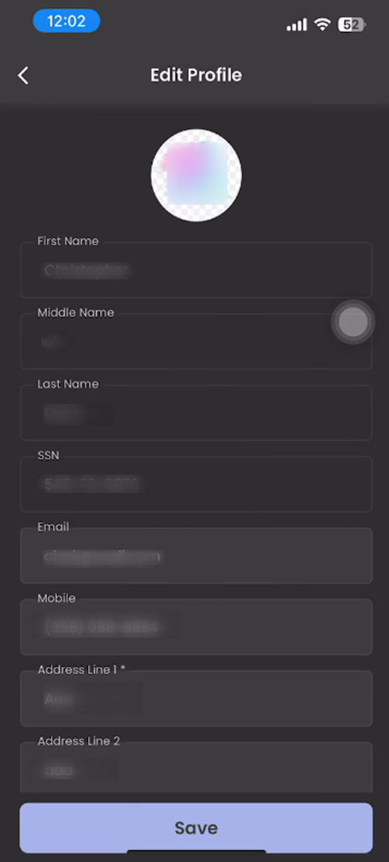
Revamp the Edit Profile Screen in the Employee Portal
The "Edit Profile" screen in the Employee Portal is redesigned. The revamped design enhances the user interface, making it more visually appealing and user-friendly. Key improvements include the enhanced input text fields for a more streamlined editing experience, along with an overall change in the UI for a modernized appearance.
Users are now able to edit specific profile information such as email, mobile number, address line 1, address line 2, city, state, and zip code. This provides users with an easy and intuitive way to update their personal information directly within the portal.
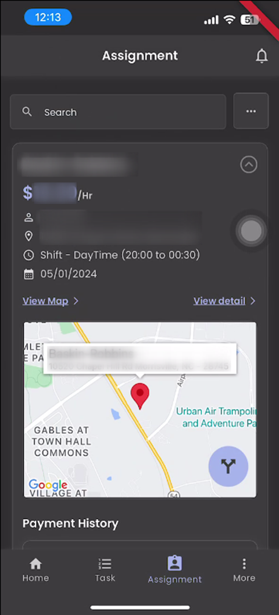
Revamp the Assignment Screen in the Employee Portal
The Assignment screen in the Employee Portal has been revamped. This new design introduces an overall UI change, focusing on improving the visual layout and user experience. The assignment cards have been updated for better organization, while buttons are now arranged more intuitively for easier interaction. A new payment history card has been added to give users a clear view of their payment details, and text on the screen is now more organized to enhance readability and visual appeal. The changes aim to make the screen more user-friendly and aesthetically pleasing.
Revamped Assignment Detail Page in Employee Portal
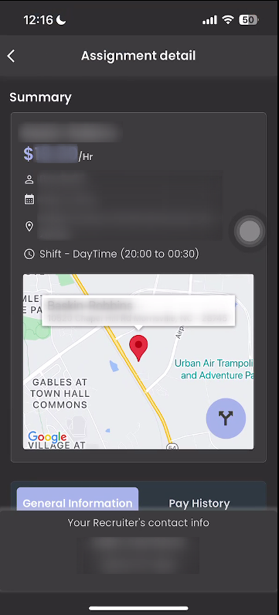
The Assignment Detail page in the Employee Portal has been revamped. This redesign includes a complete overhaul of the UI, making the page more visually appealing and easier to navigate. A new card has been added with a heading labeled "Summary," providing a clear, concise overview of key details. Additionally, the tab bar has been enhanced for smoother navigation for general information and pay history information, improving the overall user experience. These changes aim to streamline the presentation of information and ensure users can quickly access the details they need.
Enable Timeclock Punch for JSM Assignments in Zenople Mobile
This feature allows timeclock users to punch in and out for JSM (Job Scheduling Management) assignments through the Zenople mobile application. By enabling the timeclock functionality for JSM assignments, users can more easily navigate and record their work hours for various shifts. The feature also displays key shift information, such as Shift Details, Work Date, Day, Start Time, and End Time, ensuring users have all the necessary details readily available when using the timeclock.